Why you can trust TechRadar
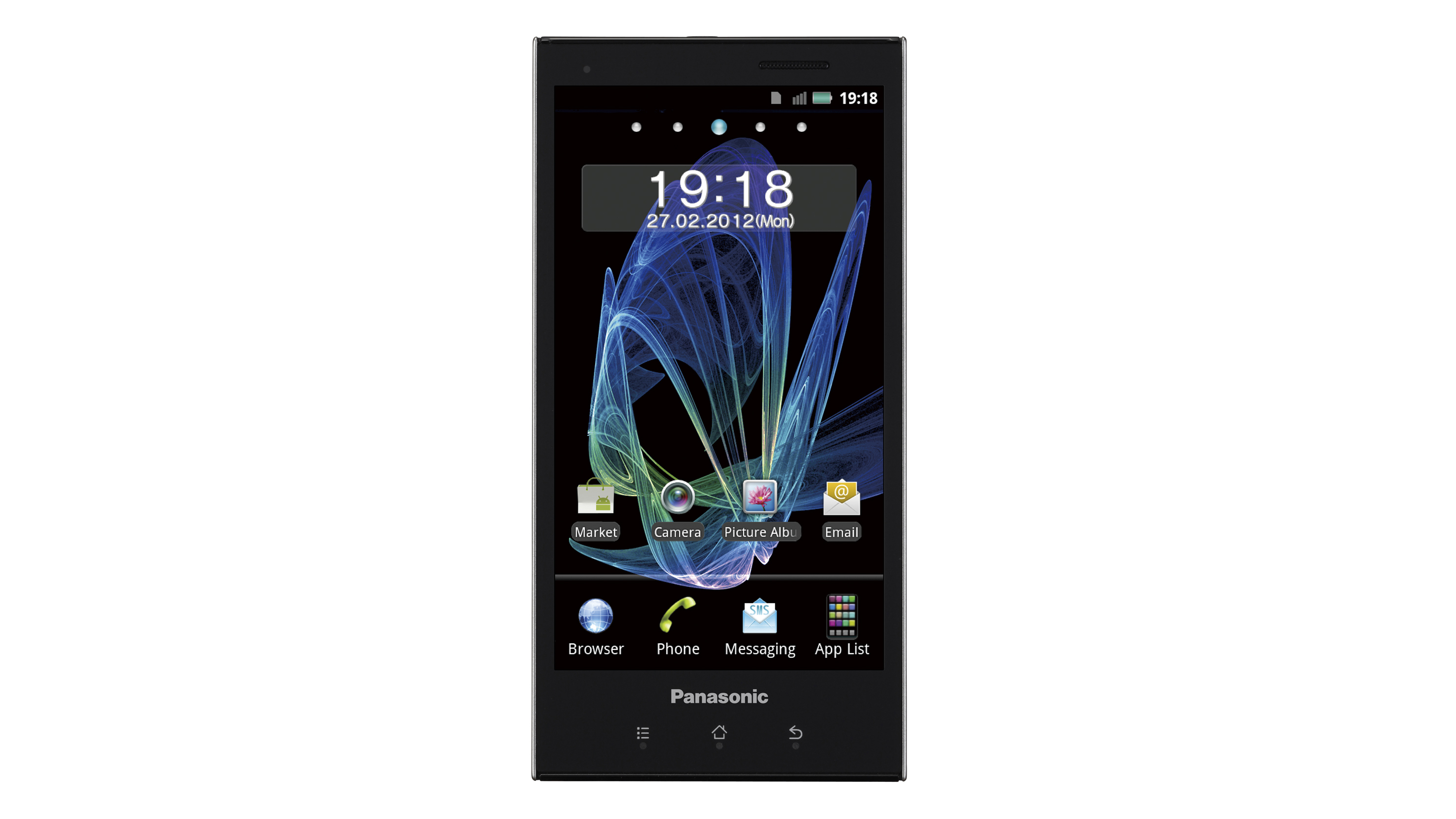
The initial disappointment with the Panasonic Eluga comes when you fire it up for the first time - and that's not because the Panasonic-designed lock screen is naff. It's because you'll see it's running Android 2.3.5.
A lack of Ice Cream Sandwich action, even with a promise of a summer update, is unacceptable for a phone costing nearly £400/$700 in mid-2012.
There is a Panasonic UI over the top, but it's minimal and shouldn't bother Android devotees too much. Panasonic's UI features are more like tweaks than actual platform changes and, in some circumstances, we're not sure why they bothered.
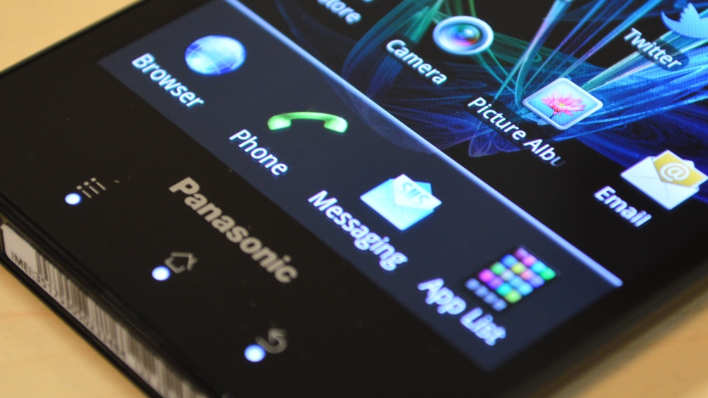
Take, for example, the launcher that appears along the bottom of all of the Panasonic Eluga's five home screens.
Unlike the native ICS bottom panel, you don't get free reign to chuck in any apps or folders that you please. You're limited to changing just three of the four shortcuts with the Rubik's cube-like App List staying put no matter what.
The App Tray has also been slightly tweaked, with apps automatically (without any other options) being sorted alphabetically and the options in the ever-present bottom line reading Preinstall, Download, Update and Home.
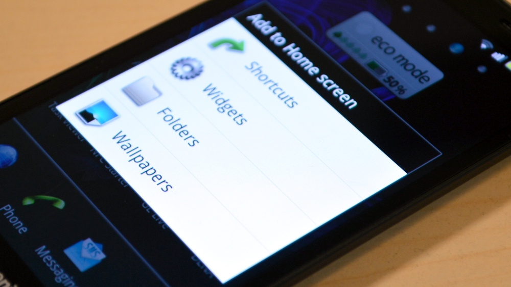
A touch and hold on a home screen brings up the option to add a shortcut, app, folder or widget - although the quality and quantity of the latter leaves a lot to be desired.
There isn't the wealth of widget wonders that HTC's Sense UI offers, that's for sure. You can also easily change your wallpaper using this press and hold method.
Back to the lock screen and Panasonic has seen fit to introduce its own unlock mechanism in the form of an arch-shaped swipe that you have to perform to get inside your phone's goodies.
This swipe seems rather rudimentary, though, and it makes a strange clicking noise when performed successfully.
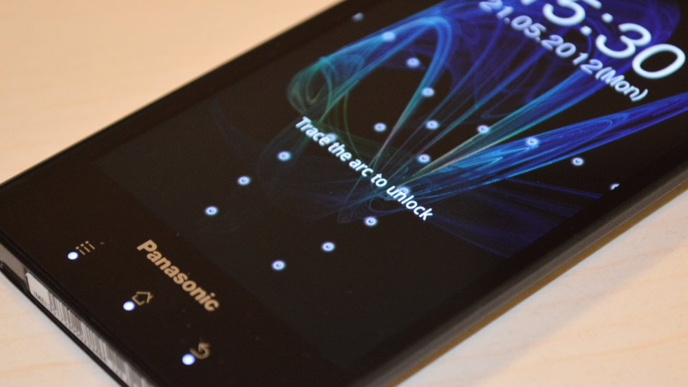
Panasonic does enable you to change this for the more traditional Android pattern unlock, or indeed a whole host of other pin and pattern-based lock ups.
Whatever lock you choose, don't be expecting to be able to access your Panasonic Eluga's stored music files - the lock screen has no media control options, sadly.
The 1GHz dual core chips seem to do the job in terms of app management. Swiping between home screens is pretty seamless, there isn't any notable lag to report, and even an Android novice should have no issues getting to grips with the menu options, settings and app locations.
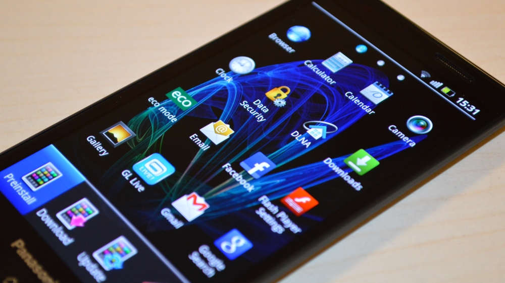
It's not native Android but it's hardly a fully skinned experience, meaning that Google's intuitive operating system is all there - even if it looks a little bit different.
