Why you can trust TechRadar
Those hoping for a classy software overhaul from Samsung to match its hardware efforts are in for a disappointment. You get the same cluttered, dated-looking TouchWiz UI layered on top of Google's Android OS - this time Android 4.4.4 KitKat.
As always, I forced myself to live with the default Samsung UI throughout the review period, resisting the temptation to streamline the experience by downloading Google Now Launcher or Apex Launcher, as I would with my own Android phones.
Nowadays, doing so is no longer a sure fire way to get me riled up. Using a modern Samsung phone like the Galaxy Alpha with its default factory settings is pretty okay. Not great, but not bad.
That might sound like damning with faint praise, but it isn't meant to be. Samsung has undoubtedly made improvements in its software design over the past year or so, and this is the best and most intuitive Samsung UI yet.

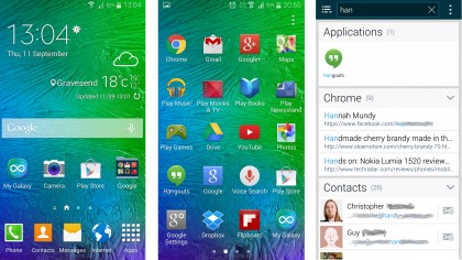
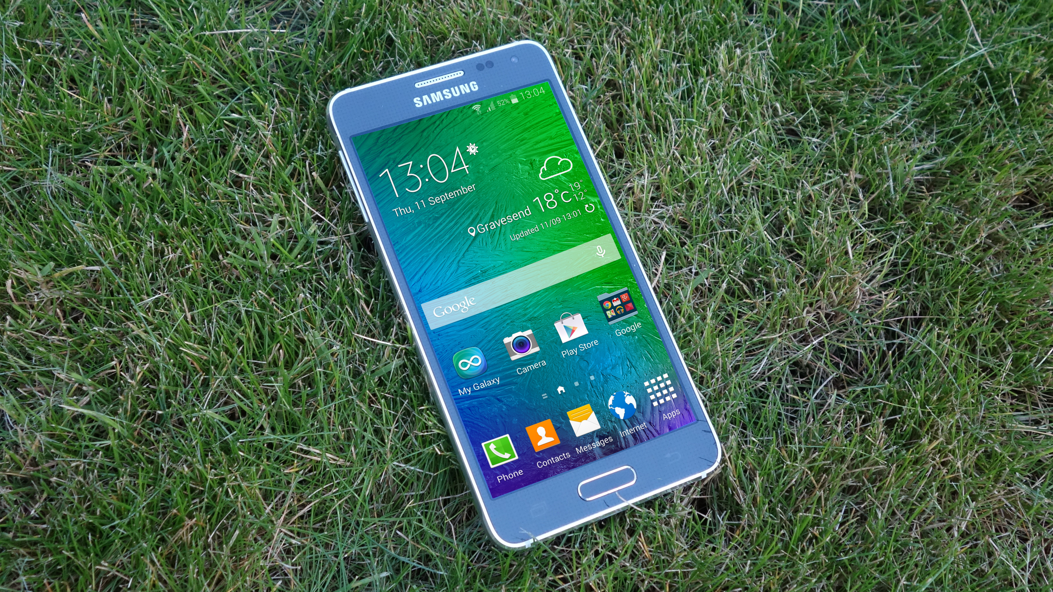
The latest iteration gives you a main homescreen with a useful and surprisingly understated weather and time widget taking up the top third, with a Google Now box leaving space for four of your favourite app icons. Along the bottom you can squeeze in your four main-use apps alongside an app tray shortcut.
It's not so dissimilar to stock Android, really. Slide left, however, and you don't get the Google Now screen as you do in the excellent Google Now Launcher (that's accessed by pressing and holding the Home key here). Rather, you get Samsung's My Magazine news story collator, which is a result of the company's team-up with Flipboard.
My Magazine looks quite nice, but it's not particularly well executed. It feels sluggish, taking an age to load up a limited range of content. You're much better served just booting up the Flipboard app itself and getting to precisely the content you're interested in.
Although there hasn't been any official word, it is all but guaranteed that the Samsung Galaxy Alpha will be updated to Google's latest mobile operating system, Android 5.0 Lollipop.
Android Lollipop has now started rolling out to the Samsung Galaxy S5, so hopefully the Samsung Galaxy Alpha will get it soon. Of course it will still be skinned with Samsung's TouchWiz interface, so don't expect an experience akin to the one in stock Lollipop.
Menus and settings
Elsewhere, Samsung's notification menus are gradually getting more functional, but seemingly not much more attractive. They're presented in a slightly uninspiring range of blue tones, but the circular function toggles are crisp enough.
Having said that, the latest settings menu is simply too spread out for its own good, with the large coloured circular markers too tough to distinguish from one another at a glance.
You can see what Samsung was attempting - to prevent that familiar information overload feeling you get with most modern smartphone settings menus. But this alternative approach makes it even trickier to find the function you want, because the odds are it'll be several swipes away from where you are, and not necessarily in a logical location.

On the plus side, I like how Samsung has started dotting thoughtful shortcuts throughout its interface. Bring down the notification menu and you'll find a dedicated S Finder button, which lets you carry out a system-wide search.
Type in a name, for example, and it'll search your chosen messaging app (Hangouts or Messages), your contacts, your email app, any stored files containing that name (including images and videos), and even Chrome's search history. It won't, however, search your Gmail app, which is a bit of a pain.
Anyway, S Finder is a nice thing to have to hand, as is a Quick Connect option for sharing content to local devices.
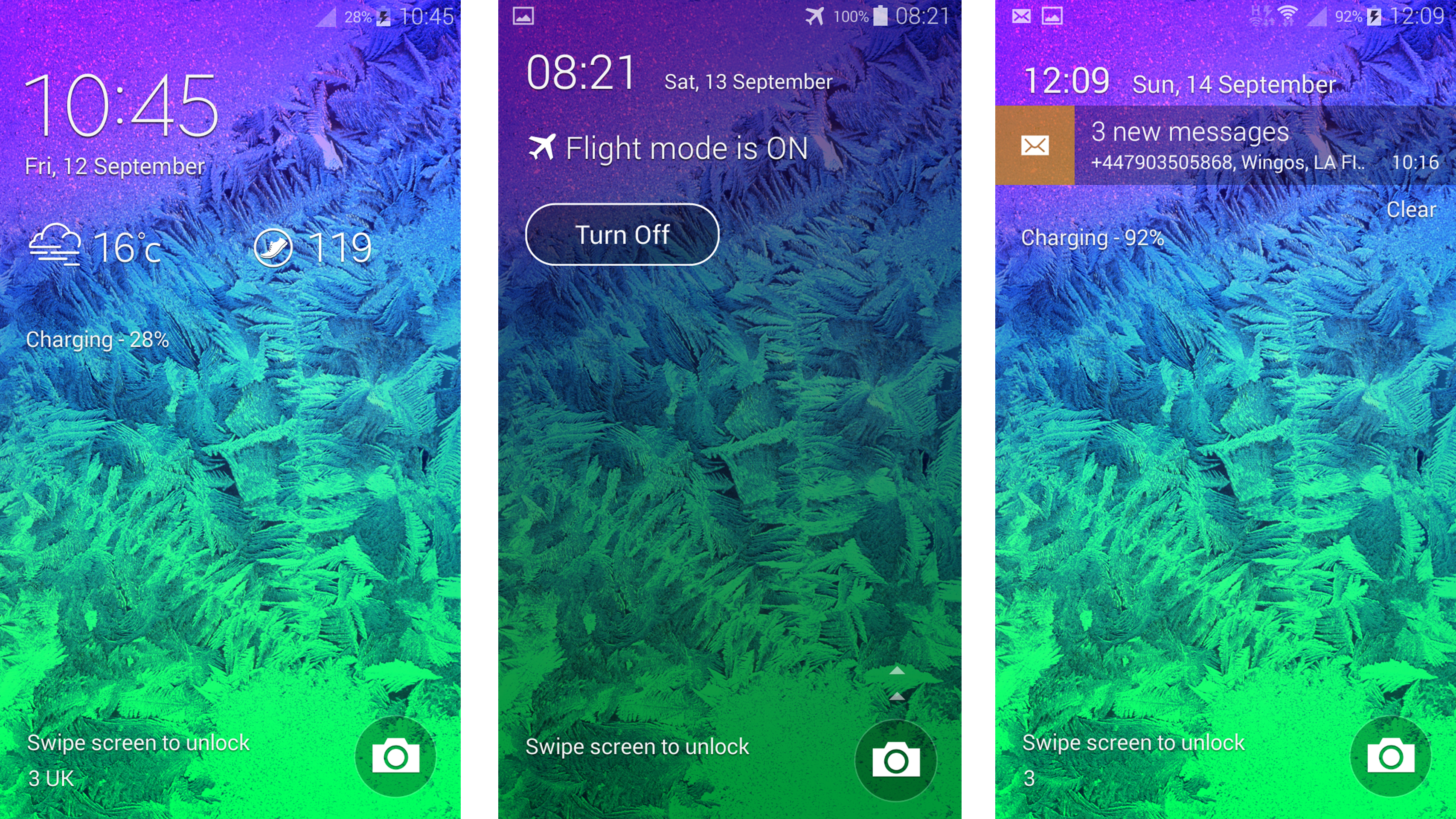
Another minor touch I appreciated along these same lines was when I switched on Flight mode when turning in for the night. When you wake the phone next, there's the option to turn Flight mode off, right there on the lock screen.
It's seemingly small touches like this that make a smartphone pleasant to use rather than gimmicky biometric readers or finicky gesture controls (which are still here, if you really want them). Samsung seems to be waking up to this fact, which can only be a good thing and hopefully we'll see more of this sort of thing with the update to Android 5.0 Lollipop.
