Why you can trust TechRadar
This is a Samsung phone, which means that it's very strong at simply making and receiving calls. While I was concerned at the relatively low and erratic signal strength that often appeared in the notification bar on my test unit, that didn't seem to reflect on the call quality in those locations.
In fact, call quality was of a consistently high standard during my time with the phone - clear, crisp, and plenty loud enough.
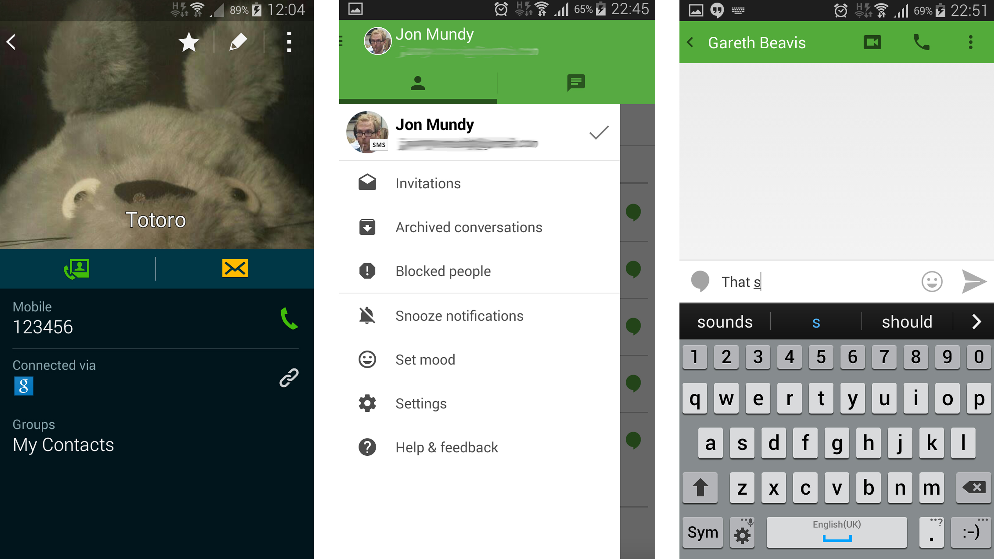
Samsung's Contacts menu and related Phone app may not be the prettiest around, but they're powerful and effective. Going to a contact brings up all of the ways in which you're connected, including any installed third party communication apps like WhatsApp.

You also get a little reminder of the last time you spoke to someone when you call them up, which is particularly handy for those business calls.
Messaging
In terms of messaging, you get the now typical choice between Samsung's own Messages app and Google's Hangouts app.
As with making calls, Samsung's messaging app is a little ugly but deeply functional. I particularly like the ability to add "priority senders" to the top row of the app, giving you quick access to those few contacts that you message all the time.
Meanwhile, using the volume buttons in the Samsung Messages app performs the rather unusual - but strangely appealing - function of increasing the size of the fonts, so you can quickly squeeze more messages in or make them easier to read.
Of course, Google's Hangouts has its own allure. It's much more stylish and pleasant to look at and use, and it smartly integrates SMS messages with data-based chats. It also automatically pushes your favourite contacts to the top of the pile.
That being said, it's one of those apps where you feel Google is still trying to hit upon the ideal layout and design, which doesn't always make for a fluid, intuitive experience and that continues to be the case in the updated Android 5.0 version. The current one's pretty good, though, so here's hoping Google runs with it.
Keyboard
Samsung's keyboard isn't particularly great, though. Once again, it's functional rather than attractive, but it simply lacks the effortless appeal of something like SwiftKey or even Google's own Keyboard.
What's more, if you're a regular comma user like me, you'll have to touch and hold on the full stop key to bring up a menu and select it from there. That gets old pretty quickly.
The predictive word suggestion system works pretty well, though, and there is a slide-to-type option - but it needs to be activated from the keyboard settings menu.
Both of the aforementioned alternatives are available on the Google Play Store - Google's for free - and both feature a comma key and integrated swipe-typing, as well as a more attractive design. Download one of those instead, unless you like to have dedicated numerical keys.
Browser
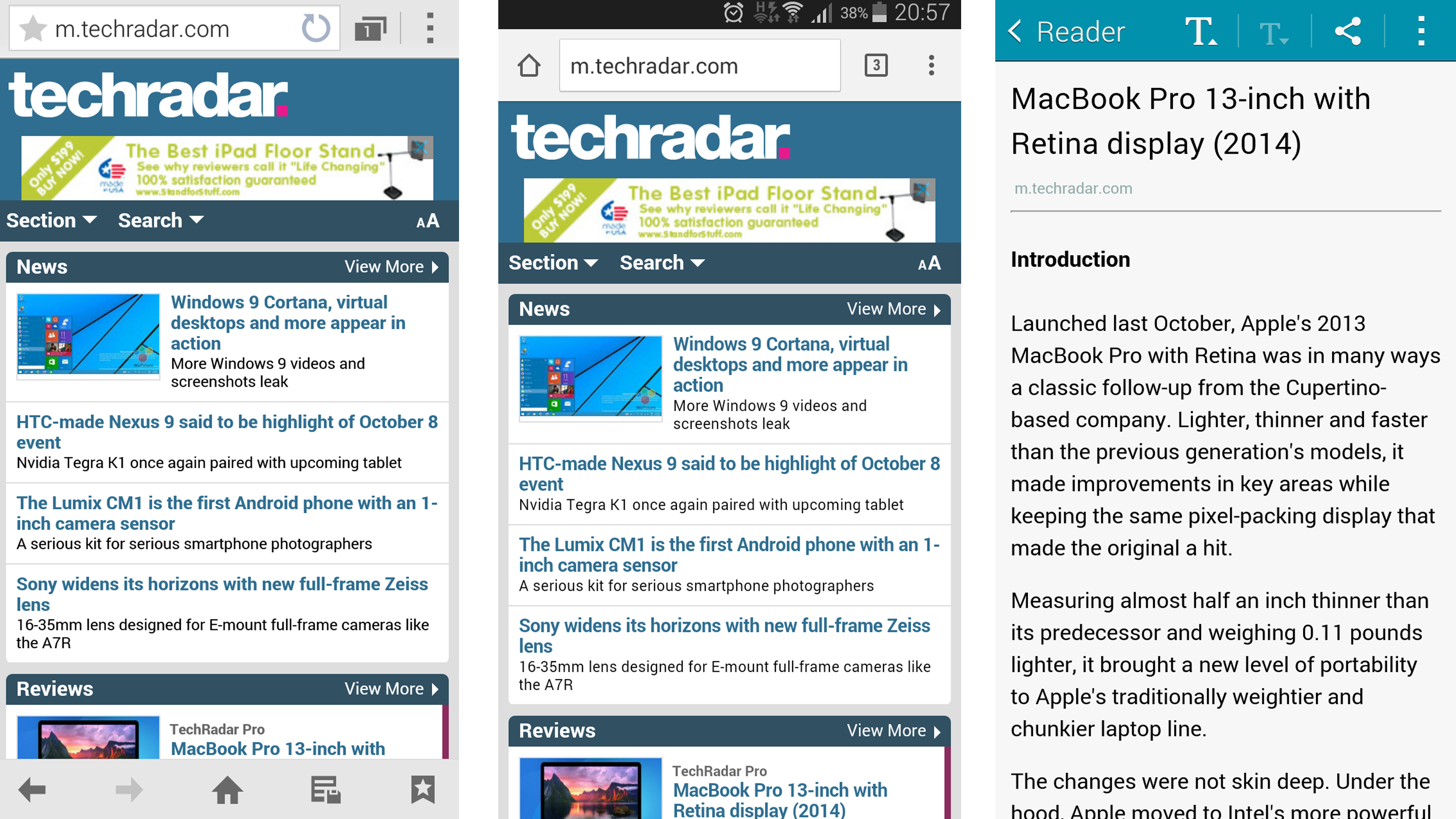
Just like the choice of messaging app, Samsung continues to offer two web browser apps here on the Galaxy Alpha. It's still a decidedly messy state of affairs that you have both Google's Chrome and Samsung's own internet app available here - particularly to those ignorant of the differences.

Of course, Chrome will be the favourite of most for its unbeatable ability to sync up with the popular Chrome desktop browser. Having said that, Samsung's own internet browser isn't bad by any means. In fact, it has a couple of features that Chrome doesn't.
I really like the little magnifying glass effect that appears when you hold and drag on text, making copying and pasting sections of text a doddle. Dare I say it's markedly better than Chrome's fiddly text-selection function? Yes, I think I would.
Samsung's browser also has a Safari-like Reader option that renders desktop-based web sites in nice, simple, mobile-friendly text-only form. These can then be saved for later offline reading. It's not the best implementation of this feature, but at least it's there and it works.
Both browsers are fast, though, and both seem eager to get out of your way and offer a full-screen web browsing experience. I just don't think it's an ideal state of affairs to have them both here at once.
