Why you can trust TechRadar
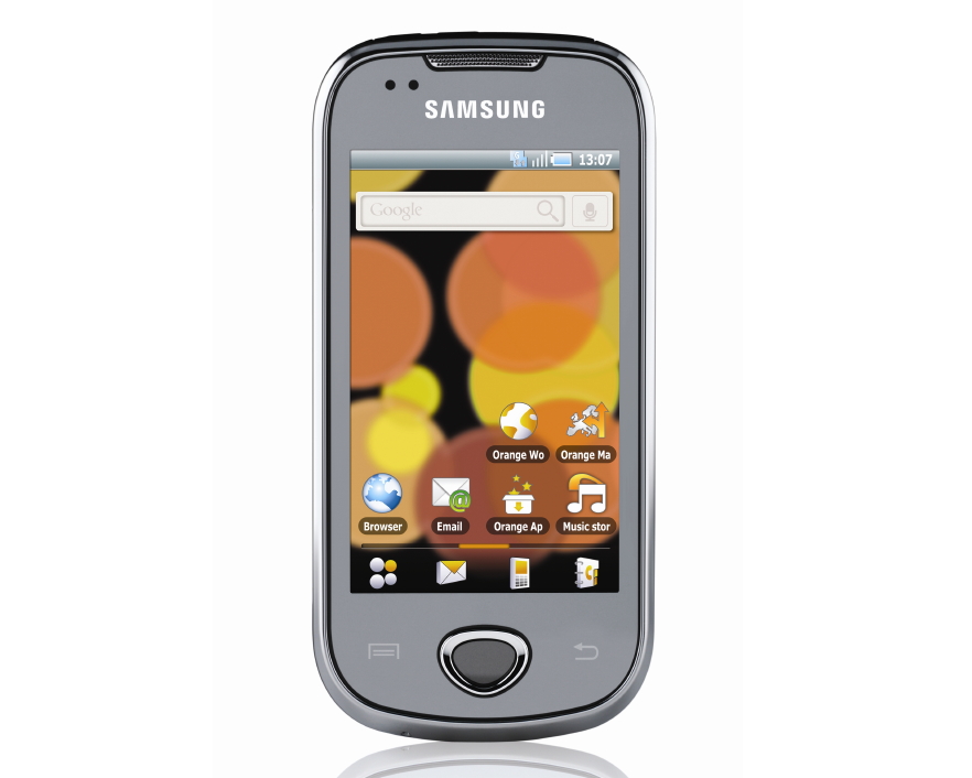
For some bizarre (and no-doubt extremely tense) political reason, the Samsung Galaxy Apollo ships with two entirely separate Android launchers, along with a custom app that lets you switch between the pair of Android skins at will.
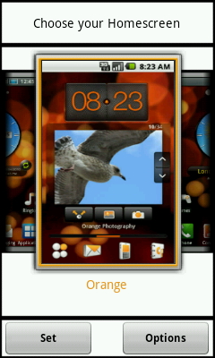
There's the Orange Home screen design, which presents the phone's Android 2.1 OS skinned in a general Orange way complete with some rather clunky widgets, plus there's an alternate Samsung Home screen layout option, which gives users a totally different skin that incorporates many of the TouchWiz 3.0 features that helped win the Samsung Galaxy S its high-scoring review.
This move will surely utterly bewilder Android newcomers, who will find themselves greeted with the option to switch launchers – and the entire look and feel of the phone – each time they navigate from an app back to the phone's Home screen, should they fiddle with the launcher selection tool at any time.
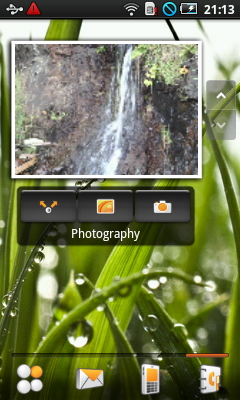
We favour the Samsung OS skin option, which brings across the same icon tray system found in the Galaxy S, also putting four quick launch icons – phone, contacts, messaging and apps – along the bottom of every screen in a convenient and stylish floating dock.
It's much cleaner and brighter than the darker, orange-coloured Orange skin.
The Samsung version of the Apollo's desktop system also gives you seven separate Home screens to place your icons and widgets on, while the Orange one only sports five – two of which arrive pre-filled with massive and rather ugly picture and messaging widgets.
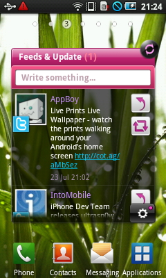
So we'll stick with the Samsung TouchWiz launcher. Its two most impressive features are its extra large widgets, which offer you a social network aggregator in the form of its Feeds & Update toy, which pulls in status updates from (and only from) Twitter, MySpace and Facebook, presenting them all in one unified mega-timeline just like Sony Ericsson's Timescape feature found in the Xperia X10 range.
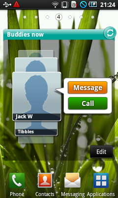
There's also a large "Buddies Now" widget which offers you a visual, flickable interface for quick access to selected contacts.
Sadly these data-hungry apps are a bit of a hindrance to the phone's operation, with the Home screens often crunching up a little when you swipe your way from screen to screen past these complex widgets.
It's a shame, because using the Apollo is usually a pretty glitch- and slowdown-free experience. Bin the few fancy widgets and the phone operates just fine.
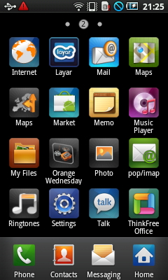
Many of the OS features and widgets are shared across both the Orange and Samsung skins, with the Orange widgets available for installation on the Samsung-themed Home pages and vice versa. You can create your own little mash-up combo of TouchWiz and Orange's Android 2.1 skin if you so wish.
But we can't help but worry about the poor average consumer, though, who's going to be utterly confused about the way his phone comes with two wildly different visual styles.
It seems like a very, very silly way of doing things, but it presumably kept the pen-pushers at Samsung and Orange happy.
Current page: Samsung Galaxy Apollo: Interface
Prev Page Samsung Galaxy Apollo: Overview Next Page Samsung Galaxy Apollo: Calls and messaging