TechRadar Verdict
In an increasingly competitive low-end smartphone field, the Samsung Galaxy Core Prime fails to stand out or excel in any way. It will meet your day-to-day demands, but you can do better for the money.
Pros
- +
Solid build
- +
Low price
- +
Easy to use with one hand
Cons
- -
Cheap faux-metal rim
- -
Screen isn't sharp enough
- -
Camera is poor
Why you can trust TechRadar
Not so long ago, Samsung made itself infamous by flooding the market with cheap and only occasionally cheerful Android smartphones. In a post-Moto G world, however, Samsung has had to raise its low-end game.
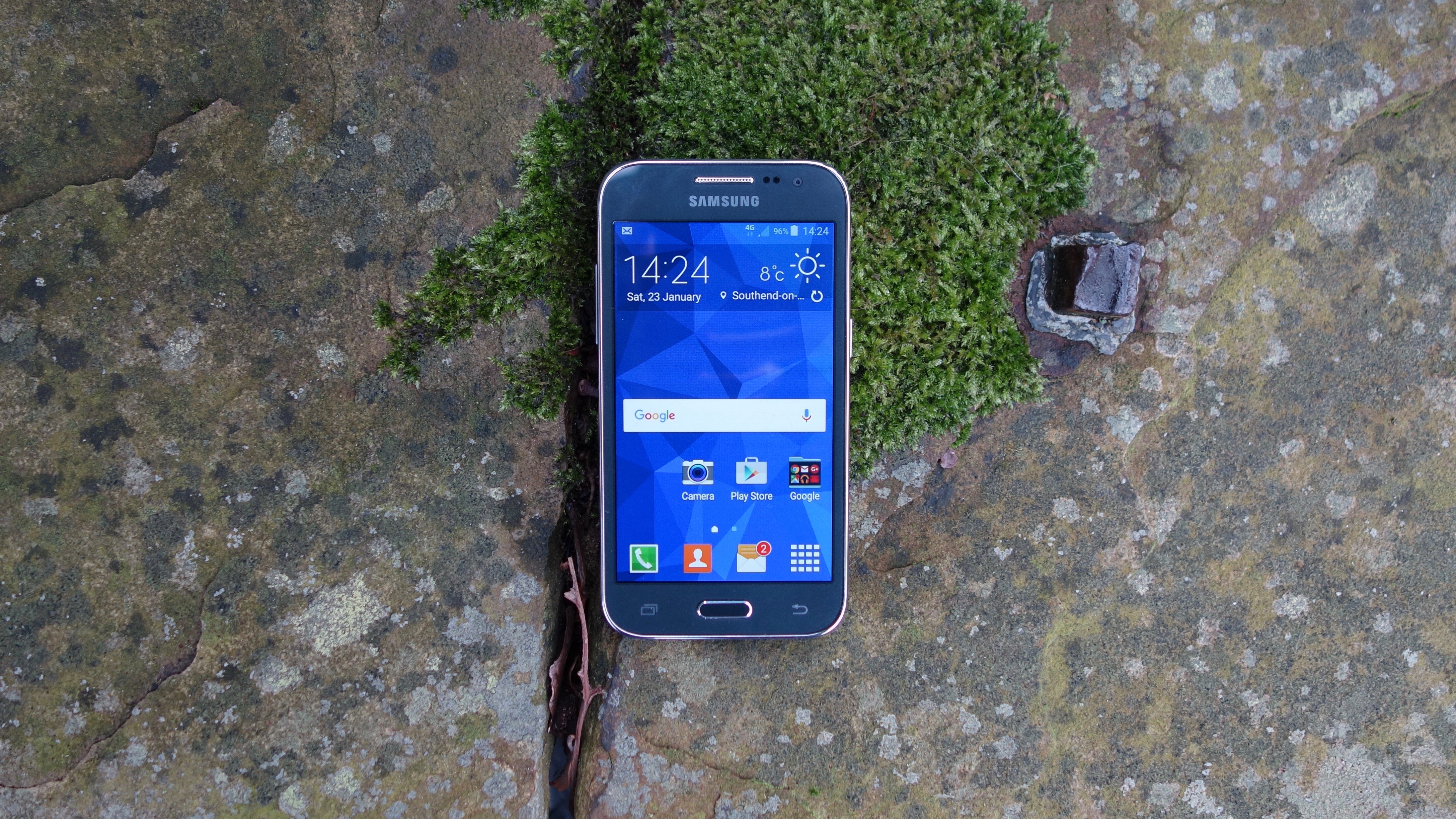
The Samsung Galaxy Core Prime might sound like a Transformer, but it's actually the Korean manufacturer's latest entry-level smartphone champ, with a modest price tag of £110 (US$170) and a competent if unspectacular spec sheet.
But is that enough in a modern market where £250 (US$329) can buy you an outright flagship killer?
I'm not so sure that it is, but there's no denying that the Galaxy Core Prime is a perfectly competent entry point for smartphone newbies and those on a strict budget.
Design
The Samsung Galaxy Core Prime is entirely made of plastic. While Samsung has completely overhauled the top and middle of its range with the sweeping use of metal and glass – just look at the Samsung Galaxy S6 and Samsung Galaxy A5 – such materials remain off limits for the budget brigade.
As Moto G users will no doubt attest, the heavy use of plastic needn't be a bad thing. But Samsung isn't as good as Motorola (or the late Nokia) at playing to the material's strengths. By mimicking the style of its high-end metal phones using cheaper materials, Samsung ensures disappointing results.
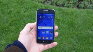
The Galaxy Core Prime uses a version of the design language set out by the Galaxy Alpha back in 2014. Rather than the cool, sculpted aluminium of that phone's straight-edged frame, you get the smooth room-temperature touch of plastic, lacquered with both shiny and matte metal-effect paint. Samsung reckons that it "feels like anodised metal." It doesn't.
From the front and back, the phone is unmistakably Samsung – and not just because of the logos emblazoned on both sides. The company has a well-established series of design cues that mark its handsets out, and all are on display here.
There's the signature lozenge-shaped physical home key, which is still a relative rarity in the Android world, but a welcome focal point for your thumb. As always, this is flanked by capacitive multitasking and back keys.
Around the back of the device you get that familiar centrally-placed and somewhat square camera unit, which bulges out from the body like a blister.
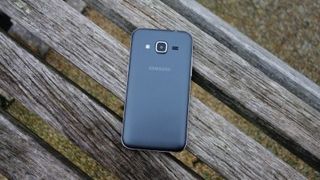
My model was a colour Samsung calls "Charcoal Grey," and it's a nice alternative to the usual black or white options. This colour is applied to both the area surrounding the screen (overlaid by the screen glass) and the subtly textured, matte-yet-shiny rear cover.
The latter can be peeled away to reveal a removable battery, as well as the tightly stacked microSIM and microSD slots.
While it's not a looker, the Samsung Galaxy Core Prime feels solid in the hand. There's a little flex in that flimsy rear cover, but the phone as a whole is reassuringly creak and rattle-free. While that's no longer unique at this low price point, it shouldn't be overlooked or underestimated.
Part of the comfortable hand-feel is down to the Galaxy Core Prime's dimensions. At 8.8mm thick it's not skinny, exactly, but nor is it chunky. It also weighs a pleasing 130g, which is about the weight of an iPhone 6.
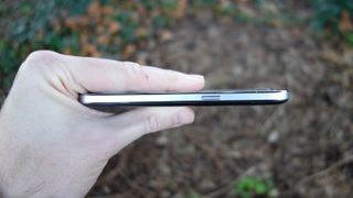
Besides its proportions, the overall balance of the phone can largely be attributed to its 4.5-inch display. Nowadays, that's viewed as a small screen size, but this is a relatively recent view. Cast your mind back to 2011, and you'll find that the Samsung Galaxy S2 (flagship ancestor to the Galaxy S6) came with a "huge" 4.3-inch screen.
The point is, 4.5-inches might be considered below average, but it's still big enough for the majority of tasks, which haven't essentially changed since the first smartphones rolled into shops eight years ago.
One thing this neatly proportioned screen is not is sharp, however. At 800 x 480, we're talking the same resolution as that aforementioned five-year-old Galaxy S2 – and an even lower pixel density of 207ppi at that. With today's HD-optimised web content, browsing the web on the Samsung Galaxy Core Prime shows up some unsightly artifacts and leaves a generally drab impression.
The even cheaper Motorola Moto E comes with a slightly smaller and considerably sharper 4.3-inch 960 x 540 display, so the Galaxy Core Prime's visual failings are hard to overlook.
The Samsung Galaxy Core Prime's display isn't the brightest around, but crank the appropriate setting right up and it's perfectly usable even in broad daylight. Of course, it lacks Samsung's signature Super AMOLED panel technology, but the TFT display gives a reasonable account of colours. Just don't expect your eyes to do any popping.
- Thank you to Carphone Warehouse for providing the review unit
