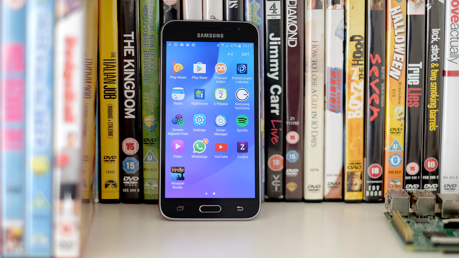
TechRadar Verdict
With a bright screen and slim design the Samsung Galaxy J3 makes a good first impression, but annoyances like a lack of auto brightness hold it back from greatness.
Pros
- +
Affordable
- +
Similar dimensions to an S7
- +
Color-rich screen
Cons
- -
Annoying manual brightness
- -
Not very powerful
- -
Camera worse than best alternatives
Why you can trust TechRadar
Not every phone can be the Samsung Galaxy S7. For one thing, not everyone can afford a Galaxy S7 – but for a while Samsung went dark on budget phones, to the disappointment of fans of the brand who lacked capacious wallets.
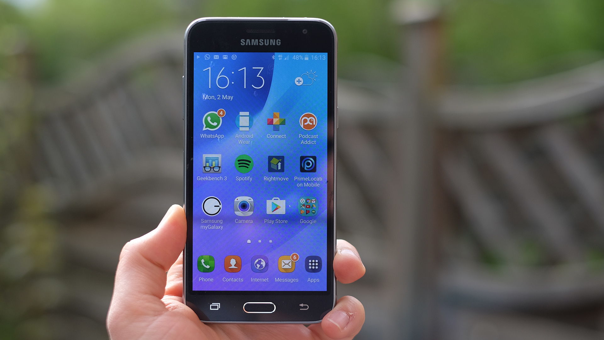
Weight: 138g
Dimensions: 142.3 x 71 x 7.9mm
OS: Android 5.1.1
Screen size: 5-inch
Resolution: 720 x 1280
CPU: 1.5GHz quad-core
RAM: 1.5GB
Storage: 8/16GB
Battery: 2,600mAh
Rear camera: 8MP
Front camera: 5MP
However, it's fired out loads of cheapies and mid-rangers over the last year or so – and its latest effort in this department, the Samsung Galaxy J3, is roughly what you'd get if you took the Moto G4 and injected it with a good shot of Galaxy S7 DNA.
But, while that sounds promising, in reality the Galaxy J3 misses out on a couple of near-essential basic features, making it a worse buy than some of the usual-suspect budget picks – it doesn't unseat the Motorola Moto G4, and the Oppo F1 is superior too.
Samsung Galaxy J3 price
It's worth considering how big an issue those niggles are for you, though, as at just £149 ($199, AU$260) the J3's price is pretty keen for a Samsung.
You do need to be doubly careful about which model you buy though, as there are several differently-specced versions of the Samsung Galaxy J3 floating about across the world, some with worse cameras than others; we're reviewing the UK version.

Design
- Familiar Samsung style in a plastic body
- Removable battery
A few years ago even Samsung's top-end phones were plastic. Remember the Samsung Galaxy S5? Great phone, dodgy styling.
The Samsung Galaxy J3 looks quite a lot like the latest Samsung flagships, but the feel is more like that of the old guard. It's an all-plastic phone aside from the glass used on the front, and the central select button, which is metal.
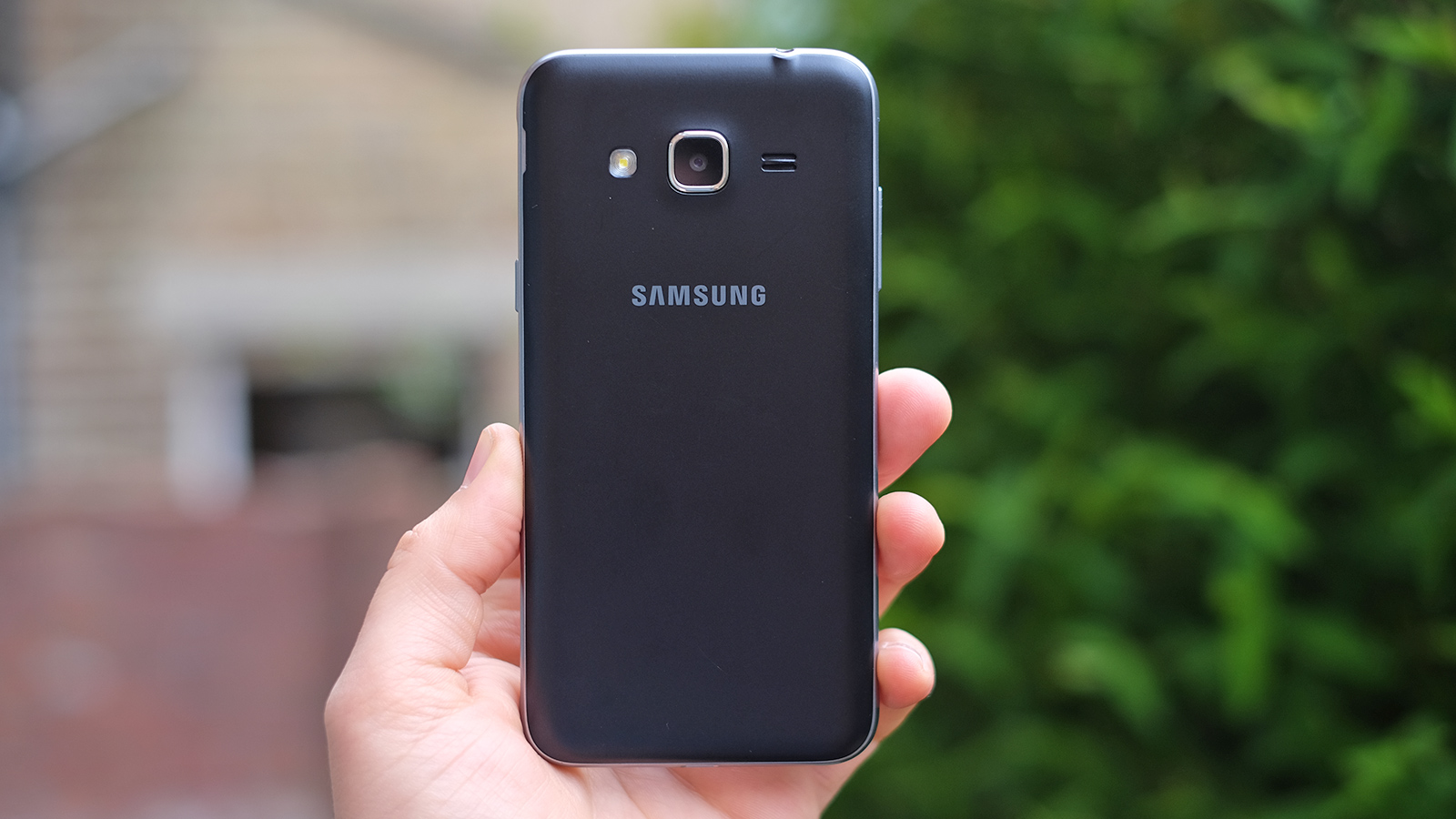
This is no surprise given that the phone is super-affordable, but there's that hint of classic Samsung deception involved, with the sides of the Samsung Galaxy J3 intended to look like fancy frosted aluminum.
Friends will probably assume it's just 'the latest Samsung' at first glance, though, thanks to the unmistakeable button layout below the screen. It's not Apple-grade iconic, but you'd be surprised at how recognisable this configuration is, even among people who aren't obsessed with tech.
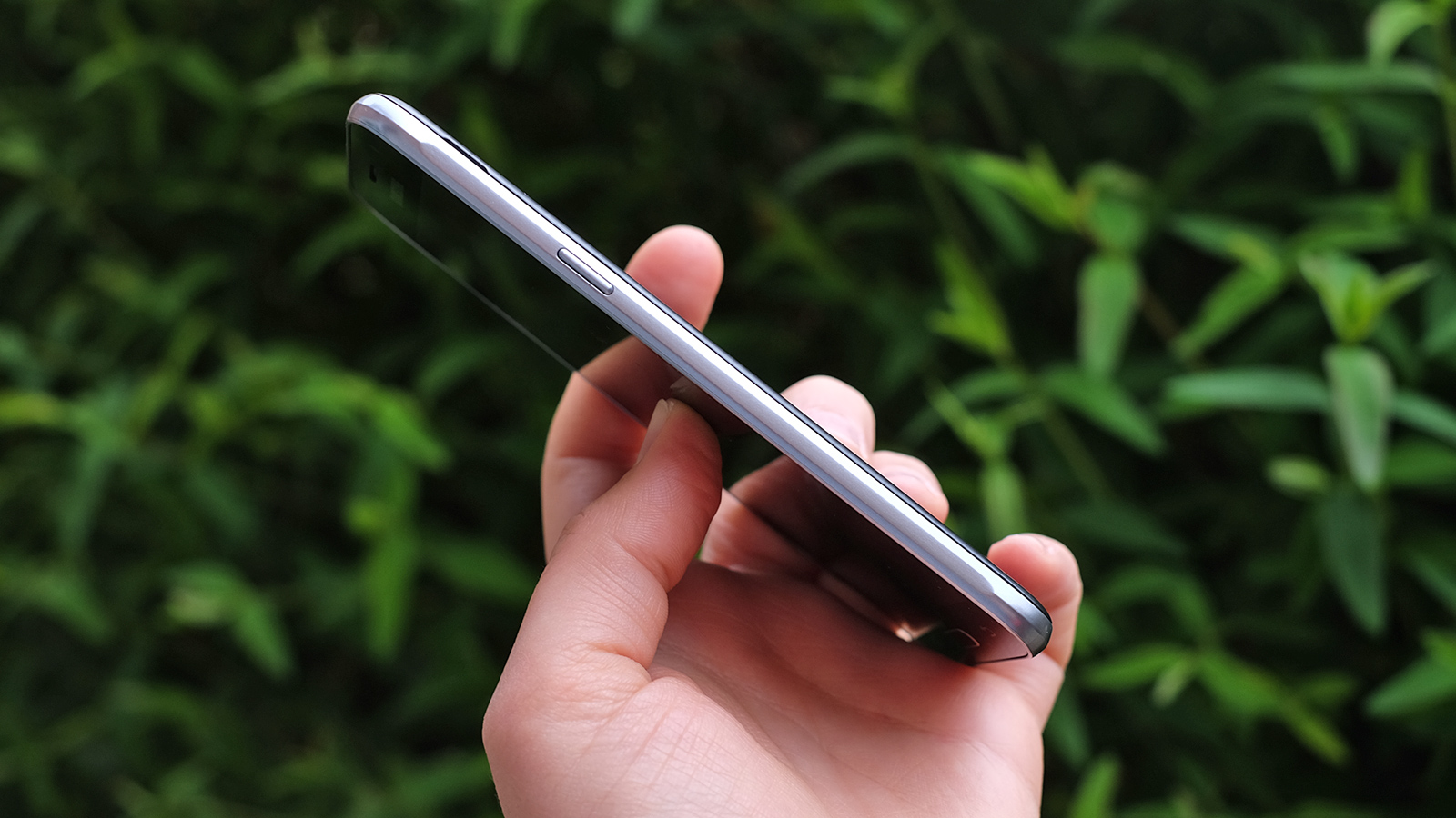
Aside from the cheaper plastic feel, the Samsung Galaxy J3's handling is fairly similar to that of the S7. Cheap phones are no longer smaller than expensive ones by default, and Samsung has done its best to make the J3 look and feel like the S7's cheaper brother.
Like that phone it's 7.9mm thick, and its footprint is just a couple of millimeters longer.
It's a clever bit of design: while the J3 has thicker bezels and a less taut design, those are offset by the ever-so-slightly smaller screen. This phone has a 5-inch display, the S7 a 5.1-inch one.
The comparison only holds up on the surface, though, and the construction of the two phones is totally different. The Galaxy J3 has a peel-off plastic battery cover, hiding the removable battery, the microSIM slot and the microSD slot.
One thing to note here is the SIM size – the J3 uses the larger micro standard, not the nano one common in mid-range and high-end mobiles.
The more you look at and feel the Galaxy J3, the more it seems like a standard budget phone. However, the split-second impression it leaves is of being a lot like the Galaxy S7: good work Samsung.
- Thanks to MobileFun for providing our J3 review unit!
Andrew is a freelance journalist and has been writing and editing for some of the UK's top tech and lifestyle publications including TrustedReviews, Stuff, T3, TechRadar, Lifehacker and others.
