Why you can trust TechRadar
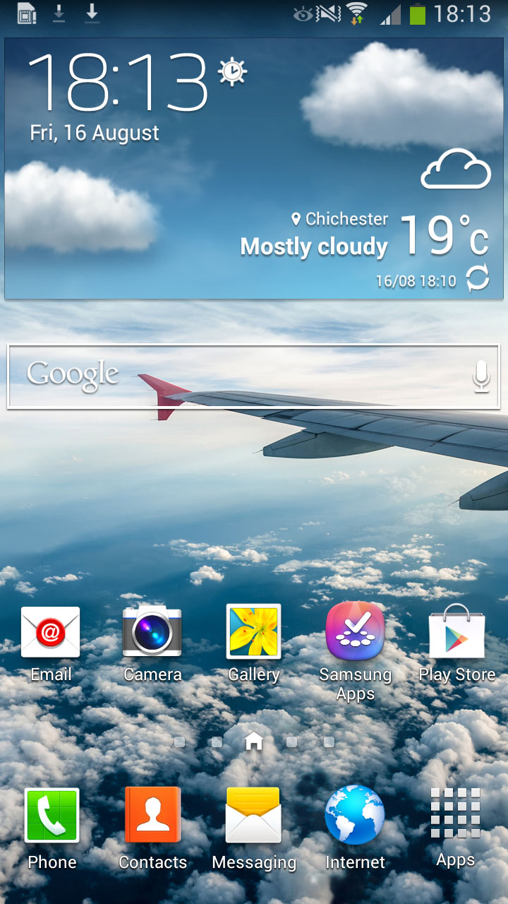
Being a Samsung Android device (4.2.2 Jelly Bean to be exact), you would be right in expecting the Galaxy Mega to come equipped with the latest version of TouchWiz, one that graces Samsung's flagship Galaxy S4 handset.
Previous users of Samsung devices will immediately feel at home, with the Korean firm making subtle changes with each iteration. In its current guise, TouchWiz is one of the best custom UI's out there, being both intuitive and easy to use.
Hardware wise, the Galaxy Mega's 1.5GB RAM and dual-core 1.7GHz processor manages to keep things chugging along relatively smartly, with no real hint of slow-down under normal use. Pushing things to the limit (updating apps, playing music and web browsing) puts an understandable strain on things.
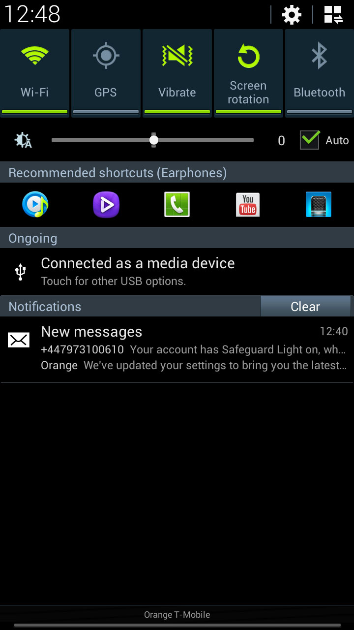
Starting from the top, the Notifications bar has had a lick of paint, although keeps access to quick settings, and a little icon for access to a wider range of quick settings, and the full settings menu.
Quick toggles to turn off settings such Wi-Fi or Bluetooth is something that we have long been fans of.
There is also a customisable Auto-brightness feature, which allows you to turn it on and off, as well as decide how bright you want the screen to be whilst on auto.
The Jelly Bean notifications, being expandable and dismiss-able, are also a bonus. The top notification expands to show you more information, such as multiple messages from WhatsApp, or the ability to archive via Gmail .
Swiping to the left or the right also allows you to remove the notification from view, meaning that you don't have that text or email sat there bugging you all day. Voicemail messages, as ever, are still sat there until you call them.
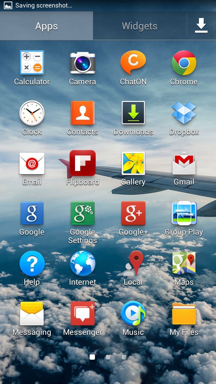
The app drawer has also had some attention paid to it. Swiping left and right moves you between pages, with apps able to be viewed in a customisable grid, alphabetical grid, or alphabetical list.
Pinch to zoom even works, allowing you to see an overview of your app drawer in the same way that you can see an overview of your home screens.
Apps can also be hidden, which helps tidy up your drawer, especially if there are apps that you can't uninstall, but you don't want around. Folder creation is also possible, meaning that your app drawer can be tidied even further.
Folder creation on the home screens (of which there are 7) is not as smooth as on the iPhone 5 and other iOS devices, with folders having to be created manually via the Menu key or a long press on an empty space.
The seven home screens are a blessing, should you be someone that enjoys using the many widgets that Android and Samsung has to offer. When it comes to widgets on the Galaxy Mega, there are many to choose from, all accessed from a separate tab in the app drawer or by long pressing a home screen.
Of the most interesting, are the assistive light (to turn your LED flash into a torch), and the clock. Just about every UI comes with a custom clock, and Samsung's is clean and effective.
The lock screen has also had a brief lick of paint, with it being possible to put widgets on the lock screen. We can see why this can be useful, however manually sliding to the left or right meant that it was just as easy to unlock the Mega and browse the actual handset. We also found that because you need to swipe across the top of the screen, we were often opening the Galaxy Mega inadvertently.
We also like that connecting a set of earphones to the Galaxy Mega brings up a list of suggestions in the Notifications bar, with the Music and Video players, as well as the Phone, YouTube and Voice recorder app being offered.
Multi-Window is also available on the Galaxy Mega, something that helps make use of the bigger screen on offer. Dragging apps off the multi-window bar and to the top or bottom of the screen allow you to view two separate apps at once. As a feature, we don't see it being used all the time, but did make multitasking that little bit easier.
The settings menu also looks slightly different, with the list being broken down into Connections, My Device, Accounts and More tabs.
There are a variety of useful features available if you look hard enough, with it possible to increase ringtone volume whilst the Galaxy Mega is in your pocket, for instance, or one handed mode that makes certain features - like the dialler and calculator- easier to use one handed.
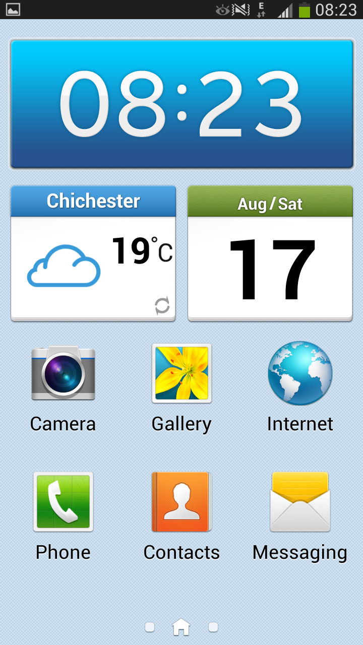
There is also a different home screen mode available, to make the Galaxy Mega easier to use for first time smartphone users. This makes the Mega a lot easier to use, with big icons to access the Camera, Gallery, Internet, Phone, Contacts and Messaging apps, with the rest of the apps accessed by the right hand home screen, and important contacts via the left hand screen.
Easy mode also provides a minor touch up to the Camera and Internet apps, giving them larger icons.
As Samsung billed the Galaxy Mega as the 'perfect device for students' at the launch, we don't see this mode being used all that often. That said, couple Easy mode with the massive screen, and smartphones suddenly seem a lot more appealing to an elderly market.
Overall, we are still very impressed with Samsung's TouchWiz UI. The Galaxy Mega handled pretty much everything we threw at it with aplomb. TouchWiz is still attractive and will appeal to both the newest smartphone users, as well as those that have used smartphones and Samsung devices before.
