Why you can trust TechRadar
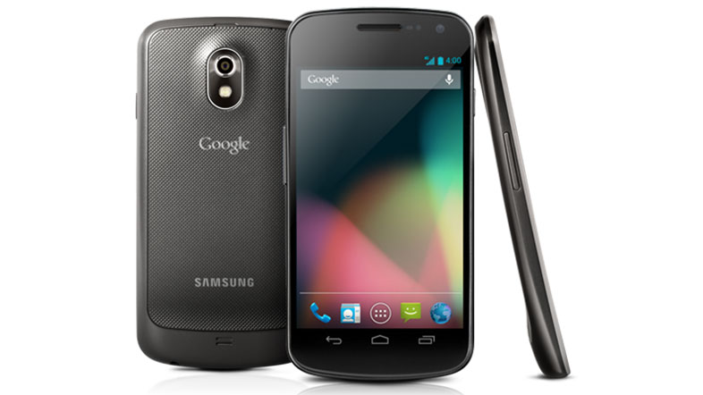
When the Samsung Galaxy Nexus launched with Android 4.0 it was one of the slickest phones around. With Android 4.1 it just got even better. Time moves fast in the smartphone world but the Samsung Galaxy Nexus is still leaving most phones to play catch-up.
The biggest change (and the first thing you'll notice coming from most other handsets), isn't one of the new features or options, but just how smooth it all feels.
Previously, despite in some cases being a lot more powerful on paper, Android handsets just didn't feel as slick and responsive to use as an iPhone. Even without comparing them to Apple's devices it was often noticeable that things just wouldn't happen quite as fast as you'd like. Homescreens would stick, scrolling would cause judder, boot up times would be long and web pages would lag.
For Samsung Galaxy Nexus owners that's all a thing of the past. Thanks to a host of under-the-hood changes collectively known as "Project Butter", Jelly Bean (and by extension the Galaxy Nexus), is just as smooth and slick as iOS, removing one of the major complaints people have about Android.
It boots faster, scrolling and multi-tasking are handled effortlessly, web pages load quickly, there's not a hint of slow down and it all just feels incredibly responsive.
Lockscreen
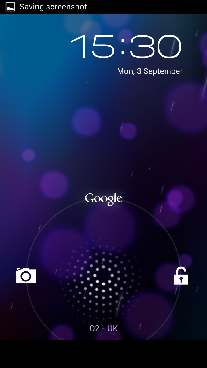
At first glance the lockscreen looks much the same as it did before the update to Android 4.1. You can slide the lock icon left to launch the camera or right to unlock the phone, but now you can also slide upwards to launch a new feature called 'Google Now'.
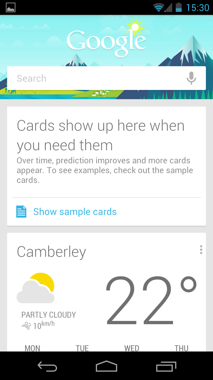
This brings up a Google search box and below it a series of tiles. These tiles serve a variety of functions- one tells you the weather at your current location, another has details of nearby public transport, there's one for upcoming calendar events, one for traffic updates and more.
What makes it more than just a series of widgets though is that it only shows you tiles when it thinks you need them. For example it only shows calendar events if they're happening soon. If you've got a meeting or other location you need to head to in your calendar then it will also show public transport or travel information to get you there.
It gets smarter as you use it more, becoming able to more accurately predict what information will be useful to you and when, though you can also go into the settings and customize the situations under which you want a tile to appear. For example you can tell it to display train information whenever you're close to a station.
It's a great idea, a bit like Siri but without having to even ask it to do things most of the time, as it just predicts what you want. It also avoids the potential embarrassment of talking to your phone (or having your phone talk back).
What it does is done reasonably well, but it doesn't do enough. There are only a handful of different tiles for it right now and some of them won't be much use to a lot of people. If Google keep developing this then a year or two down the line it could be something really special. Right now it's a neat feature, but far from essential.
Oddly, Google Now breaks totally from the dark, moody colour scheme of Android and is instead bright, colourful and cheerful. It looks good, but it's a bit of a jarring change.
Homescreen
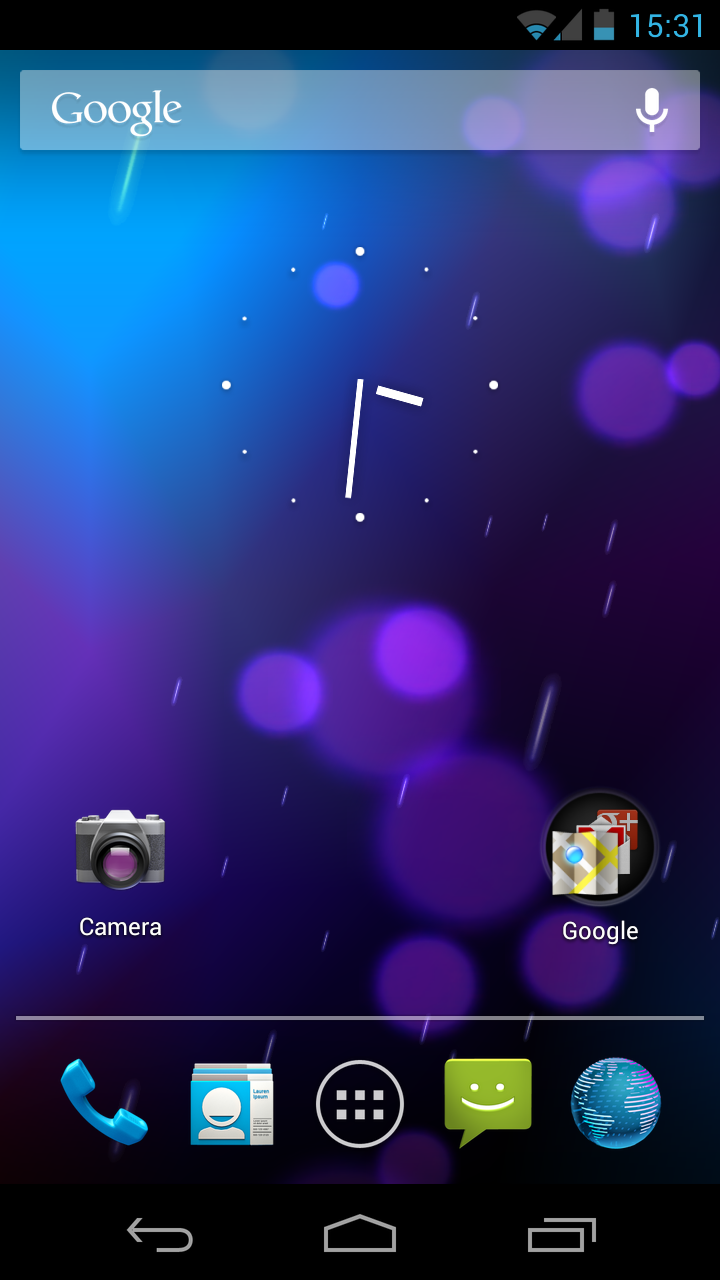
Embracing Android 4.0 (and now 4.1) wholeheartedly, there are no buttons on the front of the Samsung Galaxy Nexus. Zilch. Nada.
Three soft keys are provided within the OS at the bottom of the screen: back, home and multitasking. The beauty here is that when they're not needed, the OS disposes of them and gives you more screen space to enjoy your pleasures.
Icons have been refreshed and look sharper and clearer too... overall, along with the general slickness, it's a much more polished experience to take on the gloss of Windows Phone and iOS.
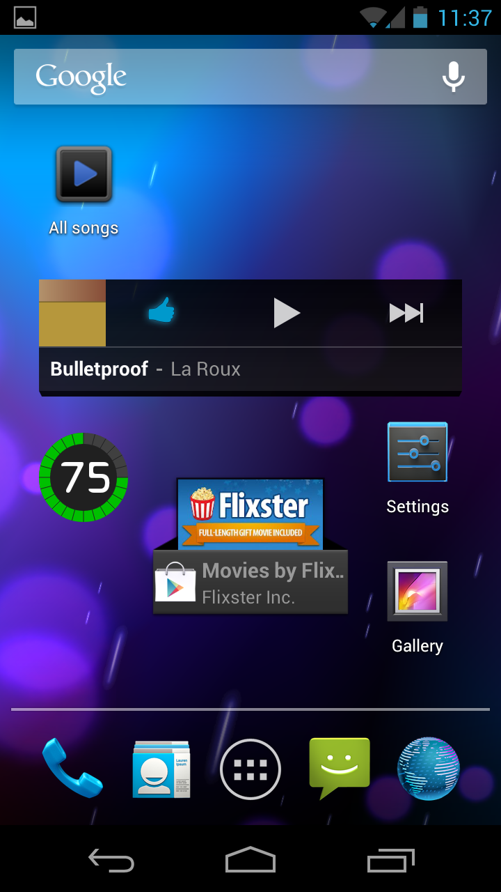
The Galaxy Nexus ships with several new live wallpapers and all look very futuristic. You can see that the whole design here is more Honeycomb than Gingerbread. It's dark and moody but also very aesthetically pleasing.
Homescreens are limited to five and without replacing the stock Android launcher with one from Google Play there is no option to extend this. We'd have hoped for at least seven which is now the standard across Android. We also found we missed the options shortcut button.
On previous Android iterations, you would long press the homescreen and be given shortcuts to actions like changing wallpapers, adding widgets and adding shortcuts.
Now long pressing a homescreen only gives the option to change the wallpaper, while everything else requires delving into the settings or applications menu and going the long way round which feels like a backwards step. Also, the ability to pinch in to show an overview of all homescreens appears to have been taken away.
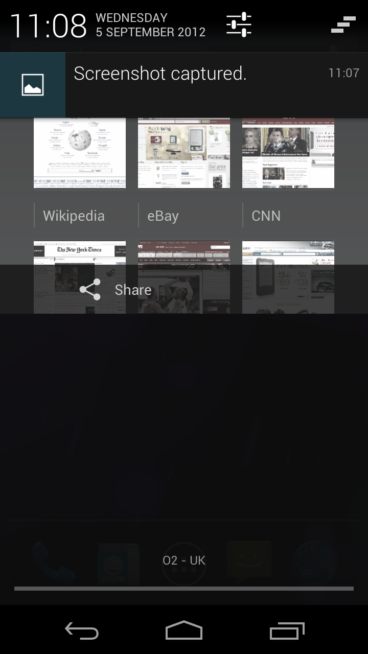
Speaking of settings, you now access that section through the notifications bar which, thankfully, Google has kept. It's been heavily redesigned though. It is now semi-transparent and the date, day and time are displayed prominently in the top left corner.
Notifications are bigger, with emails displaying the first couple of sentences so you can preview them before opening, while pictures of your friends are displayed when they message you. There's a call back button next to missed calls, speeding up the process of returning the call, and calendar events can be acted on from the notifications screen, for example alarms can be snoozed.
With all these extra features you might imagine that the screen could get quite clogged up, but a simple swipe will get rid of any unwanted notifications, while swiping up across a notification with two fingers will collapse it down to a single row. It's also now possible through the application settings screen to tell specific apps not to send notifications.
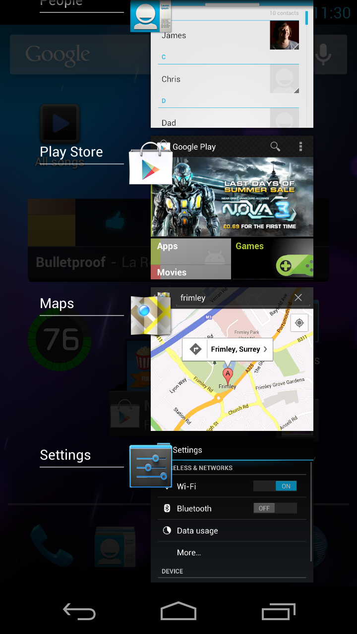
This all serves to make the notifications screen a lot more useful and we can't wait till this is rolled out on more devices.
Swiping up over the home button from any screen will launch Google Now, giving you immediate access to what might one day be a powerful feature, but which for now, for most people, is only mildly useful.
Multitasking is easily taken care of with the on-screen shortcut key. It brings up a list of cards for you to swipe through with page impressions of each app. To close one, it's a simple matter of swiping it to the side. It's yet another feature that helps give Android the slickness and intuitiveness of iOS without losing its flexibility.
App Drawer and Widgets
The app drawer looks similar to what we had before with a grid system offering four columns and five rows, and it's accessed from an icon in the centre of the dock at the bottom of your homescreen.
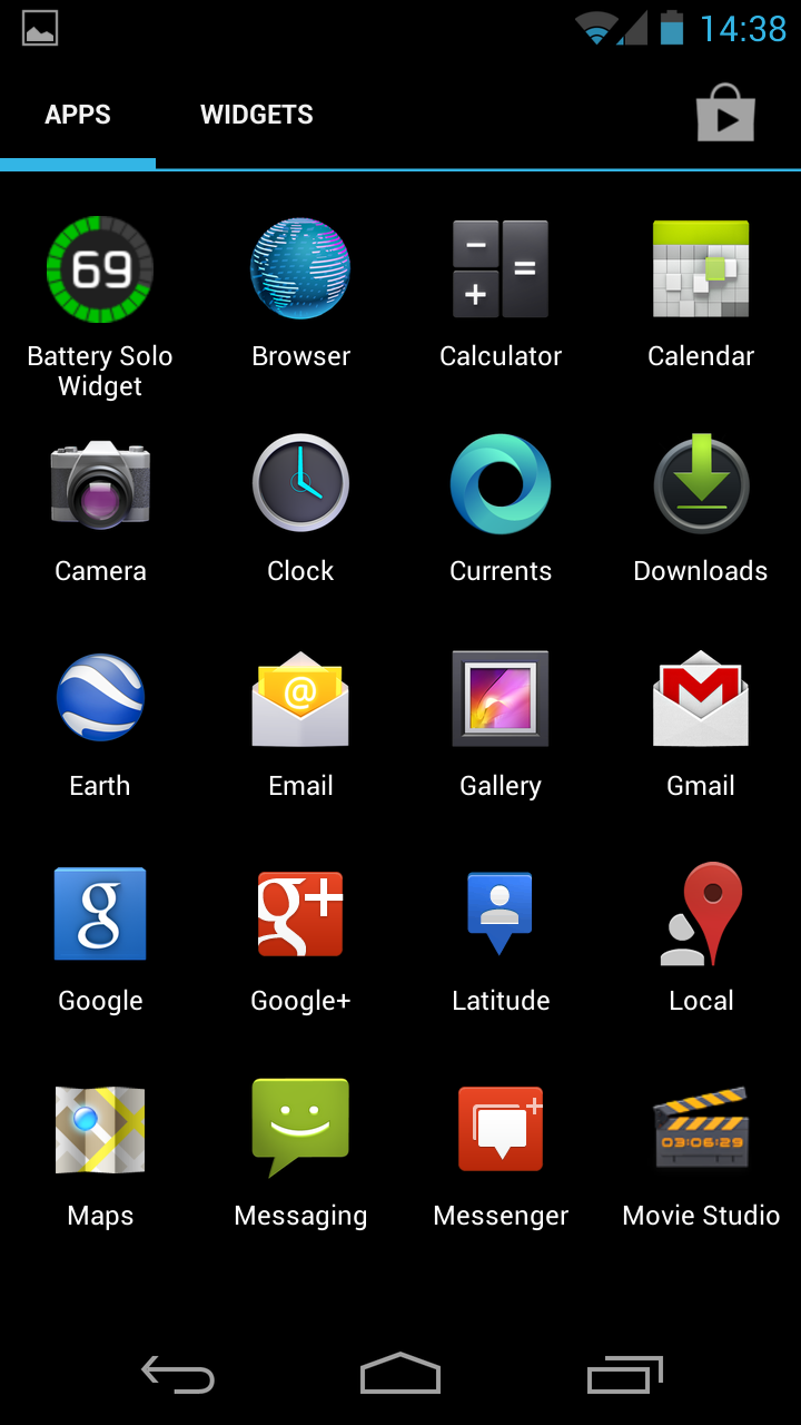
Users coming from Android 2.3 or below will find a few changes though. You no longer scroll down through your apps but across and then get your apps shooting at you from behind in an odd animation, which feels a little in your face.
There are tabs within the app drawer – Apps, Widgets and Google Play. The Google Play tab simply launches Google Play. The Widgets tab is a godsend for Android users – allowing you to preview all of your widgets here and then just select which you want to install on your homescreen.
It saves so much time compared to the old way where you'd have to plonk each individually on the screen just to see what it looked like. Widgets can be resized on your homescreen, though this is only applicable to certain ones – unlike some third party launchers which allow you to resize anywidget.
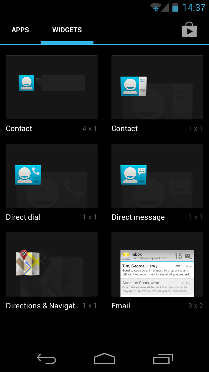
When placing a widget other icons and widgets will move around it to clear space, and supported widgets will even automatically re-size themselves if there isn't enough space for them. It really makes the once clunky placement of widgets enormously easy and other than allowing all widgets to be re-sized we can't think of a way to improve it.
You can also create folders of apps in categories in the same way iOS users can although it's not as efficient. There doesn't seem to be a way to do it within the app drawer because holding down on an app icon just brings it to the homescreen ready for a shortcut (as Android always has done.)
On previous handsets (e.g. the Samsung Galaxy S2), users could hit the options button to bring up an edit menu and create folders that way but of course, that option button has bitten the digital dust.
The upshot of it is that you can create folders but only on the home screens and not within the app drawer. Once you've mastered that skill, then creating folders is as easy as pie - but it can take a little getting used to.
James is a freelance phones, tablets and wearables writer and sub-editor at TechRadar. He has a love for everything ‘smart’, from watches to lights, and can often be found arguing with AI assistants or drowning in the latest apps. James also contributes to 3G.co.uk, 4G.co.uk and 5G.co.uk and has written for T3, Digital Camera World, Clarity Media and others, with work on the web, in print and on TV.
