Why you can trust TechRadar
Contacts
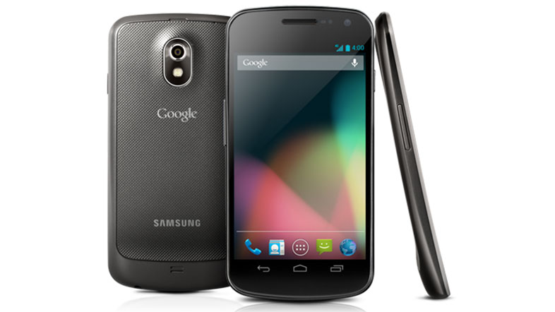
Like the rest of the UI, Contacts was rewritten for Android 4.0 when the Samsung Galaxy Nexus launched and it's seemingly been left alone for the latest update to Android 4.1.
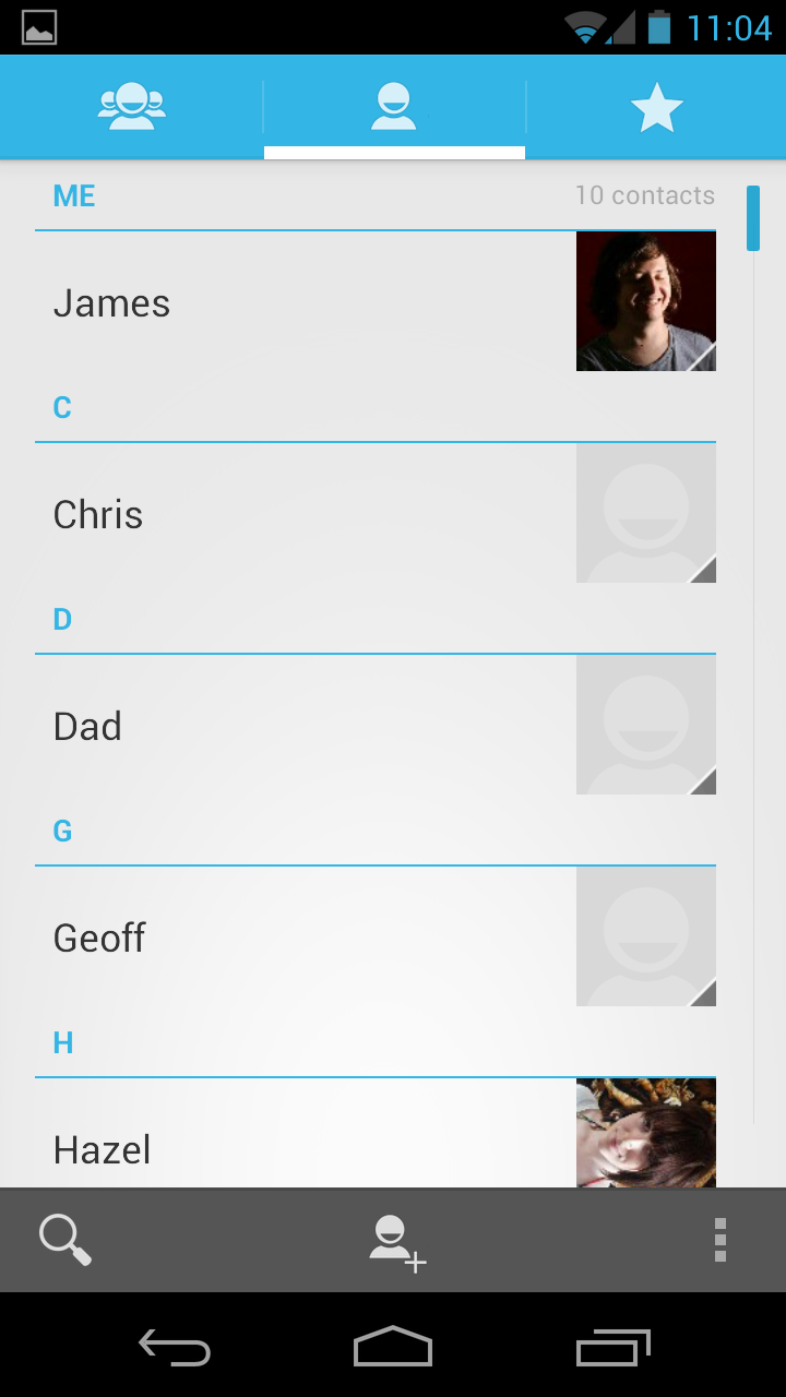
No matter, we're still massive fans of the Ice Cream Sandwich look. The older one was looking really dated and the black colour scheme was hardly imaginative. The new People app is light (white and blue) and feels so much more elegant.
Names are presented in alphabetical order with photos on the right hand side. Up top, shortcuts let you navigate to favourites and groups whilst down below you can search or add contacts with just one tap. It's all very straightforward.
One of the things we love about it is that each contact card, when opened, now has a fairly large picture in it. And when you actually phone them, the Galaxy Nexus gives you (almost) full screen caller photos.
However, the phone also places a band across the top with their details which means that some of your contacts may appear to have their heads chopped off.
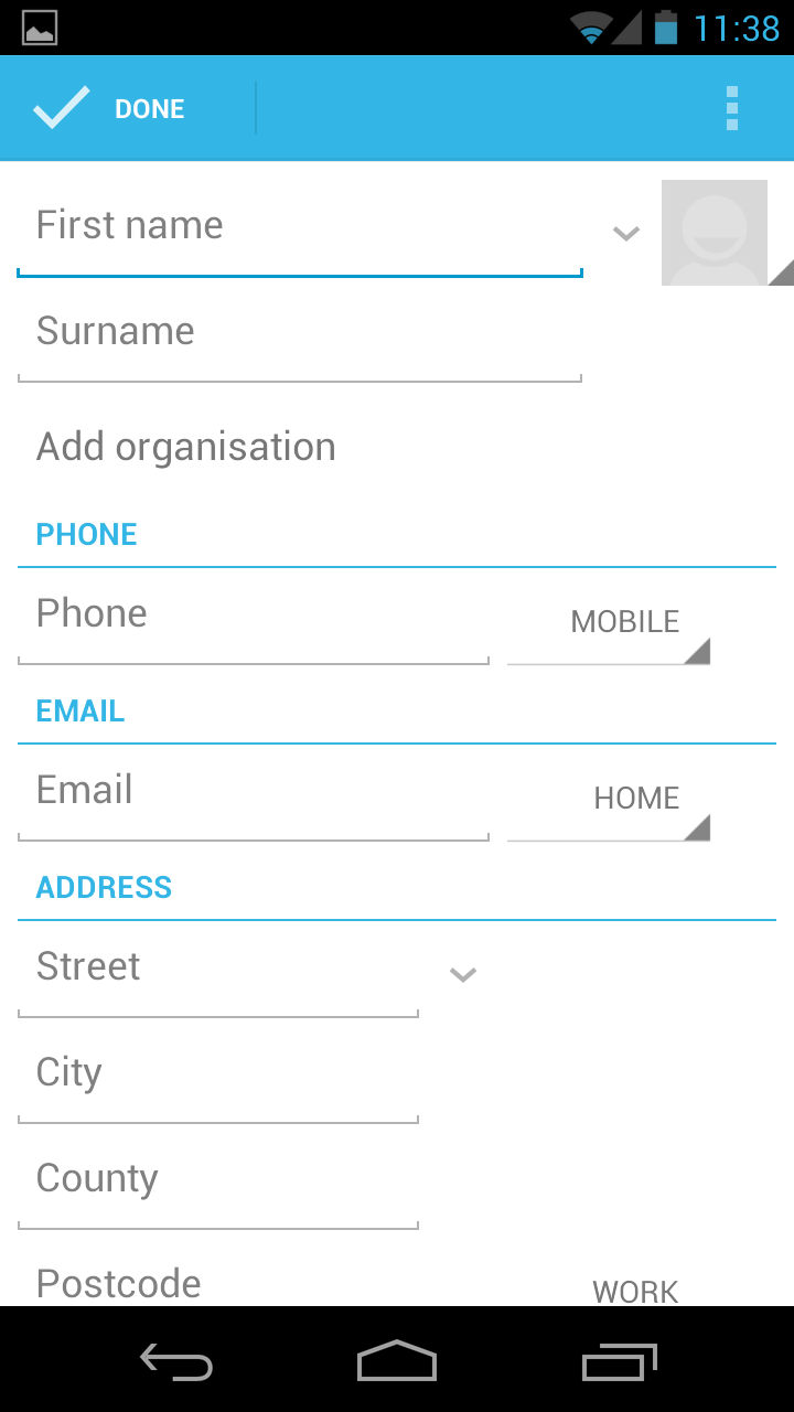
Contacts themselves are synchronised with Google in the cloud as they always have been and there is ample room for any information or field you'd care to chuck in its direction. They're accessed through the phone book or dedicated People shortcuts that you can easily place on the homescreens.
Getting into the contacts app is as simple as tapping the contacts button which is, by default, placed on the dock at the bottom of the homescreens.
Unfortunately, Google has missed a trick here as it doesn't seem to have been too keen on implementing a proper social networking solution.
We hoped to find some kind of automatic Facebook integration, for example, but none was forthcoming other than Google Talk. This is an area HTC has got spot on with its Sense handsets and others could benefit learning from.
Yes, we know this is a vanilla phone and the Galaxy Nexus is "pure Google" – we get that. But it would be nice if "pure Google" supported social networking integration.
Call history is brought up by going into the phone app – again, provided on the dock at the bottom of the screen. It's pretty much what you'd expect and displays outgoing and incoming calls in a nice list with pictures.
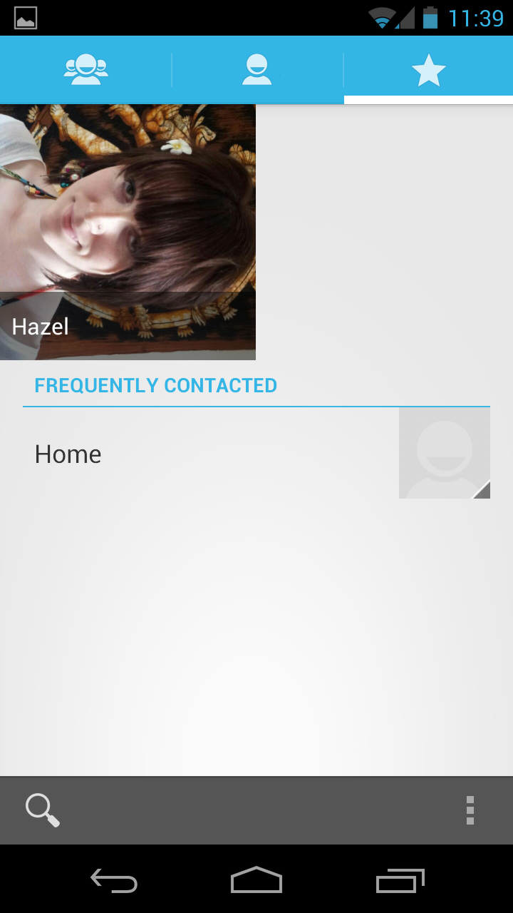
There is a tab here to bring your favourites up too and when you click on it, you'll definitely know about it.
That's because it displays them by large thumbnails – and we mean large (four to a screen.) Looks great if your pictures are high-res but low resolution images can end up looking pretty terrible.
Calling
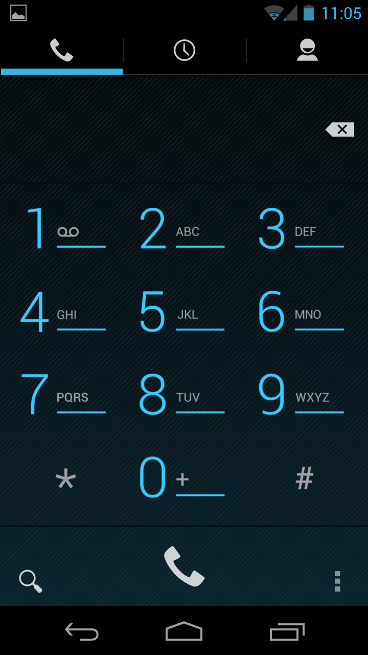
Making calls is a real pleasure. The phone-pad looks amazing in electric blue and really fits well with the Jelly Bean colour scheme.
Call quality is top notch too. There's no option to turn any noise-reduction settings on or off but frankly, they're not needed anyway as our signal quality was flawless as was the quality on both our end and other callers'.
One neat UI element is that when you get a call, you now have a button that you drag onto the relevant option: so you drag it on to answer, text or ignore the caller. Nice touch.
The speakerphone is also incredibly loud and clear. In fact, you don't even need it on. We found that with the volume turned up, we could hear voices pretty clearly blaring through the earpiece from a good distance.
When in the phone app, you can search for numbers by tapping the magnifying glass at the bottom. We expected to see some kind of smart dialling which was notable by its absence when we started tapping out numbers on the phone-pad, but it's not a big deal since there are so many other options in Android to get to your person of choice, as we've detailed above.
James is a freelance phones, tablets and wearables writer and sub-editor at TechRadar. He has a love for everything ‘smart’, from watches to lights, and can often be found arguing with AI assistants or drowning in the latest apps. James also contributes to 3G.co.uk, 4G.co.uk and 5G.co.uk and has written for T3, Digital Camera World, Clarity Media and others, with work on the web, in print and on TV.
