Why you can trust TechRadar
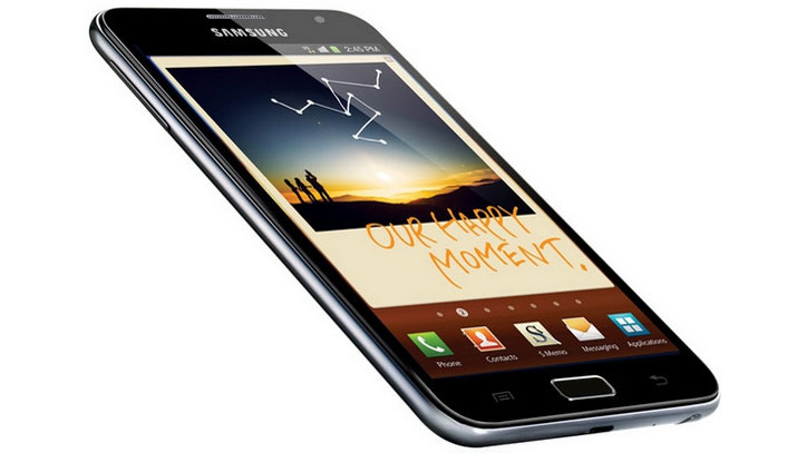
The Samsung Galaxy Note now runs Android Ice Cream Sandwich 4.0.4 out of the box, rather than Gingerbread 2.3.5.
TouchWiz is still there, heavily overlaid over the ICS experience.
It's a bit of a 'Marmite' affair. We're fans of the skin, which is what sets the Galaxy line out from other Android models, but we know others who despise it with a passion.
The thing is, if you're buying the Samsung Galaxy Note to use its S-Pen features, you'll pretty much have to stick with Samsung's software unless you're one of those who knows how to root and tinker (not for the luddites.)
The Ice Cream Sandwich cool blue colour theme has been replaced with Samsung's preferred green, and the snazzy Roboto font is also hidden here.
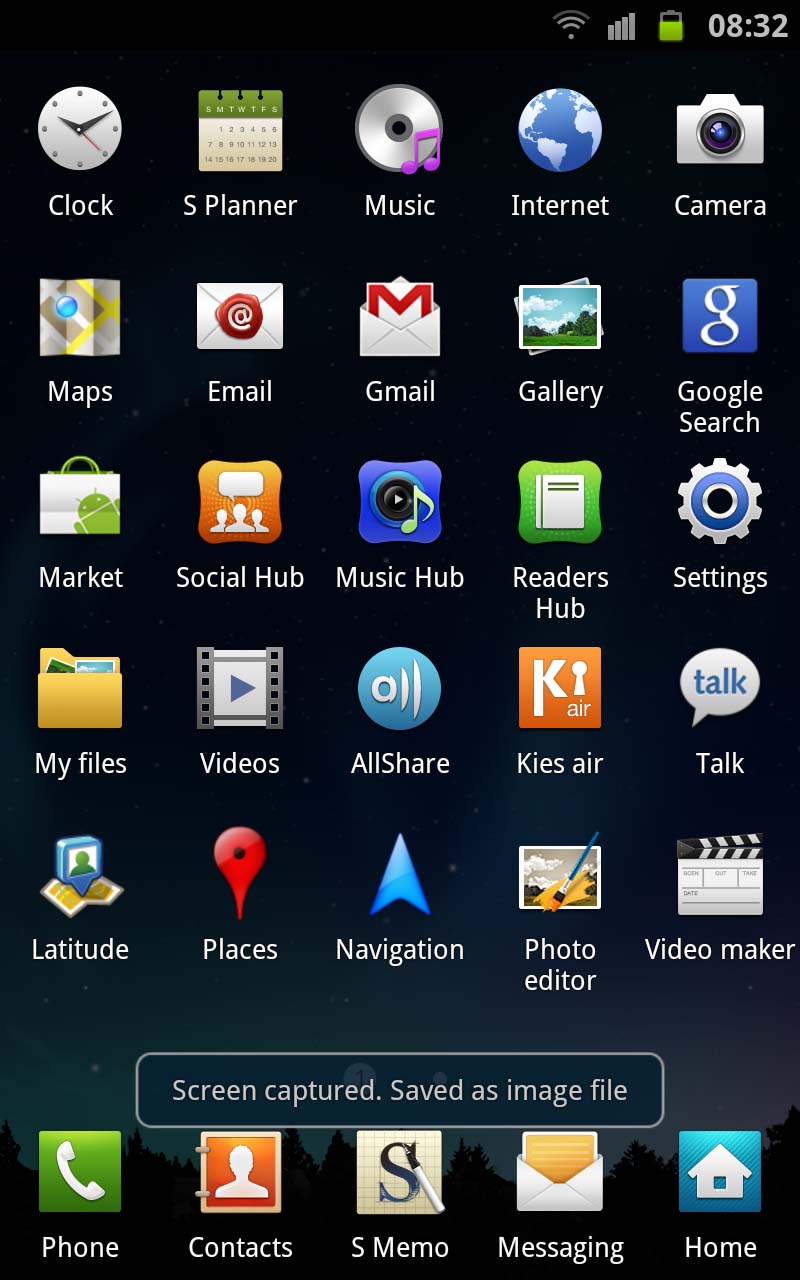
To take advantage of the extra screen real estate, there are now five icons to a row, rather than four.
You'll also find a little blue glow when you scroll to the top or bottom of a menu.
Sign up for breaking news, reviews, opinion, top tech deals, and more.
Plus, there are a couple of new live wallpapers and, when adding widgets, you now go back to the beginning of the list when you reach the end, rather than just not being able to go any further.
One of the things Samsung has sadly removed on Android 4.0.4 is the ability to preview widgets.
So, where on proper ICS you'd get the chance to swipe through the app drawer and see what widgets would look like before you committed them to a home screen (one of the nice selling points of ICS), you now have to go through the previous way of adding them, which involves just scrolling through a list on the main screen.
We can't see why Samsung has done this but we think it's a shame. Speaking of which, that list is brought up when you press the menu button and replaces a grid that we previously saw.
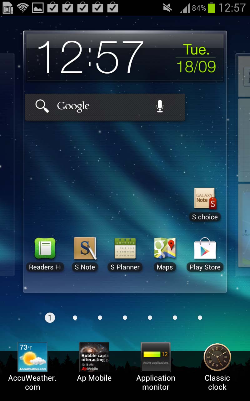
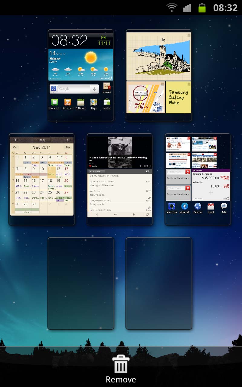
The Samsung Galaxy Note offers the usual multiple Android home screens with the ability to delete or rearrange them but not add any more than seven in total.
You can pinch in to show an overview and navigate to what you want that way, or you can swipe from left to right. Doing so at the bottom of the screen where the page number is displayed will get you between screens even faster.
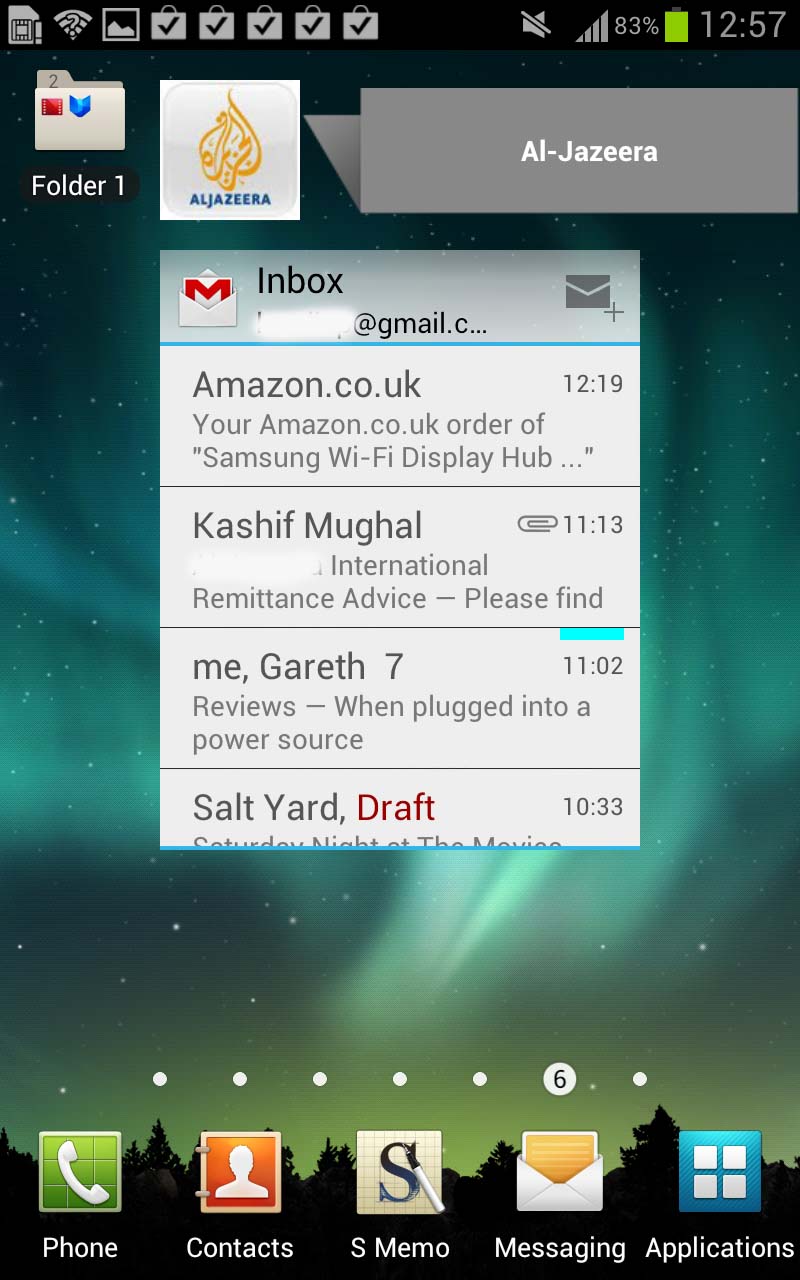
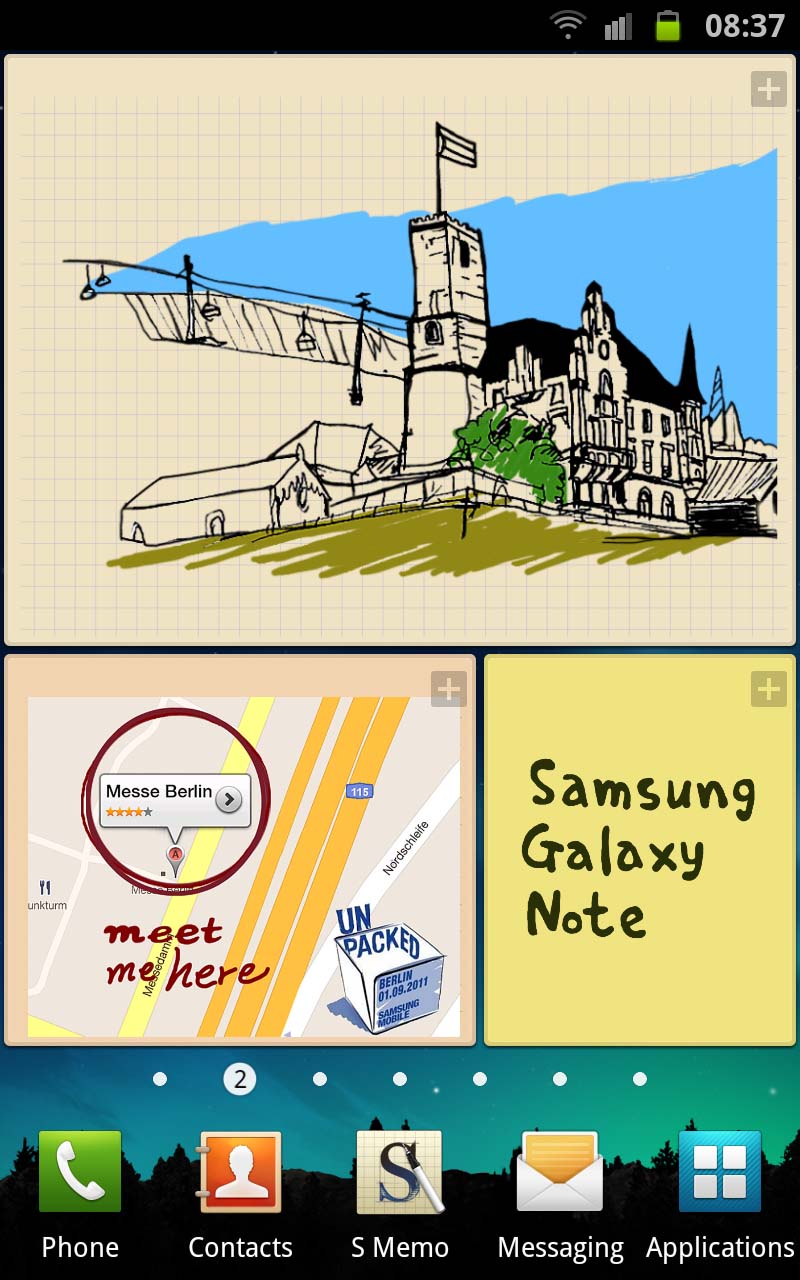
Widgets can be displayed in any place - and in any way.
Samsung offers the ability to resize them, although this only allows you to do it to certain ones (compared to some third-party launchers which let you resize everything), which is kinda annoying because some just don't fit.
For example, the Google Search bar leaves a big gap at the side and just looks aesthetically odd.
There's also a rather snazzy ability to resize web pages by holding your finger on two points and tilting the phone towards or away from you. It looks cool but is completely pointless, since you can just pinch to zoom to do the same task more effectively.
Whizzing between home screens is fast, thanks to that processor, though we did notice that the more we filled it up with apps, the longer it would sometimes take to go back to the home screen when hitting the home button from within an app.
Not so much something that you'd become annoyed with, but we just noticed it because we were looking out for it, having experienced the same delay on the S2.
Pulling down on the Android notification bar gives you access not only to your notifications but also a really helpful shortcut menu that will let you toggle things like Wi-Fi/ GPS/ Bluetooth/ sound/ auto-rotate.
Although you've now got access to a settings option here, the notification bar looks identical to how it did before. Presumably, Samsung has done this deliberately so upgraders don't feel instantly lost. But it does take a little bit of the sparkle away.
Application drawers can be a little hit and miss on Android handsets, depending on the vendor. We'd originally said that TouchWiz is one of the good ones, but we're not so sure now.
Ice Cream Sandwich brought with it the ability to drag-and-drop apps onto each other to create folders like Apple's iOS. And it did that well. But Samsung has removed this, and now you have to go through the old hassle of creating a drawer, using the menu, and then dropping things in. It's convoluted and pointless.
Apps can also be deleted easily via the drawer in editing mode, rather than forcing you to go through the settings menu as some Android handsets do.
It's a great, intuitive system and fantastic for new users. It may lack the feeling of having your hand-held that an iDevice gives a novice, but after 20 minutes' of playing around with a Samsung Galaxy Note even the most amateur of Android users will be comfortable with how it all works.
