Why you can trust TechRadar
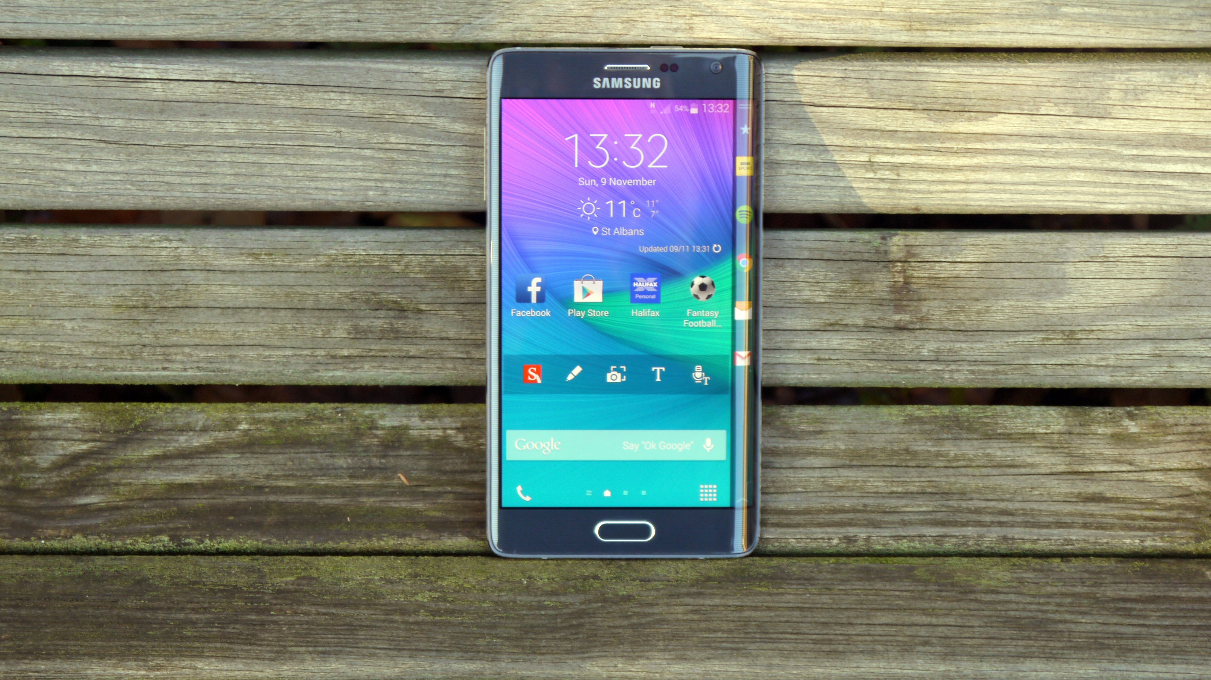
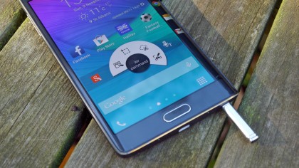
While there are some cool parts to the Galaxy Note Edge, the big reason to buy it is obvious: the curved element at the side.
I'm not going to go into the other key features of the Note range, such as the improved S Pen or enhanced camera, as these are very similar to that which we saw on the Note 4. I'll be covering them in the review, but I just wanted to point out that while they are key features of the Edge – and very good reasons to buy – you can check out the Note 4 review to find out about them, or read on through the review to see where they fit in.
An all-new screen design
I'll say it now: I can't really work out whether it's a genius innovation or design gimmick. I'd say it falls between the two, which is still good news as it means an attempt to evolve handset design has brought an improvement.
The reason I'm torn is that despite coming with quite an array of features, I only used about 15% of the options regularly. For instance, the main bar is the one you'll turn to most and here is where you'll place your most-used apps, much as you might on the bottom level of the phone for easy access.
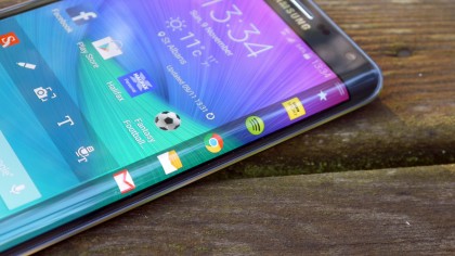
This works really well, and a quick swipe or tap on the spine will call them up whenever you need them throughout the phone. After that, there's a sort of mash-up between the notifications panel and the most recently installed / used apps, which is less useful beyond telling you the weather.
After that you've got the contextual menus, so if you're listening to Spotify for instance, you'll be able to see what's playing and skip tracks forward and back. I was really impressed with this functionality actually, as it shows Samsung has worked hard to bring the element from the main notification pane to the spine, as there's no way Spotify coded that in already to its app.
You're able to download more edge tricks from Samsung as well, meaning this area will only grow. Sports scores, stock tickers and the ability to see how much RAM your phone is using are all options available now, and if this notion gets popular, should result in more from third parties too.
Tools a-plenty
The other big win here is the ever-present tool bar that's accessed by pulling down from the top of the spine. It contains things like a timer, a torch, the stopwatch and more. The one you'll show your friends is the ruler, which is a nifty trick that will come in useful probably three times during a two year contract with the Note Edge, but hey, at least it's something novel.
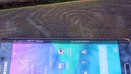
However, while the options are good, Samsung has a long, long way to go before getting it right.
One of the biggest irks is the way the spine doesn't seem to be able to perform as a proper notification area. When a new song comes on Spotify, for instance, most phones will see the notification area change to tell you the name of the song. That's fine. It's out of the way.
But when you're using the spine to flip through tracks, and the navigation buttons keep disappearing to be replaced by the track notification (which you can see written on the spine already) then the whole process becomes very long-winded and requires a lot of swiping away.
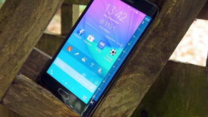
Then there's the message alert: again, this would have started scrolling through the notification bar at the top of the phone on something like the Note 4. But here, it shows up on the spine horizontally. Unless you've positioned your phone exactly in your eye line on the desk, this is no use and forces you to twist your neck and palm to read the message.
You could just unlock the phone and have a look, obviously, but the point of the quick view is just that: a quick view so you know whether the missive deserves your time.
I am looking forward to seeing what Samsung does with this feature in the future though - being able to add my own message in was fun as that's what stays there when the spine is in standby mode, but then again whenever I read it I realised that it wasn't doing much.
I had high hopes for it during media browsing, but unless you're watching a video using Samsung's own video player, the onscreen buttons won't disappear to the spine (which would allow you to see the entire screen while navigating through your movie) which is a shame.
Night, night baby
I will say this though: the night mode is brilliant. When a certain time hits, the Note Edge will instantly keep the screen shut off apart from a small clock with the weather on the spine. Plug in and lay this down on your bedside table and you've got a very unobtrusive clock that doesn't burn your retinas with brightness.
Having used a lot of purported 'night mode' clocks before, which still feel brighter than the sun in actual use thanks to the LCD backlights needing to be on even in dark mode, the Super AMOLED technology delivers a tiny fraction of light and achieves a lot.
The heart rate monitor - rebooted
Hang on a minute... I'm actually coming around to the idea that the Galaxy Note Edge could have found a better use for the heart rate monitor. It doesn't feel right. It's a useless feature, right?
Well, yes... but less so than before. Where the Galaxy S5 debuted the technology, and props to Samsung for sticking with it all this time, I didn't think that it would ever be something beyond a novelty. But recent additions to the S Health app that powers it, as well as improved functionality from the sensor, mean I was more tempted to use it during my time with the phone.
Now it doesn't just monitor heart rate (actually, it doesn't do that at all on the model I was using. While it could clearly do it, thanks to other tests noting my pulse, the actual heart rate monitor failed time and time again) but also oxygen saturation levels and stress too.
It's not the most accurate, as the fact my oxygen level is perfect in one hand but poor in the other will attest (although I could have slightly poorer blood on one side of my body, of course...) and the stress calculator is a bit vague, but at least Samsung is trying to make it a more complete system.
If it is fully accurate, then it should offer you the option to alert you throughout the day to check these readings to get a better idea of what's going on with you. Just a thought, Samsung.
But it's not that accurate right now - although I do like the life coaching goals, as these do pop up when you set ideals to follow, be it through less stress or improving happiness. It's like Samsung is giving me a digital cuddle.

TechRadar's former Global Managing Editor, John has been a technology journalist for more than a decade, and over the years has built up a vast knowledge of the tech industry. He’s interviewed CEOs from some of the world’s biggest tech firms, visited their HQs, and appeared on live TV and radio, including Sky News, BBC News, BBC World News, Al Jazeera, LBC, and BBC Radio 4.
