Why you can trust TechRadar
If you're not experienced with Android, you'll find the Portal a confusing phone to get to grips with.
For those of you who've only experienced Android via a quick fiddle on a demo phone in Carphone Warehouse at lunchtime, the operating system's basically reminiscent of a simple touch-enabled version of Windows.
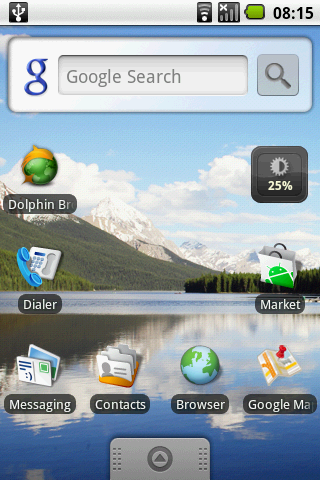
The desktop, which Google calls Home, spans three screens in the Portal's standard Android 1.5 (some providers skin this to give you more Home areas and Android 2.1 comes with five), so you're able to curate three separate collections of shortcuts.

This means you can have a page full of all your social tools, a page for your web stuff, then a third desktop space with boring work links.
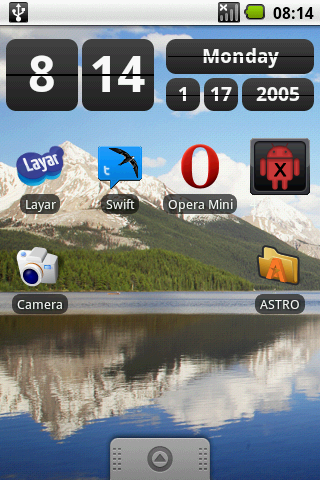
There are two types of Android Home button - icons and widgets. Icons are straightforward shortcuts to apps, a pretty simple concept. Widgets are a little different, coming in all sorts of sizes and offering interactive content.
You might download a Twitter widget that sits on your Home screen, taking up three icon slots and letting you watch a live stream of Tweets without having to fire up a custom app.
Or there are news apps that load RSS feeds directly onto your Home page, giving you the latest important business (or meaningless celebrity) news without having to open an app at all.
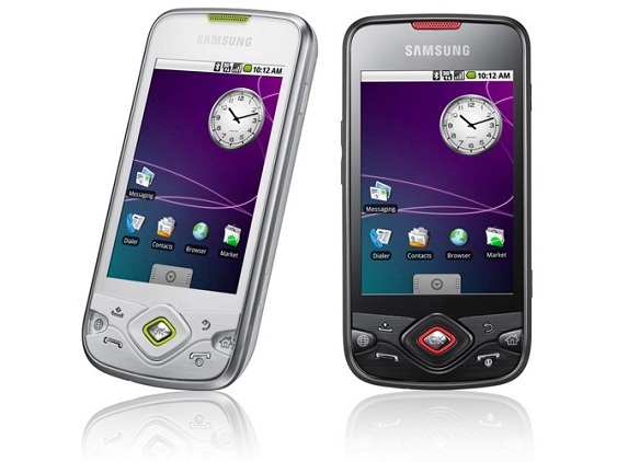
Which is the great thing about Android. The Portal's rather bland and featureless default installation is a blank canvas that can be changed beyond all recognition thanks to a good hour of app downloading through the Android Market, and you'll soon ditch the bland analogue clock for something much more swish.

The Portal's faster-than-many 800MHz processor (including the Sony Ericsson Satio and iPhone 3GS) means loading apps and swiping your way through pages is very quick, with the Settings and Applications lists populating themselves with data much quicker than they do on some slower Android phones.
The phone comes out of standby mode in an instant, and you're able to pull the menu tab up to start browsing your phone's content as soon as it's woken up. Using it's a breeze.
However, the overall feel of the Samsung Galaxy Portal's interface lacks the smooth gloss of the likes of HTC's Sense overlay - it just feels a little sparse and featureless.
Current page: Samsung Galaxy Portal: Interface
Prev Page Samsung Galaxy Portal: Overview, design and feel Next Page Samsung Galaxy Portal: Calling and Messaging