Why you can trust TechRadar
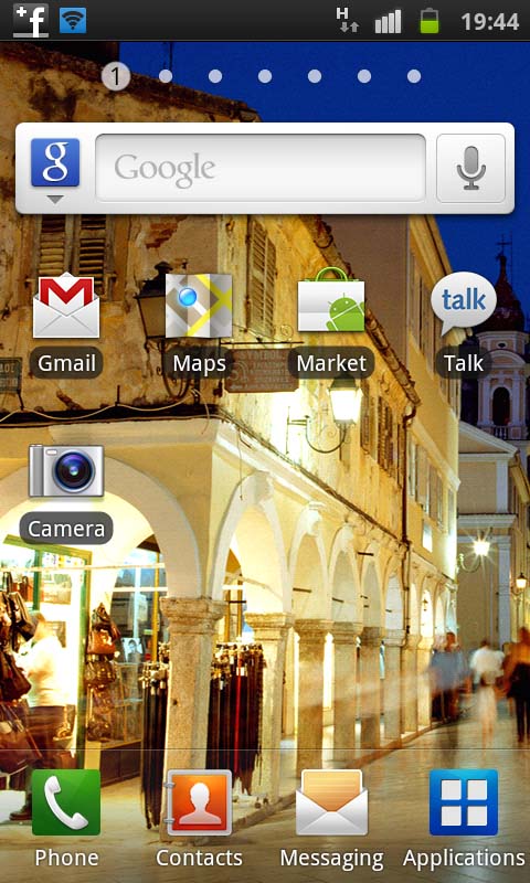
Samsung ships the Galaxy S with Gingerbread 2.3 (or at the very least, offers it as a free upgrade.) It's the latest operating system for Android and, on top of that, we're treated to the TouchWiz skin. Although Sammy's overlay polarises opinion, we're big fans of Samsung's offering here. It's vivid, colourful and makes the most of that amazing screen.
Yep, back to the screen again, because we can't stop raving about it. Especially with some of the included wallpapers. Prior to the Samsung Galaxy S2 being released, we'd put it as one of the most seductive out there, and it's still excellent. TouchWiz just makes it better.
You have seven home screens by default, and with no way to expand this. But unless you're really greedy and just gobble widgets like cakes, you'll find this is more than enough. The first home screen is your main one, and you swipe to the right to move along.
You can also just pinch the screen in to show all your screens at once. It's a nice touch, and very fluid. At no stage did we find our widgets slowing the handset down at all – but with a Hummingbird 1GHz processor inside, we'd have been surprised if we had.
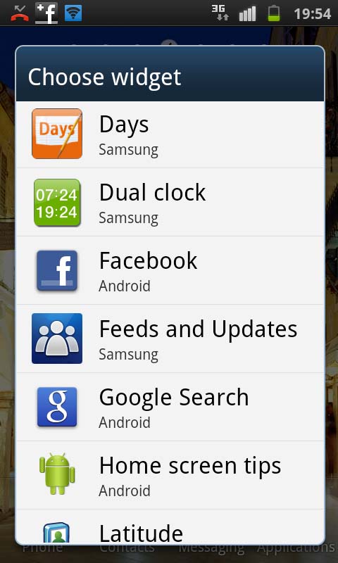
Samsung hasn't gone overboard with its selection of widgets on the Gingerbread release. When you turn it on for the first time, there are none set up on the Galaxy S home screens, and when you look into the options, there are only 11 (four of which are variations of the same one) plus the standard Android offerings.
But it's no real worry, because there are many available from the Android Market.
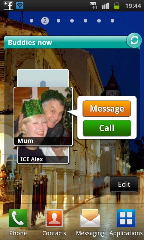
And the ones that do come with the Samsung Galaxy S, we really liked. Calendar Clock displays a large clock that highlights the times you're not available on a particular day, and Buddies Now is a cool addition – a simple carousel that enables you to call and text assigned contacts within a second or two. It's not splitting the atom, but it's fun.
Others include: Days (a diary widget), Daily Briefing, Feeds and Updates, Program Monitor (a task manager) and Y! Finance Clock (Stocks) - so far, so yawn.
TouchWiz provides four shortcuts at the bottom of your screen, which are there at all times – Phone, Contacts, Messaging and Applications. Go into any home screen and they're there. Go into your application drawer and they're there. The only time they're not visible is when you're actually using an app.
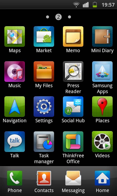
You can replace them with others by simply going into the Application drawer, and going through the Options menu. It's a simple case of drag and drop. You can also reorder your Android apps depending on which you use most and what you want to see (by default, they order alphabetically) and we really like this.
It's one of those simple functions you expect to have, but on so many Android handsets, it's missing. And scrolling through your apps can be a right pain in the neck. One quirk we did notice was when you re-order apps or fiddle with those you have in the dock at the bottom.
Once you've made your changes, you have to consciously press your Options button and select Save or your changes are lost and you have to do it all again.
We'd been using an iPhone 4 prior to the Samsung Galaxy S, and had got into the habit of just pressing the home button to save changes, so this extra click threw us a little bit. But it's not a problem – it's just a different way of doing things.
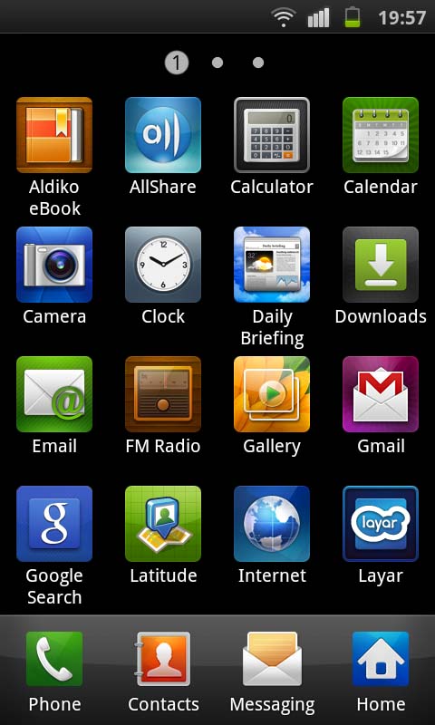
We're pleased with the look of apps in the drawer and think that here the Samsung Galaxy S actually outshines its big brother, the Galaxy S2. You see, one of the differences between iPhone apps and Android apps is that iPhone icons are all the same shape and size.
They even have that slight curve of colour and shading on them. Aesthetically, iPhone home screens look good because everything is uniform and fits together.
But with Android, they can be all different shapes and sizes and your app drawer can, on occasions, look a right mess, with a mish mash of different styles sitting together. For obsessive folk like us, that's not good.
But the TouchWiz on Samsung Galaxy S adds a box around each icon. Each one is a different colour and is fairly bright (some may think it's a little playschool, but not us) but more to the point, it regulates everything so the icons are all the same size and shape. It's one of those small touches that you don't notice is missing until it's not there, and on the Galaxy S2, we're shocked Samsung has left it out.
Another thing that shocked us is the ringtones. We know these South Korean manufacturers love their weird tones (LG is just as bad) but the ones Samsung includes are nothing short of mortifyingly embarrassing. Thank heavens you can use your own MP3s, although we wish they'd just left them out. Dreadful.
Luckily, Samsung hasn't left out the toggles on the status bar that enable you to control certain battery-hungry elements of the operating system without having to delve too deeply into the menus. That's all present and correct.
Also, Samsung has thought ahead and given users a screenshot ability where you hold down the Home and Back button to take a snapshot of your screen. It's something that Apple users have had forever and will be used to, but Android, bizarrely, makes it incredibly difficult and provides no way of grabbing screenshots out of the box.
There are various flaky apps that do it, but they don't always work, and the only guaranteed method is to run the SDK kit, so this Samsung shortcut gets a definite thumbs up from us. It could be a bit better, though, because you have to press the Back button as part of the process, which often closes the screen you're trying to shoot.
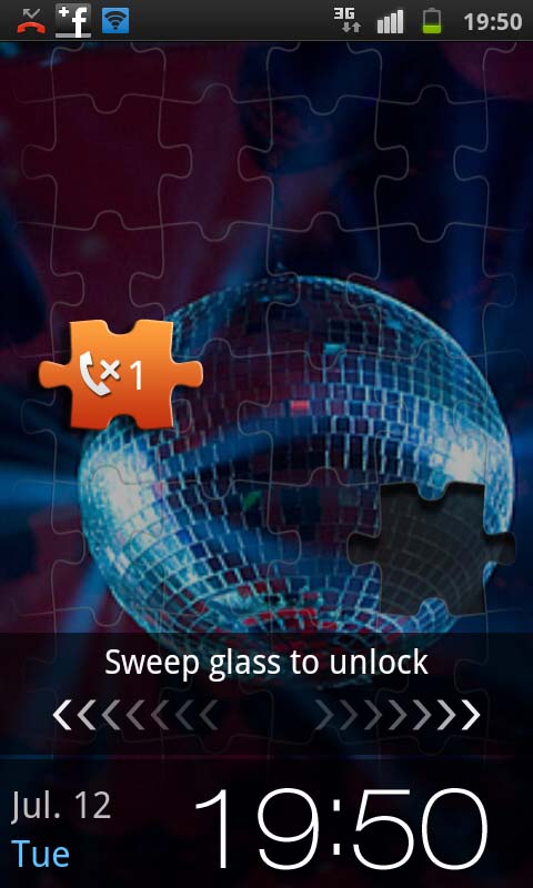
The lock screen wallpaper is the same as the home screen. It can be changed easily, although we couldn't see a way to change back to a default lock screen wallpaper once you've set one of your own (you can change to one of your pictures, but not to one of Samsung's, and you can change the standby wallpaper back to default, just not the lock screen).
To unlock the phone, it's a simple case of wiping the screensaver off in a sweeping motion. It works as well as you'd expect. And one thing we love about it (shallow, yes we admit) is the fact that when you get an SMS/missed call, the lock screen turns into a jigsaw puzzle with a piece missing. That piece is your notification elsewhere on the screen and you drag it across to fit the gap and unlock. It's daft, but it's fun.
All in all, the Samsung Galaxy S has a fluid operating system, and because it's Android, if you're coming from another Android handset, you'll be at home. The TouchWiz just gives it a little extra sparkle and, in itself, even a novice will be able to navigate it within minutes.
Current page: Samsung Galaxy S: Interface
Prev Page Samsung Galaxy S: Overview, design and feel Next Page Samsung Galaxy S: Contacts and calling