Why you can trust TechRadar
One of the biggest things that has to be thought through when purchasing an older smartphone is what software comes preloaded. For more advanced users that might look at taking matters into their own hands this isn't so bad, but for regular users this can prove a large hiccup.
Samsung launched the Galaxy S3 at a time when Ice Cream Sandwich was the flavour of the moment, but has since upgraded the handset to a more reasonable Jelly Bean. This means that it sits on software that is soon to be two generations out of date with Android L just around the corner.
What does this mean for the Galaxy S3 then? For starters it means that it lags a little behind even a lot of the cheapest handsets that are now being brought to market, and will drop even further in the coming months.
If Samsung takes the steps of making Android L available to the Galaxy S3 I would be very surprised, but don't take my word as gospel truth, crazier things have happened.
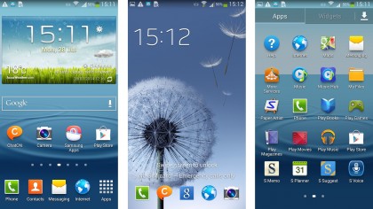
Those that aren't fans of Samsung's TouchWiz UI should look away now as there is no escaping its clutches on the Galaxy S3, predating any agreement that Samsung has with Google to tone down the customisation in favour of a cleaner more Google-y experience.
This means that the Samsung's Touchwiz overlay does feel a little dated. The lock screen still has that water ripple under the finger complete with water drop sound, which is a nice touch, but gets annoying very quickly so I soon turned it off.
Also available are a whole raft of widgets, a swipe to the left or right over the clock allows you to easily browse information, and faster than opening the S3 itself. It's not something I found I used an awful lot, but I can see it being quite popular.
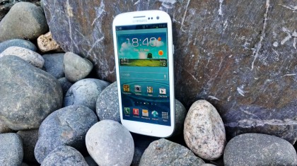
Samsung has taken a leaf out of HTC's book as well with the new overlay to the Galaxy S3, by enabling you to open up specific applications from the lock screen. Simply swipe the application upwards and you'll be taken directly to it without having to navigate within the phone itself.
The S3 wasn't the speediest to wake up from sleep mode, pressing the unlock key on the side and there was a noticeable lag to turn the screen on, something that I've not really found on any newer handsets.
The 1.4GHz quad-core Exynos processor chugs away behind the screen, and at the time was one of the best on the market. Since the advent of Qualcomm's Snapdragon series this has taken a back seat, and I would suggest that even the lower powered Snapdragon 400 feels slightly faster.
In terms of widgets, the Galaxy S3 comes with 11 packed screens so there is a lot to play with even before you've selected your favourites from the Play Store.
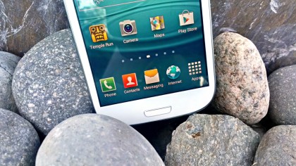
The dock at the bottom of the display holds five items, which is now the standard across larger screens. What I can't work out is why this hasn't been carried above to the home screens, which instead can still only hold four.
It's annoying that you still have to create folders though - stock Google allows you to drop icons on top of one another to create clusters of similar apps, but with the Samsung Galaxy S3 you still need to manually make a folder before you can lob stuff into it.
Given that the Samsung Galaxy S3 is an older handset, there may still be the worry that the quad-core CPU will be a little power thirsty, hence the introduction of an innovative eye-tracking method called Smart Stay.
This will track your eyes when looking at the display, and dim it when you're not checking out your phone. In tests though I found that it was a little hit and miss, although this isn't something that is confined to the S3 as I have found that problem on a whole range of Galaxy devices.
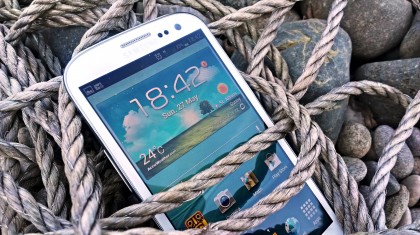
Smart alert is also present, and is a lot more useful than voice activation. Pick up the phone when you've got a missed call or text and it will vibrate gently in your hand in combination with the notification light to let you know you're a popular bunny.
In truth, the fact that the notification light is there is more useful when picking up the phone to see if anyone has got in contact, but it's a neat feature that adds to the overall effect of the 'human integration' of the phone.
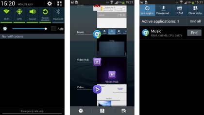
Samsung's quick control functions are thankfully still available in the drop down notifications menu, easily accessed from the top of any screen. I'm glad they're still there even today as it makes doing things like turning the Wi-Fi on and off much easier.
Android Jelly Bean is embedded out of the box, meaning you've got an older OS but still the plethora of options when it comes to notification management. You can easily get rid of anything that you don't care about by simply swiping the alert left or right – it's a really neat system that means you can leave the bits you really care about.
Samsung has also put the brightness alteration bar in, and also allows you to adjust the level of auto brightness.

The neatness is reproduced in the application management pane: when holding down the home button at the bottom of the phone you're presented with a long list of all the applications you've recently opened – another flick of the finger and they're shut down.
This, thankfully, loads up instantly, and comes with some friends at the bottom, unlike other Android handsets. The Google Now option is flanked by an icon to shut down all the open applications, as well as being able to jump into your RAM usage and cut that down as well.
In terms of management options, there are more than ever before. The battery usage meter is joined by the data management tool that enables you to see which apps are sucking down the most bytes, and also (quite neatly, using sliding bars) enables you to set warnings for when you're getting close to your data limit and when you've reached it.
You can even tell the phone to stop connecting to the internet over 3G if you're worried about your data charges after a certain period. This is certainly going to satisfy those who don't ever know how much data they're using, because you're in total control.
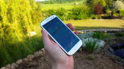
The menu system is very easy to use, as before. You can sort your apps chronologically or alphabetically and if you're not a fan of the standard grid system you can chuck them all into one long list.
There's a tab for apps (which you can filter to just those you've downloaded) and also widgets too – with the seven enabled home screens on the top to chuck them into. There are loads to choose from (with more to come as you download applications) which can get a bit chaotic when you're scrolling through.
And if you want to uninstall apps, simply open up the option from the menu in the App drawer - much easier than messing about through the innards of the phone or heading through Play Store.
The other big feature for the S3 is the addition of motion control – not necessarily a new idea, but one that's been pushed to a whole new level in the phone.
This means that not only does turning over the phone or placing your hand over it mute a call, but also performs the same trick when playing music. It can even do it when turning the phone over in mid-air, which is quite impressive when you think the handset can tell the difference between the pocket and a desk.
Other features, such as tapping the top of the phone to move to the top of a list, are pretty cool, but ultimately pale in comparison to Apple's (likely patented) tapping at the top of the screen. The S3's effort is nowhere near universal, so you can find yourself tapping the phone to no avail on more than one occasion.
Overall the Galaxy S3 still performs well, powered by that quad-core processor. That said, the budget brigade are creeping up with quad-core CPU's of their own and are providing more than adequate challenges to the S3.
The Moto G at a similar price comes with updated software, and without the same TouchWiz UI that sits over Android. This means it feels a little slicker, and more modern overall.
Current page: Interface and performance
Prev Page Key features Next Page Battery life and the essentials
Gareth has been part of the consumer technology world in a career spanning three decades. He started life as a staff writer on the fledgling TechRadar, and has grew with the site (primarily as phones, tablets and wearables editor) until becoming Global Editor in Chief in 2018. Gareth has written over 4,000 articles for TechRadar, has contributed expert insight to a number of other publications, chaired panels on zeitgeist technologies, presented at the Gadget Show Live as well as representing the brand on TV and radio for multiple channels including Sky, BBC, ITV and Al-Jazeera. Passionate about fitness, he can bore anyone rigid about stress management, sleep tracking, heart rate variance as well as bemoaning something about the latest iPhone, Galaxy or OLED TV.
