Why you can trust TechRadar
Building the Samsung Galaxy S3 Mini's interface upon the Android 4.1.1 Jelly Bean operating system means that Samsung has tweaked its Touchwiz overlay yet again.
We've always been fans of Touchwiz, and anybody that has any experience of previous Samsung phones will feel almost immediately at home.
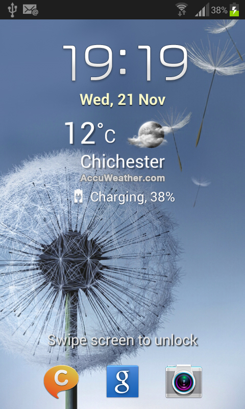
Starting from the lock screen, the Samsung Galaxy S3 Mini has continued the 'inspired by nature' theme that was present on the Galaxy S3.
Taking cues from other custom UIs such as HTC Sense, the lock screen provides quick access to up to three applications.
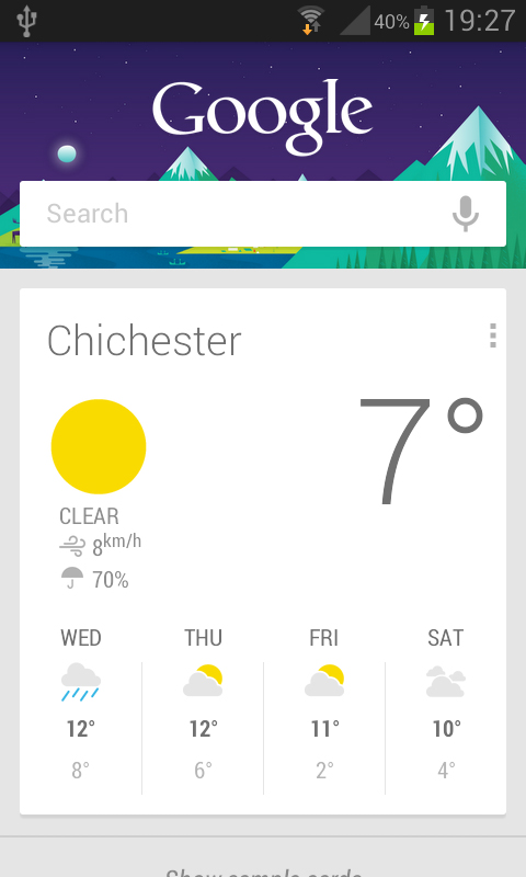
By default these are ChatOn - Samsung's answer to BBM and iMessage - as well as the Google Now search engine, and the Camera app. If you'd prefer other options, these can be customised.
Interestingly, it is possible to access the camera app by holding the lock screen and rotating the Galaxy S3 Mini to landscape. We found this a little difficult to work out initially, but we soon got the hang of it.
Touching the screen brings ripple effects, and swiping across to unlock brings small ripples akin to skimming a stone.
This is accompanied by an annoying water drop sound, which you also get when pressing the varying buttons on the Galaxy S3 Mini. Thankfully these can be turned off within the settings.
It could well be the Project Butter of Jelly Bean, but after our initial concerns over the Galaxy S3 unlock and wake up speed, we didn't find any slow down on the less powerful Galaxy S3 Mini.
The whole device wasn't lightning fast, the compromise of having less cores, but only once did we find any real hindrance, during initial set up as all our apps downloaded and synced from Google's cloud.
The latest Touchwiz brings across the same icons and the same feel that we found on the Samsung Galaxy S3, and we were happy to say that it felt a lot more simplified than it had on older Samsung devices.
To make it even simpler, the settings menu enables you to change the Home screen mode, between Basic and Easy mode.
We were a little bemused as there was no Advanced mode, but the idea behind Easy mode is that it makes it easier for first time users. We don't think even the most inexperienced should need it though.
Touchwiz also brings along Samsung's vast array of widgets to the Galaxy S3 Mini.
From Android Honeycomb, the widgets can be accessed via a tab in the app drawer, enabling you to preview the widgets, as well as providing the widget size so you know whether it'll fit on your selected screen.
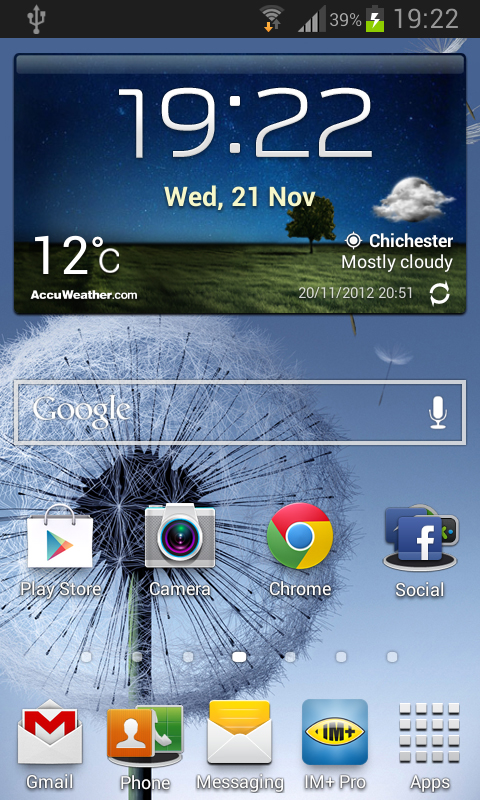
The main widget, as for just about every modern smartphone, is the clock widget. Samsung's clock is a very smart offering, with a landscaped background reflecting the time and weather conditions of your position.
Some widgets are resizable, however there is no indication as to which these are, which is more than a little frustrating.
We might have mentioned it before, but we're glad that the latest Touchwiz dock has been expanded.
Android has long had the ability to have five icons in the dock, yet previous iterations of Touchwiz only allowed for four, and that included the app drawer itself.
Another useful feature is the ability to put folders in the dock, freeing up more room. Folders can be made throughout the Samsung Galaxy S3 Mini, although they don't have the same intuitive feel that has become prevalent on other devices, most notably in iOS.
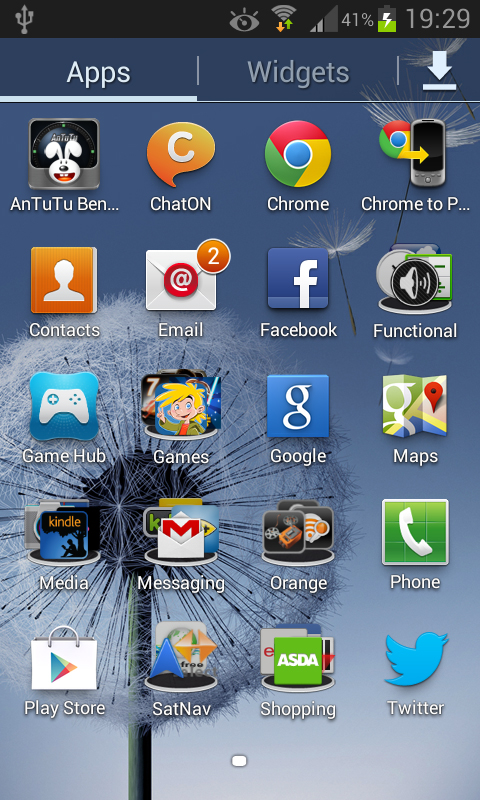
On a Home screen, pressing the menu button or long-pressing a blank spot on the screen gives you the option to create an empty folder, and from there you can drag and drop apps into it.
Thankfully, it is a similar experience in the app drawer, and means that you can be very organised; we've managed to get all our apps onto one screen.
Another feature we're pleased to see is the ability to hide apps, done by accessing the app drawer menu.
We're big fans of this as often there are preinstalled apps that can't be removed without rooting your device, and we know this isn't for everyone. Having them hidden helps make the app drawer seem a lot more organised.
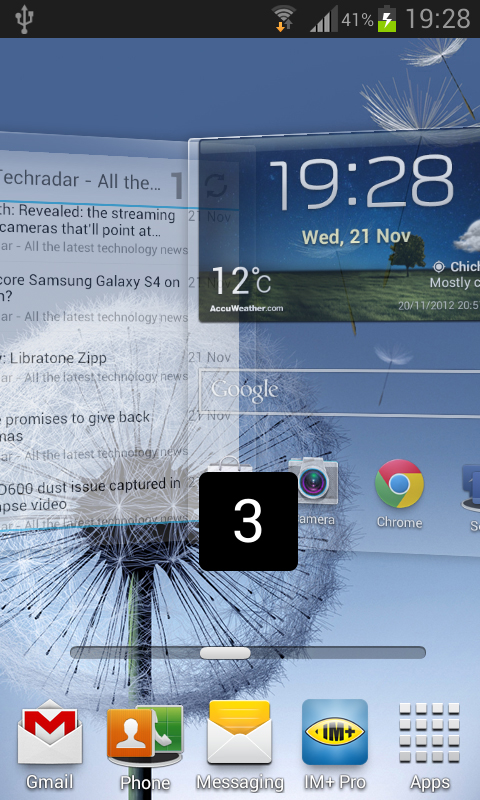
To display your many folders and widgets, the Samsung Galaxy S3 Mini permits up to seven home screens. This is a big plus in our eyes, especially as the Google Nexus 4 infamously allows only five.
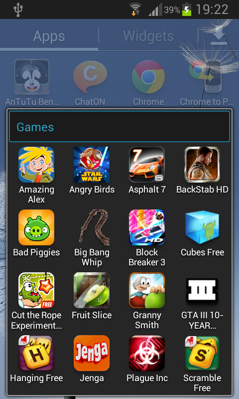
Moving around home screens was smooth, no hint of any slowdown from the less powerful processor.
The infinite scroll loop is something we're fans of, as is the scroll bar.
It's one of Touchwiz's less obvious features, but the dotted screen indicator on the home screens and app drawer turns into a scroll bar for even faster screen switching.
The app drawer has also had some customisation, with the ability to sort apps in any way you choose, so you can dedicate certain screens to certain apps, alphabetically or in a list.
We're not massive fans of the custom screen, mainly because uninstalling apps then leaves a gap.
One of the key features of any Android experience, emulated on later iOS versions, is the notifications bar.
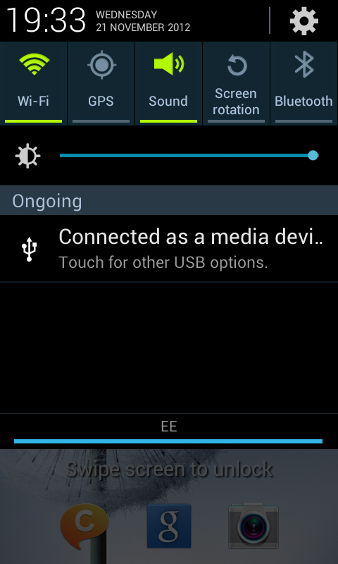
We liked the notifications experience on the Galaxy S3, but having Jelly Bean behind the Samsung Galaxy S3 Mini means it has had another lick of paint.
Surprisingly, it is accessible from the lock screen.
Swiping the bar down gives access to the notifications screen, complete with the quick settings that Samsung has put in every Touchwiz iteration.
There are a lot more options than you may previously be used to, and as we mentioned before, it moves across every time you open the bar.
We could list all the available power saving options, but needless to say they cover GPS and Wi-Fi, as well as the Mobile Data and an interesting setting known as Blocking Mode.
Blocking Mode disables notifications, including calls from people other than on a set list. It can also be set to a timer, making it ideal for when you're asleep.
Elsewhere in the Samsung Galaxy S3 Mini notifications bar is a brightness toggle, as well as the very smartly laid out clock and date in the top left, opposite access to the phone's settings.
We're extremely disappointed that Samsung has included a brightness toggle, mainly because it is their compensation for the lack of an auto brightness setting, something we cannot get our heads around.
We really like the contrast of the greens, blues and blacks, giving a very professional finish, and the fact that the little bar at the bottom only lights up when you are swiping the bar up and down show Samsung has given it a lot of thought.
The Jelly Bean experience with swiping away notifications, and expanding notifications is also present making it easy to dismiss the spam emails, or a Facebook message that you "don't want" when you're at work...
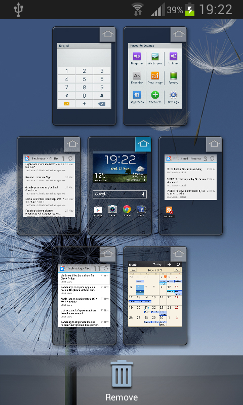
The S3 Mini also has Android's superb multi-tasking pane, accessed by long pressing the home button. From there you can open, or swipe away, all your recently opened apps, the Google Now engine or the 'Recycle Bin' that removes all recent apps.
The Samsung Galaxy S3 Mini also includes Samsung's Smart alert feature; pick up the phone with a missed call or text and it vibrates gently to let you know.
Samsung has also included a whole set of other features, such as the ability to have the battery percentage in the notifications bar, and the Smart stay eye-tracker.
While we're sure this helps the battery life, we found it a little inconsistent.
Maybe it was the poor sensor on the front of the device, but we found that even while looking at the Samsung Galaxy S3 Mini head on, the little Smart Stay Icon didn't always appear, yet it sometimes appeared while it was sat a few feet away on the table.
The Korean firm has also upped its motion control throughout certain apps, which we will go into more detail later, but the Samsung Galaxy S3 Mini enables you to mute calls or music just by flipping the phone over. It's not a new feature, yet is very handy.
In all, Samsung has really paid attention to the UI, in order to differentiate itself from the other Android manufacturers. The customisation has always helped Samsung stand out, and the dual core processor coupled with Android Jellybean rarely suffered.
