Why you can trust TechRadar
Contacts
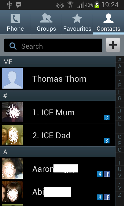
The Samsung Galaxy S3 Mini follows on in the same way that the Samsung Galaxy S3 did for its contacts, and we weren't massive fans.
This was mainly because Samsung provided a fairly standard list of contacts drawn in from varying social networks, such as Facebook and Google+.
We were a little upset to see that Twitter had somehow disappeared from Samsung's list of social network integrations, something that started with the Ice Cream Sandwich update on the Galaxy S2.
We commented on its lack of appearance on the Galaxy S3, so we're not entirely shocked.
Each contact is adorned with a profile picture, taken from either the Google assigned image or their Facebook profile picture.
The images are small and low resolution, another disappointment given the larger images found on the Google Nexus 4. The contact list also shows you which accounts are linked to each contact.
Opening up the contact provides that contact's details. The tiny low-res picture is still out in full force, leaving a massive gap to the side.
We said it on the Galaxy S3, and now again on the Samsung Galaxy S3 Mini, but we're disappointed not to have a longer image, with the gap being left to Google+ updates (for those who have Google+ contacts).
We're big fans of the ability to choose the contacts image, though. Well, to an extent anyway.
By default the image is the Google image, meaning should you find that John from Accounting's Facebook picture is actually his cat, it is entirely possible to change that to choosing the Google image.
The Samsung Galaxy S3 Mini does suffer a little in the social integration side, compared the HTC One S, as status updates aren't shown within the contacts details. HTC Sense seems to have nailed contact social integration.
We could bemoan the Samsung's contact list for being a bit poorer than other offerings, but it is a very functional app and based upon the fantastic Android offering.
This means that contacts can be sorted into groups, have favourites or widgets, or go so far as to assigning different contacts their own individual ringtone and vibration pattern.
Contacts from different accounts can all be merged, however there aren't any link suggestions unless you go via each contact manually. Again this is something that HTC has perfected with each Sense iteration
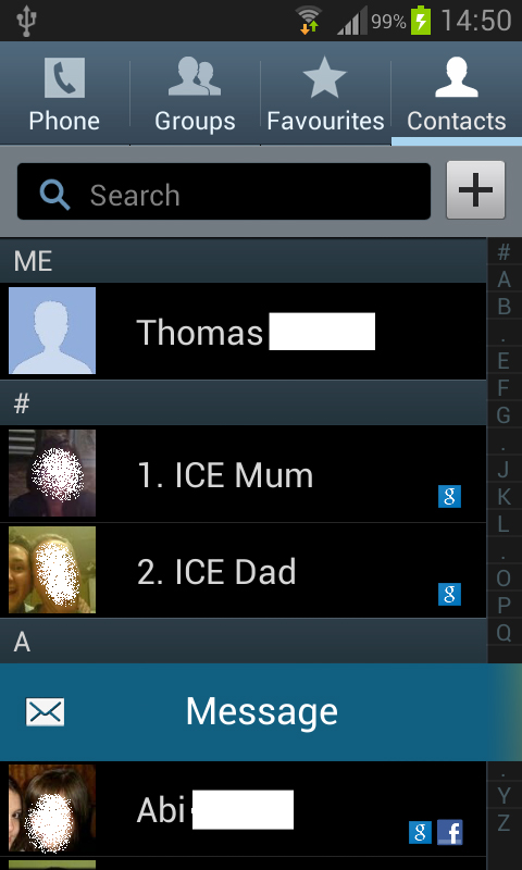
Samsung has also introduced a certain level of motion control to its Contacts app, with a side swipe to the left or right initiating a call or message to the chosen contact.
It is also possible to call a contact, simply by placing the phone to the ear when the contact details are on screen, although we found this to be a little erratic.
Calling
Samsung wouldn't be able to call the Galaxy S3 Mini a smartphone if there were no calling options. It would just be a smart, and that doesn't make a whole lot of sense.
Thankfully the Korean firm seemed to have given it a decent amount of attention.
We made a few calls, and while we might not have been blown away by the call quality, there were very few problems.
Within the call are the standard Android options - Headset, Keypad, Speaker, Mute and End Call.
The contact's image is large, and right in the centre, meaning a quick glance at the screen is often more than enough to help you decide whether you want to answer or not.
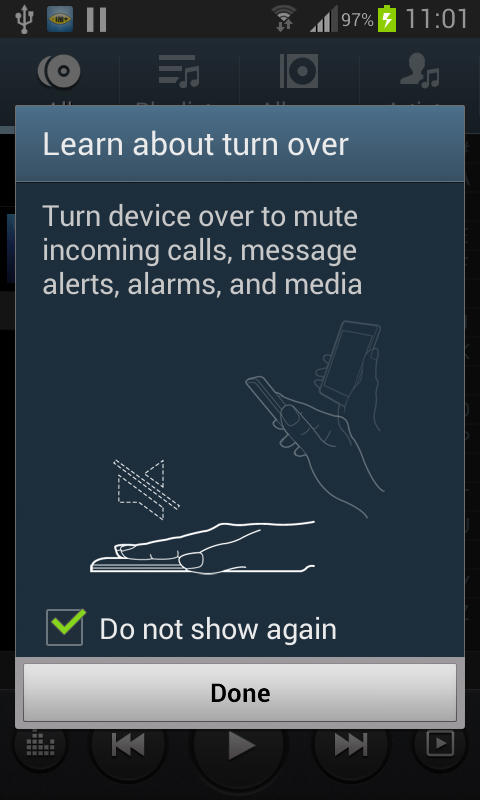
And with Samsung's motion control, call rejection is as easy as turning the phone over.
Unfortunately, again, the Samsung Galaxy S3 Mini's call screen has no social network interactivity.
The status updates that we have often used as conversation starters weren't present, so we actually had to think of stuff to say. Daunting.
Just about the biggest problem we seemed to have was the signal, while not always being as high as we might have expected (on Orange/EE), we noticed that we had signal more times than we had expected, and we never suffered from dropped calls.
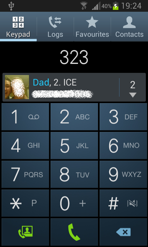
Within the Phone app, the smart Jelly Bean dialler screen is in effect, meaning a smart blue and white T9 pad, that supports smart dialling.
Typing 323 bringing up both 'Dad', as well as any contacts with 323 within the contact number.
While many would consider it a staple of the smartphone diet, its inclusion on the Samsung Galaxy S3 Mini is well received given that it doesn't appear on iOS or Windows Phone devices, and not even on the oft referenced Google Nexus 4.
We were also impressed by the inclusion of a dialler widget. We can't really see any major need for one, given that the phone icon is something that is likely to be on the ever present dock, but it was a nice touch.
The front facing camera is a massive clue that the Samsung Galaxy S3 Mini supports video calls.
We'd suggest that the majority of video conversations will take place over apps such as Skype, but can be made direct from the dialler screen, and over 3G. The VGA camera isn't exactly the sharpest, but given the tiny screen size we doubt that will be too much of a problem.
