TechRadar Verdict
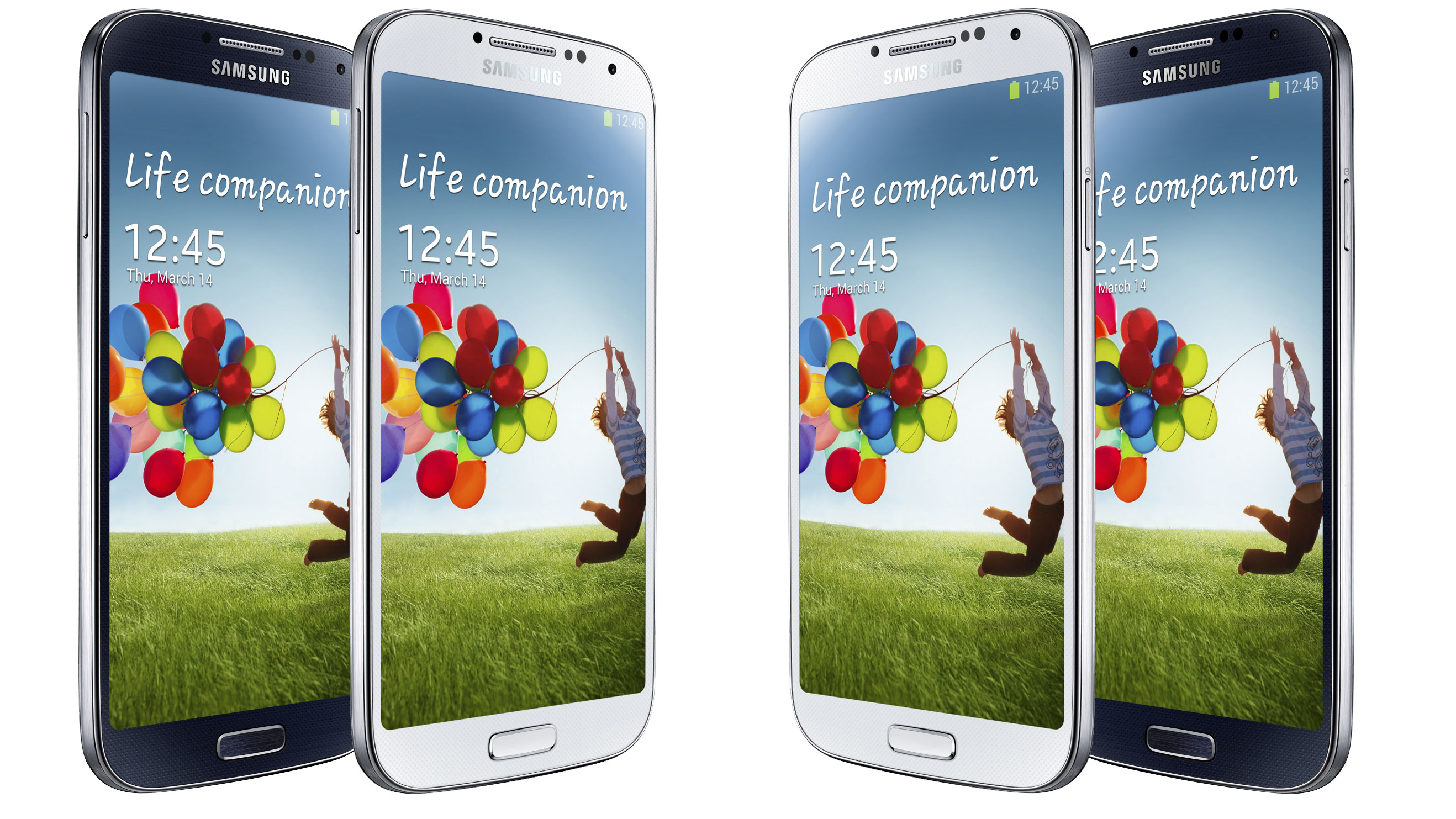
The Galaxy S4 is a stunning smartphone that won't let you down for a variety of tasks. It's not as good overall as the HTC One, especially when you factor in the design, but we love the S4 and would be proud to have it in our pocket.
Pros
- +
Stunning screen
- +
Superfast processor
- +
Great camera
Cons
- -
Feels cheaper than similar-priced phones
- -
'Innovation' makes things too complex
- -
Slight UI issues
Why you can trust TechRadar
The Samsung Galaxy S4 is now two and a half years old, and not only was it replaced by the Korean firm's 2014 flagship offering, the Galaxy S5, but the Samsung Galaxy S6 has also been on the market since March this year.
That means that the Galaxy S4 is now feeling a little long in the tooth. Samsung also made matters much worse by releasing the innovative Samsung Galaxy S6 Edge.
It offers the same design as the Galaxy S6 but includes a curved display where it bends around both the edges. There's now even a larger version with a 5.7-inch screen called the Galaxy S6 Edge+.
Without the fancy new bells and whistles that Samsung is including in its latest flagship phones, the Galaxy S4 can almost feel as if it is a relic from another age. However, just because two years is a long time in smartphones, it doesn't mean that we should write off the Samsung Galaxy S4 just yet.
After all, not everyone wants a phone with top-end specs - if good value is more your bag then the 2013 Galaxy S4 is still worth a look - it's still on sale, at a lower price point of around £250 ($368, AU$483). It has also dropped in price on contract.
That isn't too bad for a handset that is still pretty impressive under the hood. Samsung is also continuing to support it by churning out brand new software updates for it.
Samsung was quick to upgrade the Galaxy S4 to Android 4.4 KitKat. Together with a few minor Samsung additions and modifications, it tightens things up behind the scenes for a slightly sprightlier navigation experience.
On top of that, you can now also upgrade the Galaxy S4 to Android 5.0 Lollipop. That means the latest version of the software is on a 2013 handset.
Apparently the new software is coming to all handsets in Europe at the moment, so we'll be nabbing the upgrade as soon as it hits our review model and updating this review to see how it affects battery life, speed and overall functionality on the now-budget handset.
If you've already got a Samsung Galaxy S4, head over to our guide on when to expect the Android 5.0 Lollipop upgrade. We update it constantly, so it's your best source for finding out when the new operating system will reach the Galaxy S4.
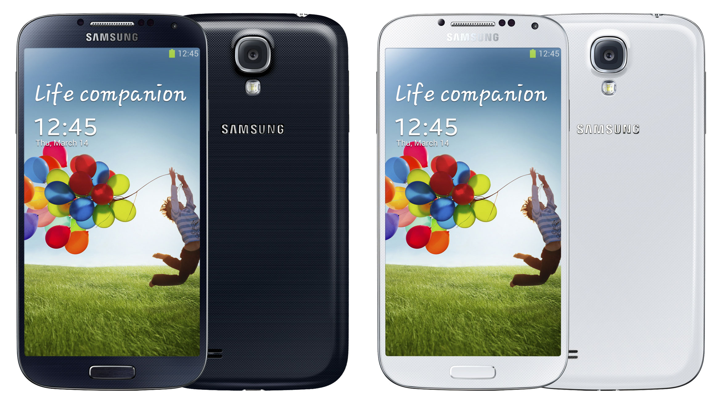
The arrival of the S6 and S6 Edge has finally spelled the end of the Galaxy S3. The Galaxy S4 comes in at 136.6 x 69.8 x 7.9mm, the same dimensions as the S3, meaning it feels pretty tiny in the hand compared with today's super-sized smartphones.
Samsung usually excels with its screens, and the S4 offers a 5-inch display with Full HD resolution. That's no longer a big deal when compared to the QHD offerings of today's top handsets (such as the 5.5-inch LG G3) but it's still good enough for the likes of the HTC One M9.
I should also note that the Galaxy S4 is considerably smaller and lighter than its successor, the Galaxy S5, despite conceding a mere 0.1 of an inch in screen size. This is evidently a result of the S5's tougher water and dust-resistant construction, but not everyone will count this as a worthwhile compromise.
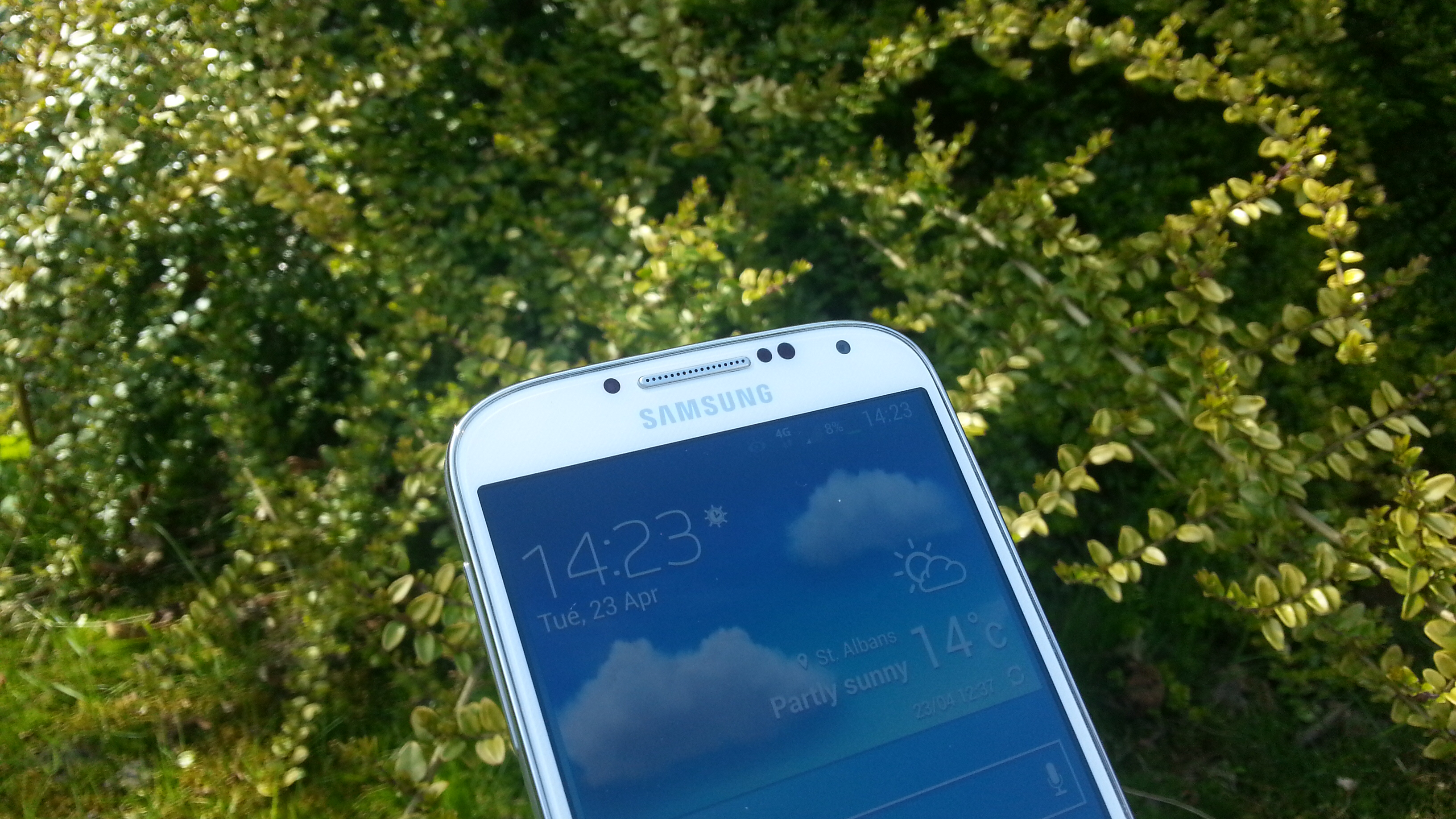
The Galaxy S4 shares a lot with the other top smartphones of its era. Both the Sony Xperia Z1 and the HTC One have screens that use the same resolution, but neither of them have the still impressive clout of the Super AMOLED HD screen on offer here.
On top of that, it packs in a much faster processor than its 2013 contemporaries, offers ample storage space for media thanks to an expandable memory card slot (something missing from Samsung's latest phones), and 4G, Bluetooth 4.0, NFC and pretty much any other connection you care to mention on board.
Samsung supplemented this decent specs list with a tranche of software upgrades too, meaning a more powerful camera, a better way to communicate with your friends and consume media, and the firm's first big push into health through dedicated apps.
Design
Before I dissect all the possibilities the phone has to offer, let's look at the design. As I mentioned, the Samsung Galaxy S4 is impressive in its form factor, thanks to the sub-8mm thickness. At 130g it manages to still be light without shaving off so much heft that you feel like you've got a flimsy piece of plastic.
Compare that with the Galaxy S6 just unveiled by Samsung: it's 6.8mm thick and weighs 138g.
That's probably the biggest compliment I can pay the Samsung Galaxy S4 - where its predecessor the S3 felt a little bit cheap in the hand, the S4 manages to bring a much more solid build and better construction to boot.
So while the "faux metal" band makes a comeback on this model, it looks a lot more premium. And there's very little flex in the chassis when you hold it tightly, which was another problem with the Galaxy S3.
It can get dented very easily though, and be careful not to crack your screen if you do so - I've heard of a few instances where this has happened to Galaxy S4 users, although that can be said of many other polycarbonate smartphones.
That doesn't mean that the phone is completely remodelled from the S3 - it's very similar in appearance, so much so that a number of people asking to see it during my review thought I was palming them off with my old S3. The polycarbonate chassis remains, but that brings with it the faithful battery cover, which conceals a removable battery and microSD slot.
I'm not so fussed about the battery being able to drop out of the phone - so few people carry around a spare battery, and nowadays portable charging blocks are becoming so cheap and light that they make much more sense.
It's something Samsung has done away with in its latest handsets, so the S4 will still appeal to those who like the removable battery option.
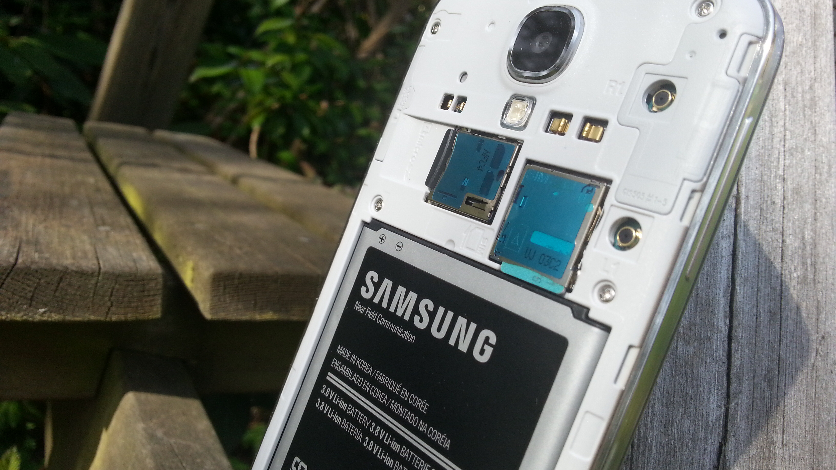
I'd almost prefer something like the Sony Xperia Z3, which has a refined and packaged chassis but doesn't need a removable battery - instead it makes use of a slot for the memory card. This integrated nature would make for a slightly more premium feel to the phone.
However, it's a small gripe with the Samsung Galaxy S4, as while the cover feels flimsy, it's better than it was on the S2 and the S3, and they both sold like hot cakes.
In the hand, the Samsung Galaxy S4 feels much better than any other Samsung phone that came before it (apart from the gargantuan smartphones the brand used to make - the i8910 Omnia HD might have been built like a brick, but it felt wonderful to hold). The screen's spread towards the sides of the phone means a much narrower bezel, and the effect is certainly impressive.
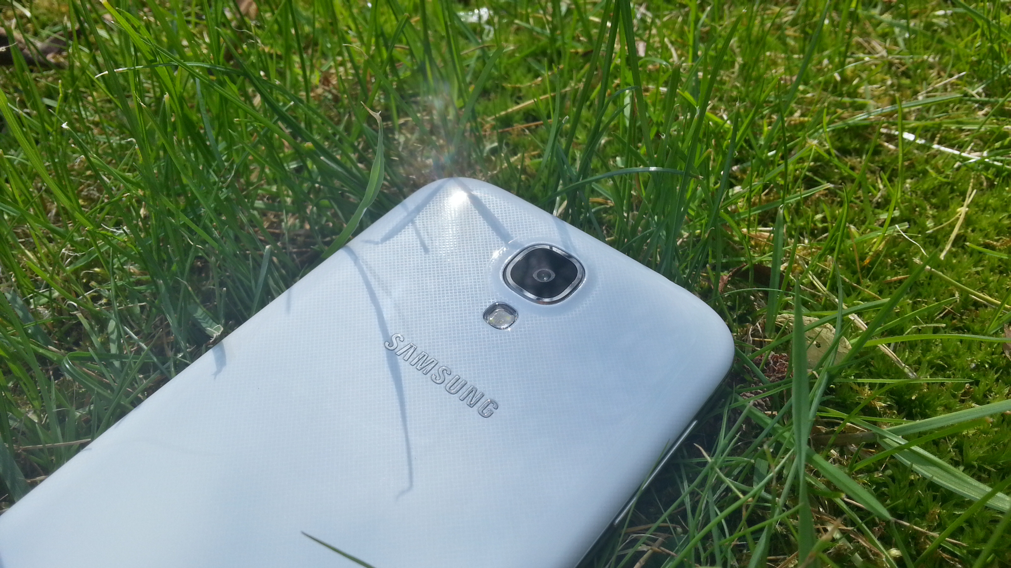
It might look very similar to the S3, but when you take the Samsung Galaxy S4 up close, you really start to appreciate the nuances.
I'd say it feels a lot more like the old LG Optimus G range now - when I first picked it up, I was struck with how similar it felt in terms of sturdiness and the polycarbonate construction to the LG Optimus G Pro.
It's since been mimicked once more by the LG G2, which was a real competitor to this handset when it first launched - it's got the same ugly plastic case, but much improved innards at the same price.
That's no criticism, as the device is well built, but it has a similar rounded feel. This is intriguing given the history of the two companies, and shows more of a leaning towards the plastic shell from the Asian brands in general.
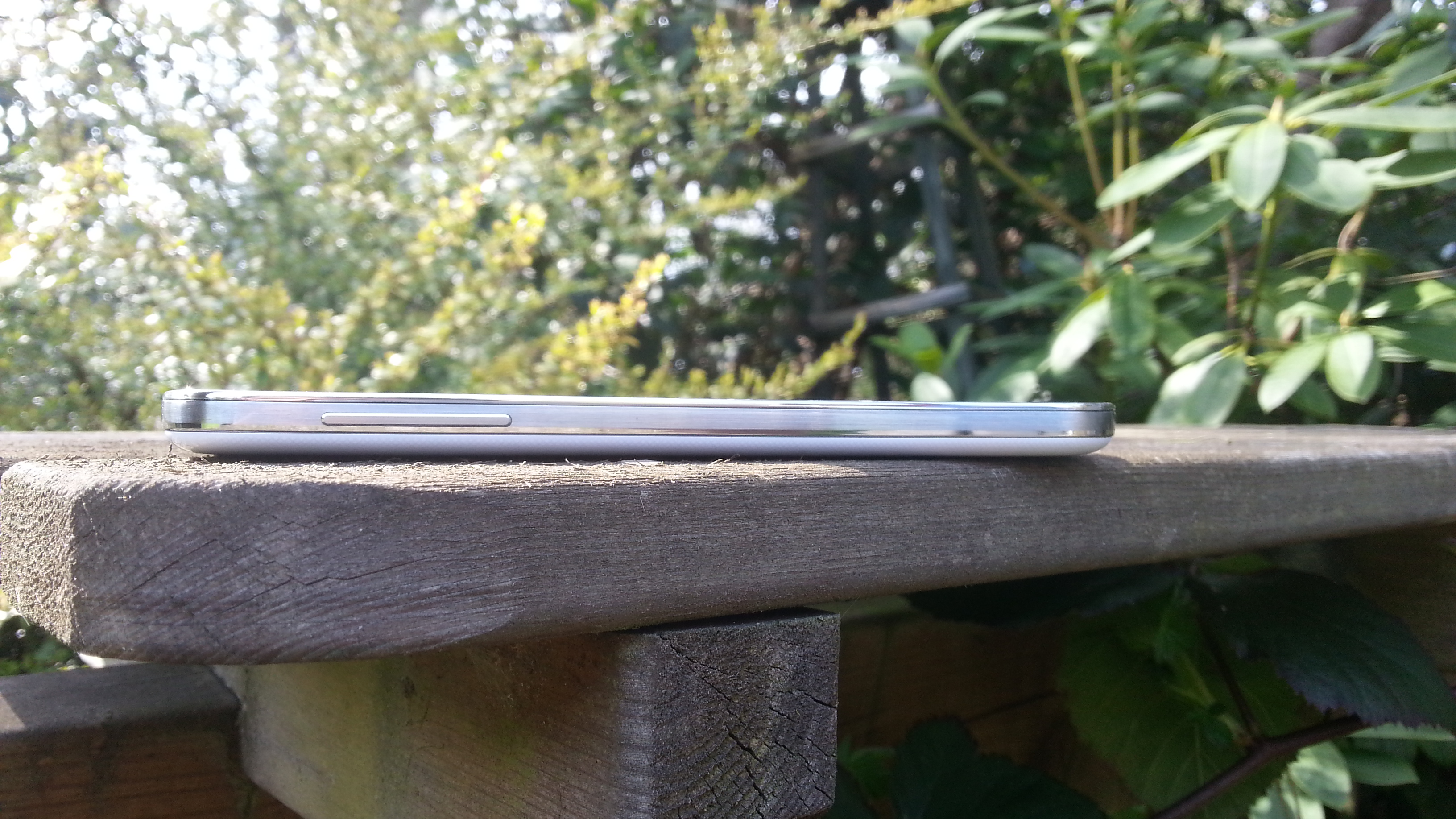
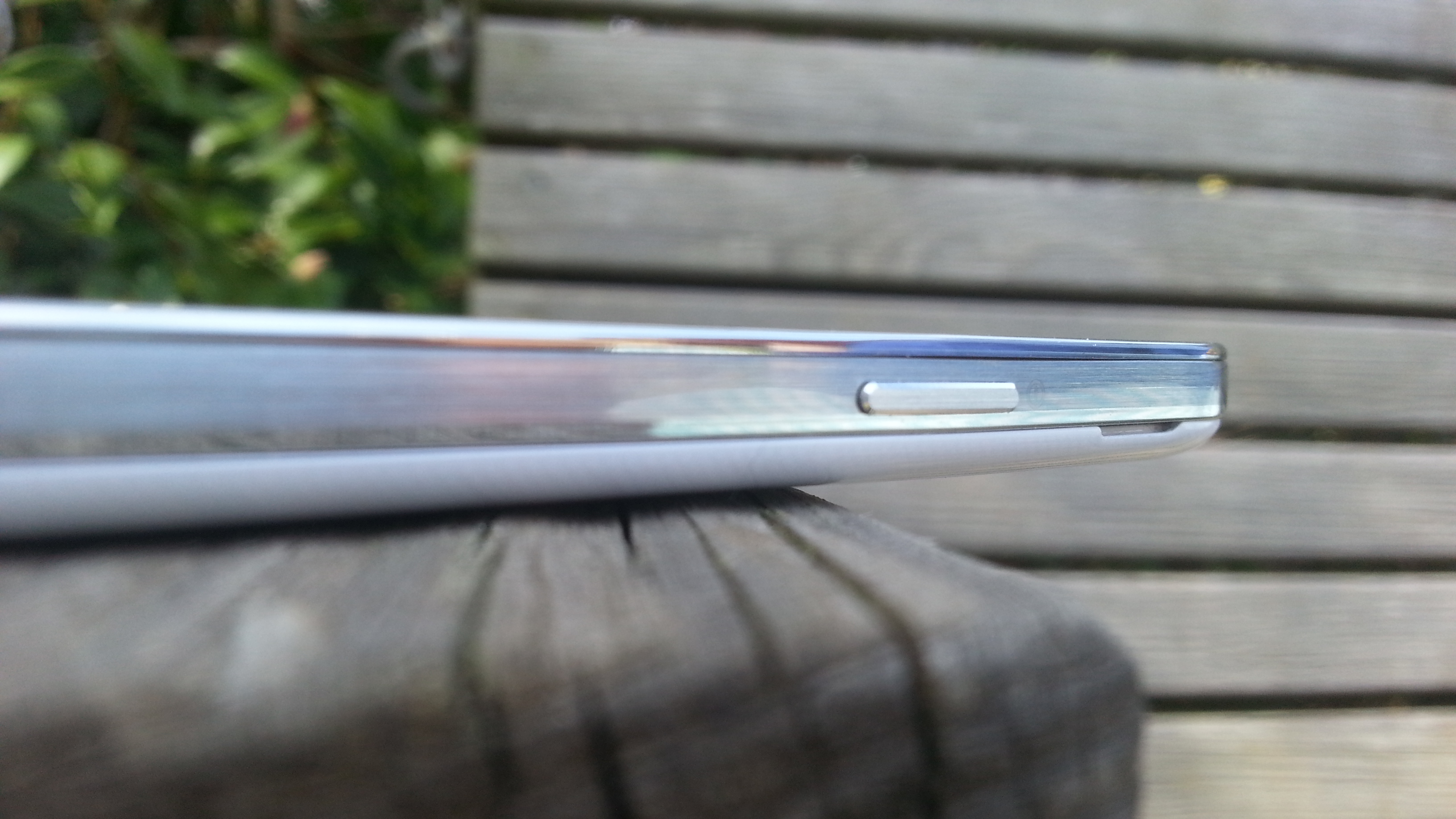
The buttons have barely changed from before - the power button has been shifted slightly on the right-hand side, and is now much easier to hit than it was on the S3. Samsung clearly took some lessons from the Galaxy Note 2, which has a really well positioned power/lock button.
The volume key is less easy to hit, and could be lower down in, but the travel on both of these buttons is satisfying, and you'll always know when you've hit them.
The plastic used on the home key has been upgraded too, with a more solid feel under the thumb when you press down to get back to the main home screen. The two buttons flanking it give you access to menus or take you back from whence you came, and while both are easily hidden, they light up nicely with an even glow when called into action.
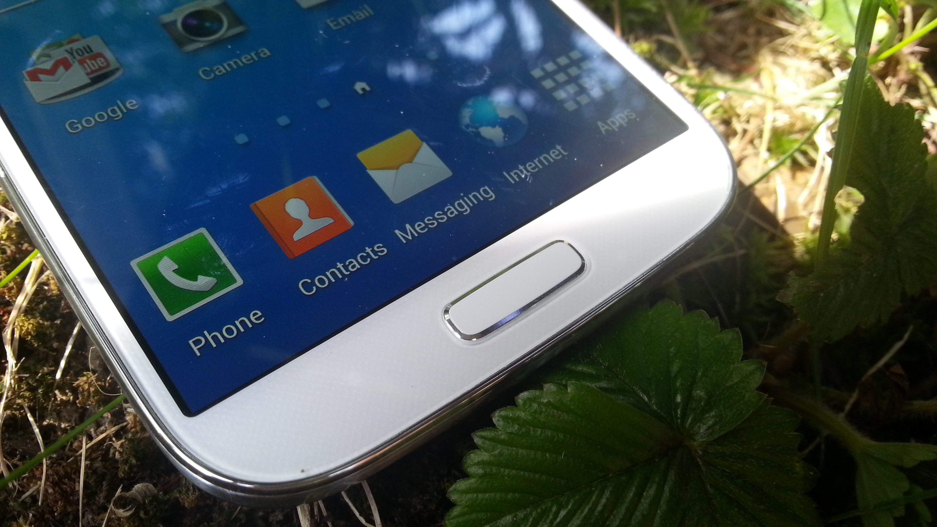
There are loads of sensors on the front of the phone above the screen, including cameras to track your eyes, a 2MP camera for HD video calling and a proximity sensor for knowing where the phone is in relation to your ear. On the white review unit I had their presence looks rather ugly either side of the generous earpiece, but on the darker models this is less of an issue.
The other notable addition to the design of the Galaxy S4 is the infrared blaster on the top of the phone. This enables you to control your TV, satellite box, DVD player, amp and even air conditioner. Again, this isn't a new feature, but it works well in practice, and despite being small is powerful enough indeed.
Other than that, there's not a lot more to say about the design of the phone, as it's just a little underwhelming. I know it's unfair to lambast a brand for not overhauling the design every year, but in the One X and the One, HTC proved that it is possible to offer up a new design over successive generations and still keep things attractive.
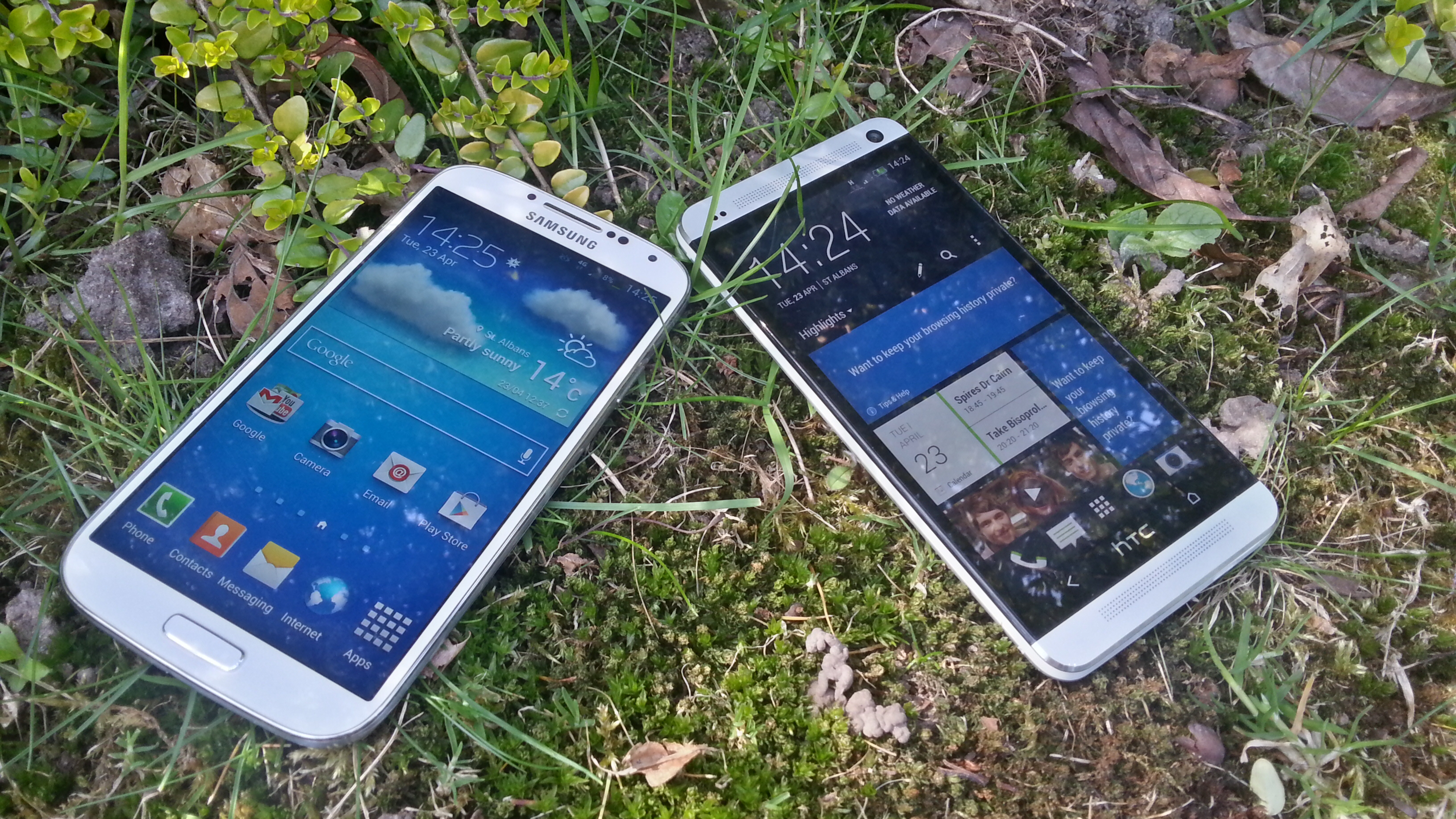
Looking so similar to the Galaxy S3, you can't help but feel Samsung has gone a little too Apple and created something more in keeping with the Samsung Galaxy S3S - a minor update to a great phone to keep those coming out of contract happy that they have a premium phone to upgrade to.
I do implore you to get the phone in your hand before making your judgement though. While it's not got the best design on the market when it comes to materials, it was a big step forward for its time and allows for a grippy and easy-to-hold phone with a whopping screen inside.
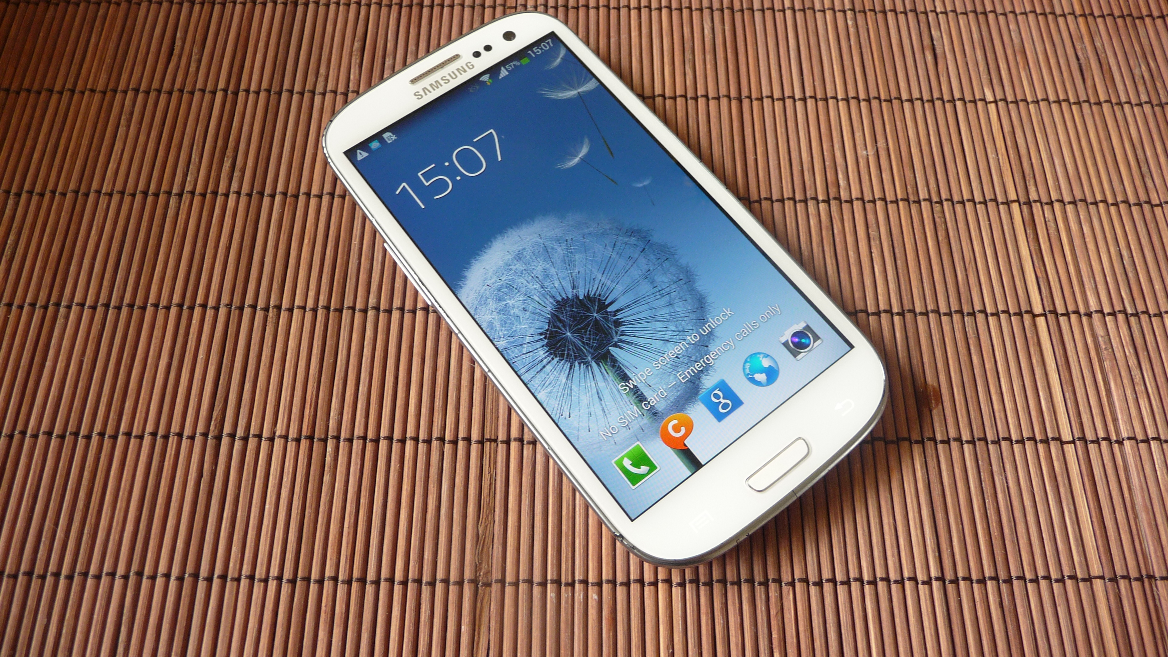
It still feels cheap as chips compared to the iPhone 6 and Samsung Galaxy S6 though.
To just dismiss it for being plastic would be doing the Galaxy S4 a disservice as it has so much more going for it than that. But it's worth remembering that to a lot of people, the way a phone looks is as important as how much RAM it's got on board and how fast the CPU is - if not more so.

Gareth has been part of the consumer technology world in a career spanning three decades. He started life as a staff writer on the fledgling TechRadar, and has grew with the site (primarily as phones, tablets and wearables editor) until becoming Global Editor in Chief in 2018. Gareth has written over 4,000 articles for TechRadar, has contributed expert insight to a number of other publications, chaired panels on zeitgeist technologies, presented at the Gadget Show Live as well as representing the brand on TV and radio for multiple channels including Sky, BBC, ITV and Al-Jazeera. Passionate about fitness, he can bore anyone rigid about stress management, sleep tracking, heart rate variance as well as bemoaning something about the latest iPhone, Galaxy or OLED TV.
