Why you can trust TechRadar
The Samsung Galaxy S4 Zoom runs the latest version of Android- specifically Android Jelly Bean 4.2.2. That's a pretty big deal in itself as many handsets are still stuck on older versions of Android.
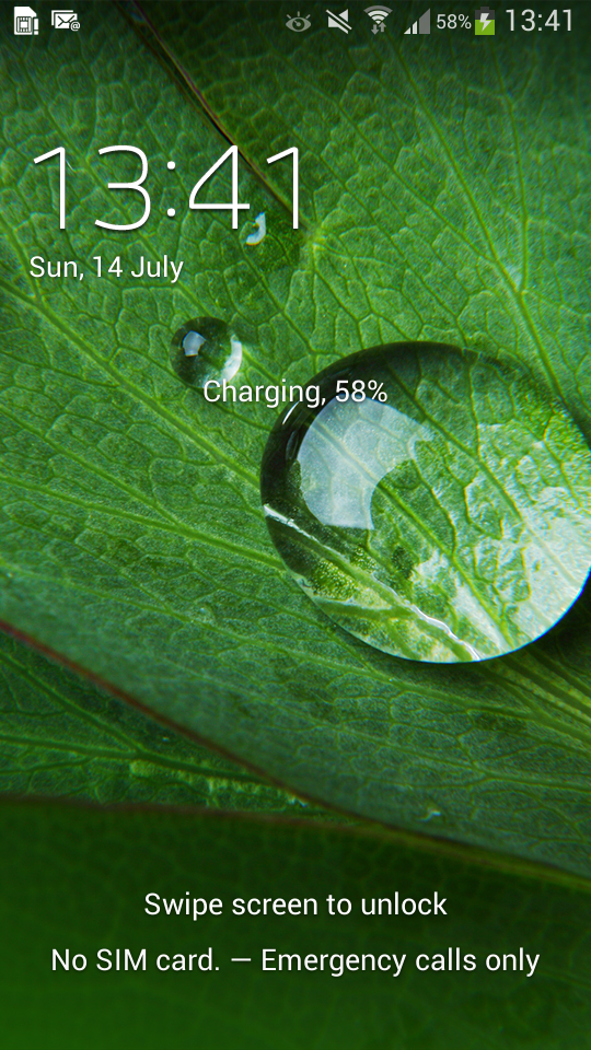
When you turn on the handset you're greeted with the lockscreen. Assuming you don't have any security set up that will just show your wallpaper and at the top you can see the time, day and date along with your next alarm in white writing.
Swiping the screen in any direction will clear it. However you can also set up security options such as a pin code or facial unlock, in which case there'll be a little more on the screen and you will have to do a little more than just swiping it to unlock it.
However you set it up, once you unlock the phone you'll land on your homescreens. These should be immediately familiar to anyone who's used a Samsung Android device, well, ever and shouldn't take too long to familiarise yourself with even if you haven't.
Your homescreens aren't the blank slate that some phones like the Google Nexus 4 give you. Instead they're positively littered with apps and widgets.
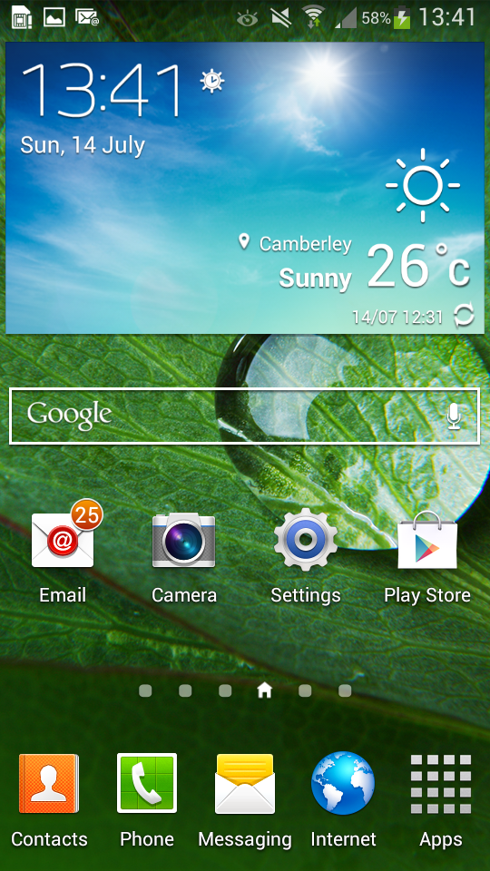
We'll cover the apps in the apps section of the review, but on the widget front you get stories from Flipboard, information on holiday destinations from 'S Travel' (which is basically just TripAdvisor) and a day planner.
There are also big screen filling icons for Samsung Hub - which is Samsung's own app store, and 'Story Album'- which lets you create photo albums based on photos with specific tags, be it a time, date, location or the people in the photos.
It might all seem a bit overwhelming but by long pressing on any of the widgets you can move or delete them, so none of it has to be permanent.
Some of it is quite useful though, for example the planner (called 'Briefing') pulls information from your calendar and Facebook, showing you any new events or updates. You can even get it to show news stories.
Apps can be moved around or deleted from your homescreens in exactly the same way as widgets- just long press them, then drag them where you want to move them to (other apps and widgets will move around them to make space), or drag them up to the dustbin icon that appears at the top of the screen to delete them.
In the case of apps you can also make folders, which can be done by dragging an app up to the create folder icon which appears next to the dustbin when an app is being long pressed. You can then pick a name for the folder and just drag and drop any other apps into it.
Alternatively folders can also be created by long pressing empty space on a homescreen. In which case you get options to either add a folder, add apps and widgets, set your wallpaper or add more homescreens up to a limit of seven.
You can move between homescreens by swiping left and right or by tapping on the little homescreen icons near the bottom of the screen.
At the very bottom of each screen there's a dock with four apps in it. These four apps are a permanent resident of all your homescreens, so you'll never be far from them. The apps given pride of place down here are 'phone', 'contacts', 'messaging' and 'internet', but you can swap them for other apps if you'd prefer.
As well as four apps there's also a permanent icon which takes you to your App drawer. From here you can view and open any and all of your apps, or long press them to delete them or place them on a homescreen.
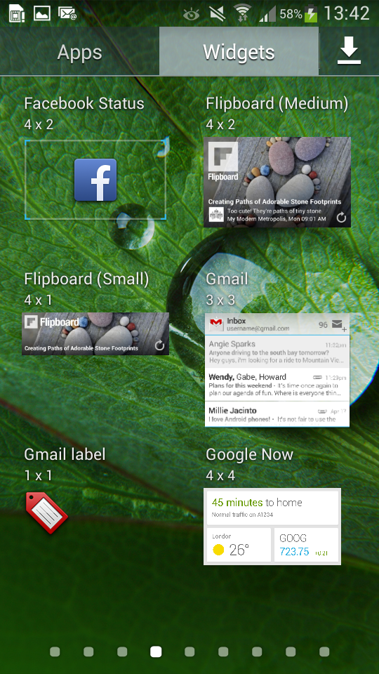
There's also an icon along the top of the app drawer which lets you view all of your available widgets and place any of them with a long press. There are a lot of widgets already littering the homescreens but there are far more available here, from Dropbox folders to music controls and more.
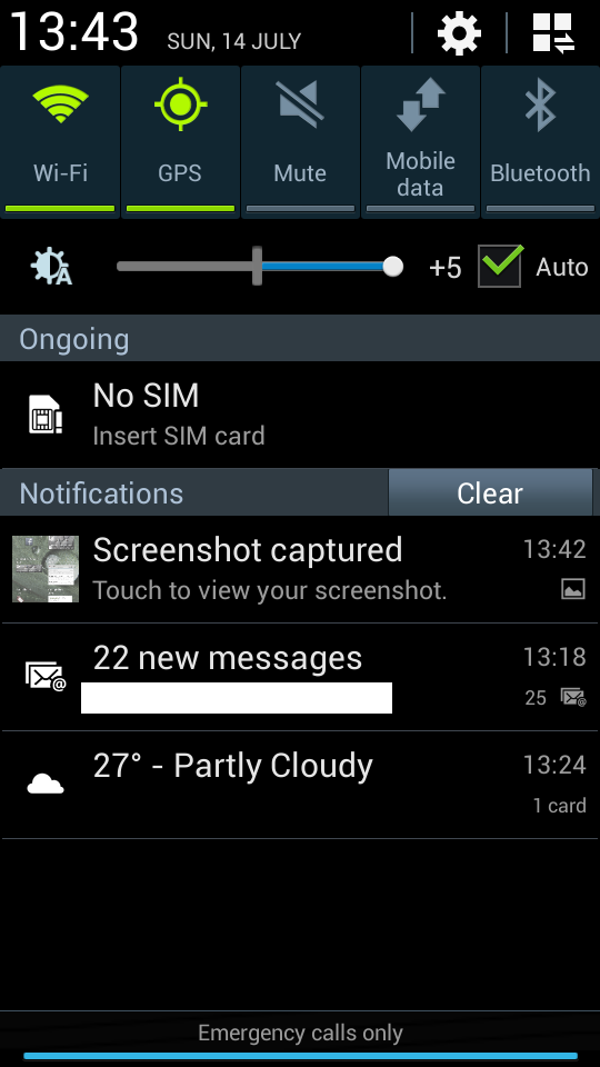
Back on your homescreens you'll find a notifications shade at the top. Like on other Android phones this will take the form of a narrow bar along the top showing you the time, your battery level, any active connections and little icons for any new emails, texts or missed calls.
Sliding it down will give you the whole shade, which shows you full details of missed calls, texts and emails and lets you tap on them to action them as appropriate.
It also gives you a bunch of quick toggles for things like Wi-Fi, GPS and Bluetooth, alongside a brightness slider.
At the very top you can see the time and date and there's a cog icon which will take you to the main settings screen and an icon with three little boxes which will display additional quick toggles (though you can see these anyway from the main shade if you slide your finger horizontally across the visible toggles).
If you'd rather be taken straight to this second screen then opening the notification shade with two fingers rather than one will achieve that.
Aside from tapping and swiping the screen there are three main buttons which you can use to interact with the Samsung Galaxy S4 Zoom. There's a home button, a back button and a menu button and they all lie right below the screen.
The menu button is on the left and tapping it brings up a context sensitive menu with a bunch of options. For example if you tap it when on a homescreen it lets you add apps and widgets, create folders, set the wallpaper, change the primary homescreen, search the web, access the main settings screen or access a help screen which talks you through using your homescreens.
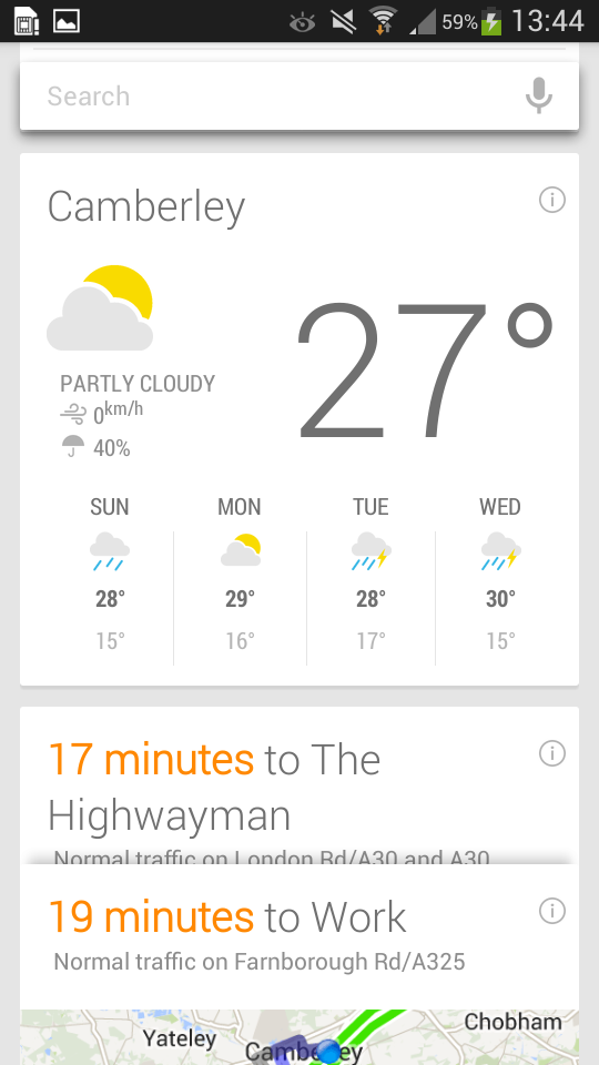
Tapping the menu button when elsewhere will bring up a different set of options. It also has a secondary function, as if you long press it Google Now will launch.
Google Now is essentially Google's answer to Siri, but it's a lot more text based, showing you information tailored to your needs. So for example in the morning it will tell you if there's any traffic on the way to work and give you an estimated journey time, or when you reach a station it might give you train times.
It's a good service and if it ever doesn't give you the information you need you can also type or speak a query.
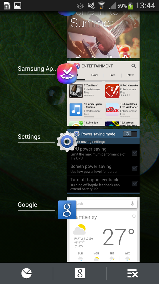
Moving on, the home button is to the right of the menu button. This is the only physical button of the three - the other two are soft touch, light up buttons. Tapping the home button will take you back to your primary homescreen, while long pressing it will bring up a display of recently used apps.
You can then tap on one to switch back to it or swipe it to close it. There is also a button below the list which launches Google Now and another which will close all running apps.
Then to the right of the home button there's the back button which just cycles back through menu screens.
The last thing to go over here is the settings screen. This largely covers the same ground as other Android settings screens, with toggles and setup for network connections, options for brightness and screen timeout delay and other things along those lines.
However there are a few other options which are more unique to Samsung handsets. You can for example choose which quick toggles you want to have available on the notifications shade.
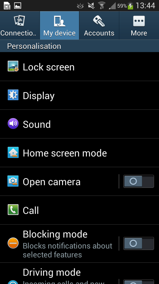
You can also set the phone to launch the camera rather than your homescreens when the device is first turned on - which would be handy if you plan to use the Samsung Galaxy S4 Zoom as a camera first and a phone second.
There are also a couple of smart screen settings, which when activated will ensure your phone display stays on while you're looking at it and that the screen will rotate according to the orientation of your face.
Smart Scroll from the Samsung Galaxy S4 seems to be absent, but the two smart settings that you do get work well enough and can be genuinely useful.
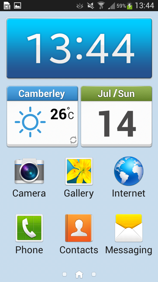
Then there's an option to toggle 'Easy Mode' on your homescreens, which gives them bigger icons and simplified controls - for example you can't long press icons, there are no folders and there's no dock.
It's designed for those new to smartphones and we can imagine it would work well as it's certainly a lot less to take in. Unfortunately it's also buried in the settings screen, so new users may well not even find it until they've got to grips with things.
Actually operating the Samsung Galaxy S4 Zoom is easy enough. It might not be anywhere near as powerful as the full fat Samsung Galaxy S4 but it's generally got enough grunt to glide around homescreen's and menus seamlessly.
There were a few occasions when we had to tap something several times before it would respond, but otherwise it was quite smooth to use.
We wish the screen was slightly better. At 540 x 960 and 256 pixels per inch it's not too bad and in fact it matches the screen on the Samsung Galaxy S4 Mini, but if you've been spoilt by high end phones it will definitely comes as a disappointment, particularly considering it carries a high end price tag. On a more positive note at 4.3 inches it's a decent size and it's impressively bright.
While operating the Samsung Galaxy S4 Zoom is mostly quite intuitive, particularly if you've come from other Android phones, there are a few things that might not be immediately obvious to new users, such as the fact that you can long press icons and buttons.
The wealth of options and widgets can also be a bit overwhelming. Thankfully there is a help screen and an 'Easy Mode', but neither of these are exactly front and centre, so they could take some finding.
Coming from other Samsung Android handsets it should be a near seamless transition and anyone who's used another smartphone or even just considers themselves tech savvy won't likely struggle either, but you might want to think twice before getting a Samsung Galaxy S4 Zoom for your gran.
James is a freelance phones, tablets and wearables writer and sub-editor at TechRadar. He has a love for everything ‘smart’, from watches to lights, and can often be found arguing with AI assistants or drowning in the latest apps. James also contributes to 3G.co.uk, 4G.co.uk and 5G.co.uk and has written for T3, Digital Camera World, Clarity Media and others, with work on the web, in print and on TV.
