Why you can trust TechRadar
Specs and performance
- Powerful processor (Exynos in Europe, Snapdragon in US)
- Excellent speed at opening and closing apps
- TouchWiz interface is refined again, and is much slicker
- MicroSD slot is back for expanded memory
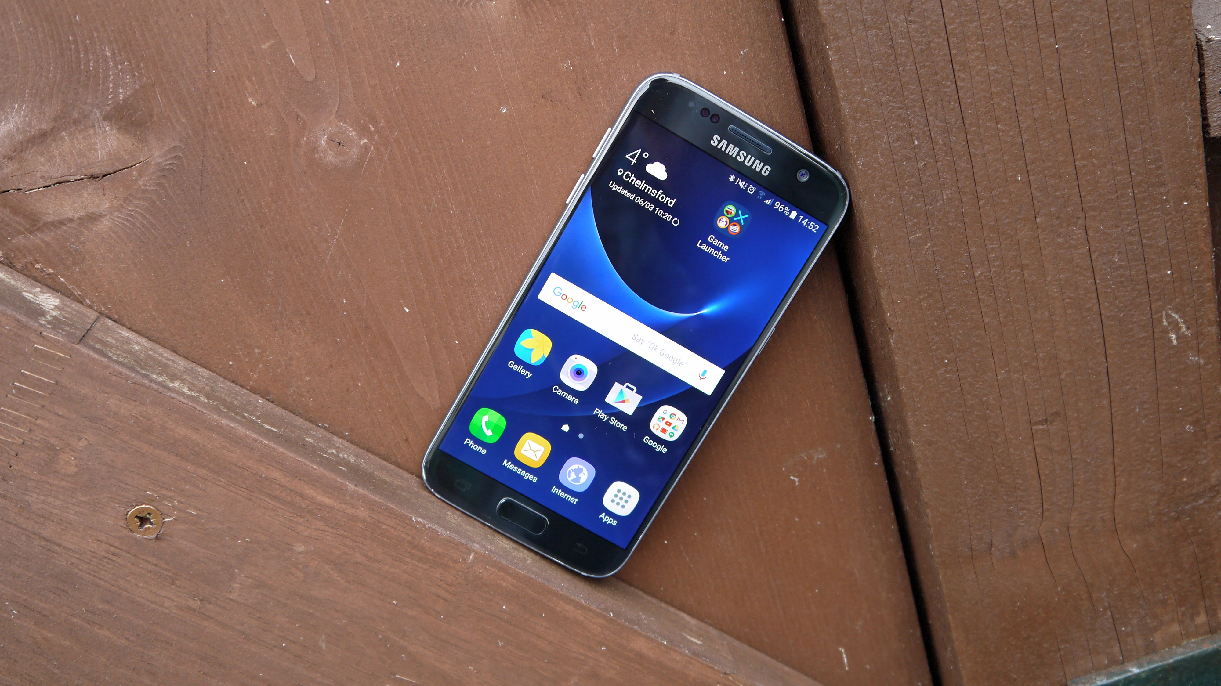
The Samsung Galaxy S7 was a flagship smartphone, so it comes as no surprise that it's packing a punch under all that metal and glass.
Things aren't straightforward specs-wise though, as Samsung has deemed it necessary to produce two variants of the S7, with the difference being the processor inside them.
The majority of the world, including Europe, will find a Samsung-made Exynos 8890 octa-core processor inside their Galaxy S7 (model SM-G930F), providing a huge amount of power for the time and still decent performance in 2018.
Those in the USA get something a little different: a Qualcomm Snapdragon 820 quad-core chip in model SM-G930. The reason for this is that the 820 supports some vital LTE bands required for Verizon and Sprint customers, and the Exynos doesn't offer this.
Now both processors are powerful, and with 4GB of RAM backing each of them up you'll have enough going on under the hood to not slow you down.
However, I had access to both variants during my review, and running Geekbench 3 on them yielded some rather different results, with the Exynos-toting Galaxy S7 coming out comfortably on top.

The Exynos variant scored an average of 6542 on the multi-core test, while the Snapdragon 820 handset averaged 5398 on the same test.
It's fair to say, then, that customers in America have a right to feel a little aggrieved, although in reality you're not going to notice the difference in day to day use.
The bigger news here is that both variants absolutely smash their competitors. The Galaxy S6 managed to clock an impressive 4850, but it pales in comparison to its successor.
As for the competition, the iPhone 6S recorded an about-average score of 4417, the Sony Xperia Z5 came in at 4015 and the HTC One M9 only managed a lowly 3803.
Meanwhile the Snapdragon 820-toting LG G5 set an average score of 5386, matching that of the S7 variant with the same chip. The HTC 10 managed 4962, which is miles below too - either Samsung has the most powerful phone on the market (probably) or it's 'optimising' the S7 during the tests... which it has been known to do in the past.
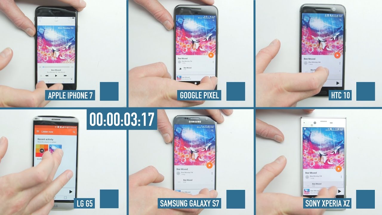
For a slightly different test, we pitted the Galaxy S7 against five of its main competitors to see how well it coped with opening up apps at speed. We ran our speed test on each of the phones to see how fast it could run through 10 apps.
See how the Samsung Galaxy S7 fared in our smartphone speed test video

The test found the iPhone 6S was slightly faster than the Galaxy S7 in opening up apps at speed, but only just with it coming two seconds behind. The boot up time on the Galaxy S7 took quite a while which added eight seconds onto the iPhone 6S time.
This is a very particular test and isn't the only way of showing speed, but it shows the Exynos version of the Galaxy S7 is a speedy handset. Of course, newer flagships and even some upper mid-rangers have it beat now, but this is still a capable phone, especially for what it costs.
Navigation is smooth on the S7, apps load promptly and Samsung's cleaner, fresher TouchWiz feels more lightweight and easier to manage this time around.
Android purists will still kick up a stink at Samsung's insistence on playing with app icons – which are an improvement over the S6's designs – and on bundling in bloatware and generally adding more fuss to the system.
Anyone currently looking to get the latest version of Android on this phone (that's Android 10 if you're interested) will be out of luck, but the S7 has had two major updates - first to Android 7 Nougat and then to Android 8 Oreo.
What did these updates bring? Better battery life, faster updates and access to the new Google Assistant - but sadly not Daydream VR support.

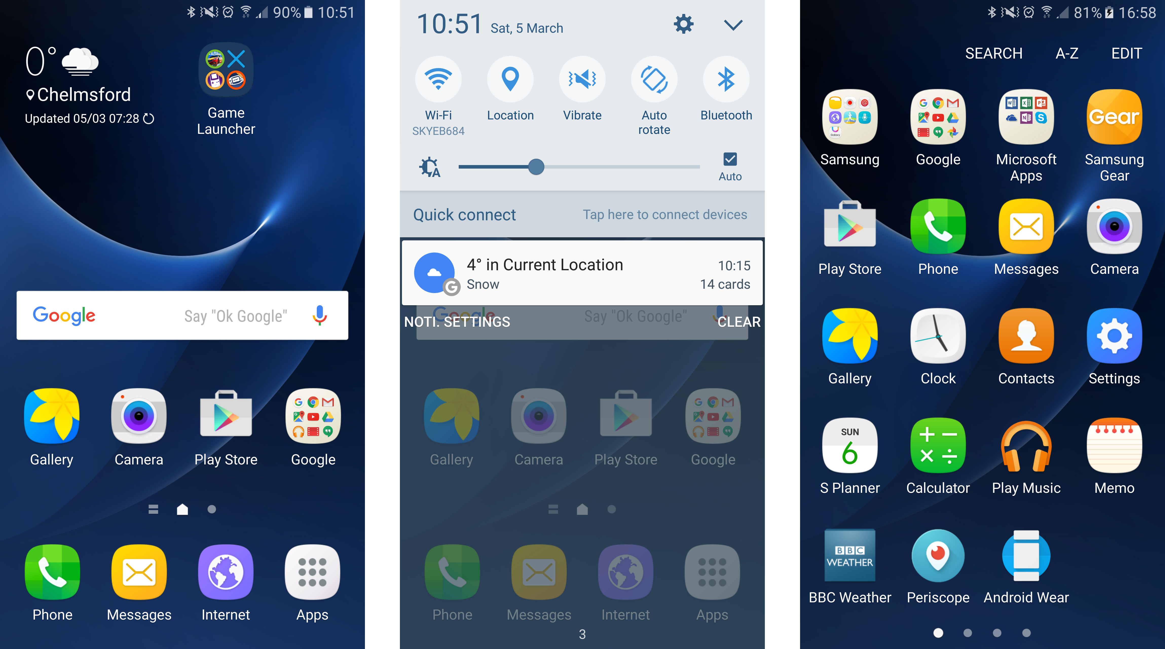
Apart from the slightly smarter app icons, another obvious area where TouchWiz has been tweaked is the notification bar, which is now a more pleasing blue-on-white affair.
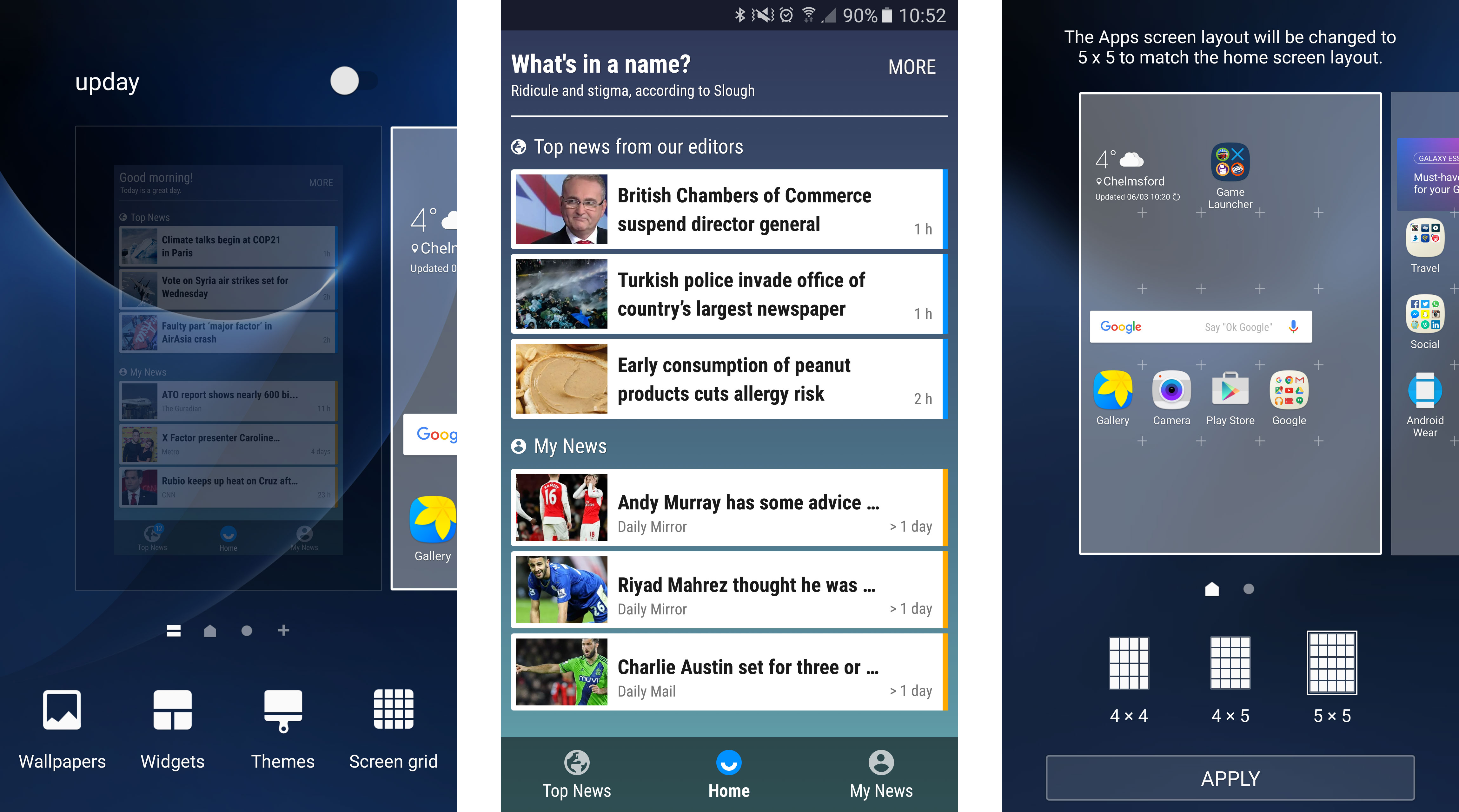
You get the usual array of quick settings here, along with a brightness slider, while swiping left to right on the home screen opens the upday (or Flipboard if you're in the US) news aggregator.
This is okay for a general splash of the latest news centered around a few topics you define as favorites, but I didn't find myself visiting it all that often. The good news is that you can turn it off, so you never have to look at it.
Those of you who like to cram your home screens full of apps may find the default 4 x 4 layout of the Galaxy S7 a little restricting. That can be addressed, though: just hold down on a home screen and you can change the grid layout to either 4 x 5 or 5 x 5.
The latter option can feel tight on the 5.1-inch display – but just think of all those extra apps you can squeeze in.
Samsung's split-screen view is also still in full force on the Galaxy S7 – hit the multi-tasking button to the left of the home key and apps which can perform the half-screen view trick will have an icon next to the cross button.
The annoying thing about this feature is that only a select few apps can actually go split-screen. Core apps such as Chrome, Gmail, Gallery and so on are supported, along with a handful of third-party options including Facebook, Twitter and Microsoft's Office suite.
While split-screen view may be mildly useful for business types on the move, in reality I found very little use for it on the Galaxy S7.
Something else I found frustrating was the ability to reduce apps to a floating window on screen.
It's potentially useful on the very odd occasion, but because the swiping motion to trigger this is very similar to the action to pull down the notification bar I found myself repeatedly shrinking apps when all I wanted to do was see my quick settings. #rage.
There have been some improvements in the keyboard department too, with slightly better spacing and next word prediction on offer, but the Samsung board still frustrates.
Simple actions such as employing a comma are not particularly easy, and I'd still recommend downloading a third-party offering such as SwiftKey if you do a lot of typing on your phone.
- Samsung Galaxy S7 problems? Here are some of the most common issues

TechRadar's former Global Managing Editor, John has been a technology journalist for more than a decade, and over the years has built up a vast knowledge of the tech industry. He’s interviewed CEOs from some of the world’s biggest tech firms, visited their HQs, and appeared on live TV and radio, including Sky News, BBC News, BBC World News, Al Jazeera, LBC, and BBC Radio 4.
