Why you can trust TechRadar
The Samsung Galaxy S7 Edge has two variants: one running the Snapdragon 820 quad-core CPU from Qualcomm (available in the US) and the other using Samsung's own Exynos 8890 octa-core CPU for the rest of the world. Both chips are paired with 4GB of RAM.
The reason for the different chips is that the Qualcomm 820 can handle LTE bands that Samsung's can't, and Verizon in the US needed a chip that could use its network. I'm reviewing the Exynos version, which benchmarked higher than the Qualcomm chipset using Geekbench.
With those specs you'd expect everything on the Galaxy S7 Edge to run smoothly under the finger, despite having a skin on top of Android 8.
For all those who say "Oh, I hate TouchWiz", and use it as a reason not to buy a Samsung phone, well, you're running out of reasons to be so pigheaded.
We're not saying that it's the same, better or worse than stock Android; but then again many brands are still skinning their phones without attracting the same level of vitriol that the South Korean giant gets for its overlay.
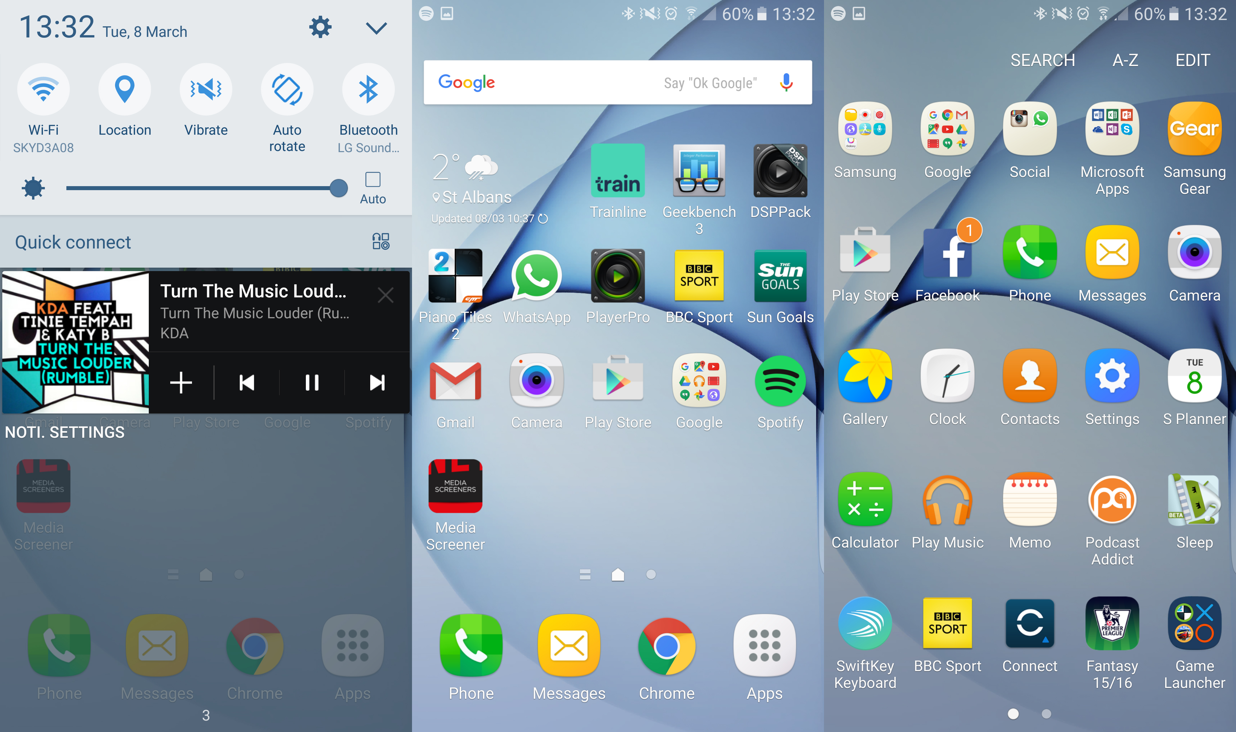
The menu is now one long scrolling list of options, the icons are even flatter and easier to use and see, and your customization options are plentiful; in short, we can't really fault TouchWiz as a skin.

We do think there's more that can be offered in terms of tweaks and tricks to make things work a little better, but if you want that level of customization look at the Huawei range and its Emotion UI, as that's going to offer you the chance to alter nearly every element.
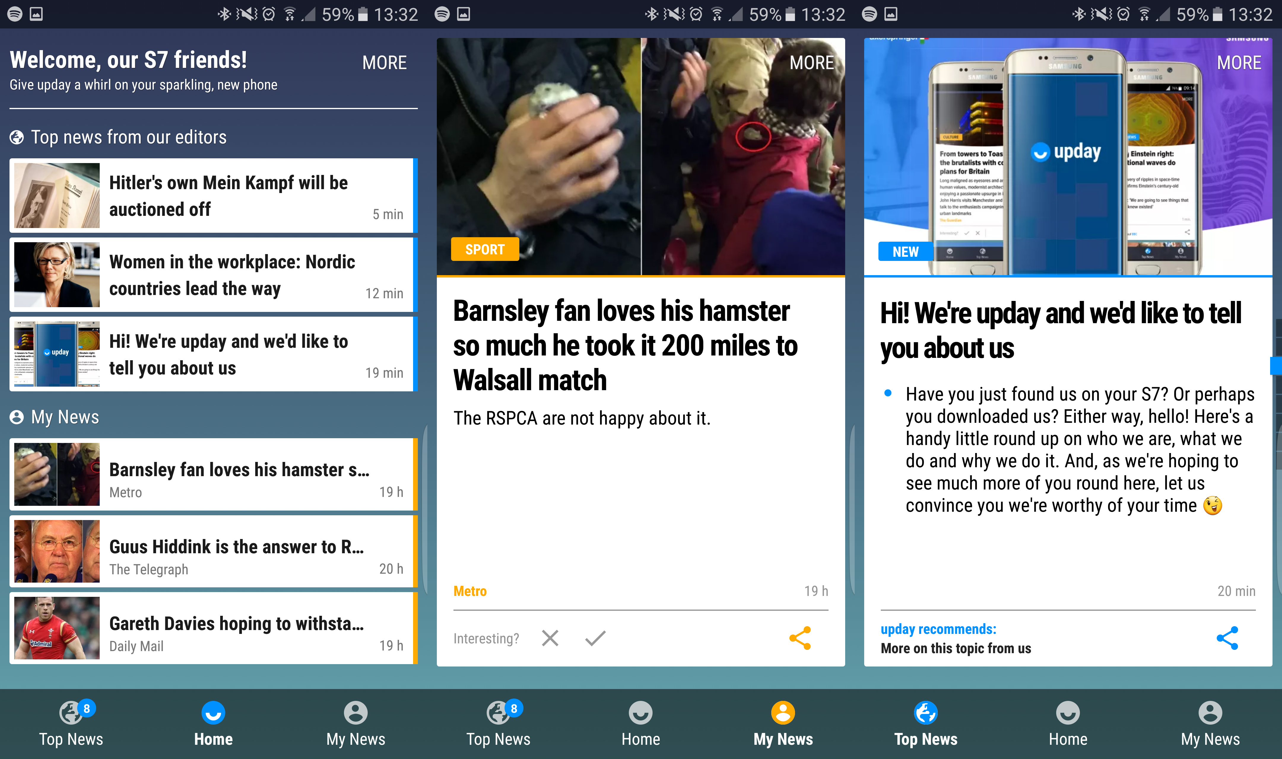
The new addition for the S7 Edge is the upday portal to the left of your main home screens, which replaces Flipboard in non-US versions of the phone as the default news aggregator.
It's better than Flipboard in some ways: first, the curated news is decent, and if you spend a little time customizing the topics you'll generally find something relevant (although if you do spend time with Flipboard, you'll arguably get a better mix over time).
However, upday presents itself as 'Apple News with brains' and that's a little OTT – it feels equally as informed as the iPhone service, but perhaps with a sheen of editorial interaction on top.

But it's really limited: it takes from sources that you can't define, and while we spent time trying to tell it what we did and didn't like it wasn't as good as other services, or dedicated apps that do the same thing.
HTC's Blinkfeed, for example, is a much more fully-featured portal, giving you the chance to choose your sources as well as mixing in Twitter and Facebook to give you some truly good elements to flick through during idle times.
It's easier to just turn off the service, as it'll save a little battery too. You do get SOME good news, but unless upday improves soon we can't say it's a big improvement to the mix.
The Galaxy S7 Edge initially launched with Android 6, but Samsung has since pushed out the Android 7 and Android 8 updates to the handset, bringing it more in line with the newer Galaxy S8 and even the Galaxy S9. However, this might be the end of the line in terms of updates, as it probably won't get Android 9.
Edge display
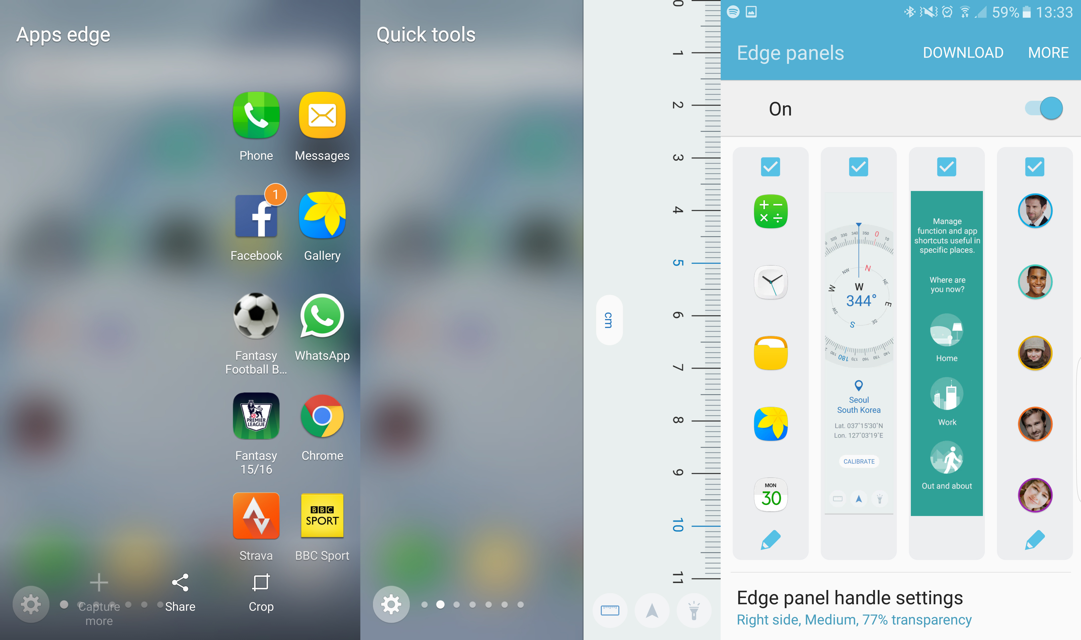
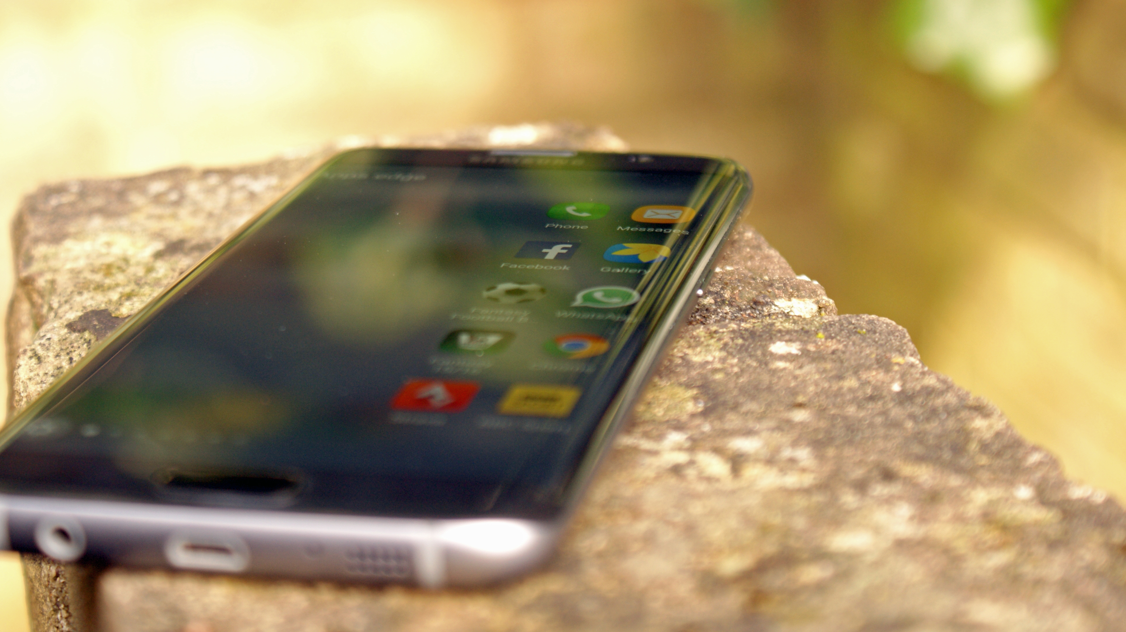
The edge display on the Samsung Galaxy S7 Edge is, thankfully, finally useful. When the Galaxy S6 Edge launched you could essentially just flick the side of the screen and see a list of your favorite people. Woo.
Here you can set your favorite apps, choose more people to talk to (and do more things with them), open tools and see the weather.
There are more features coming too, with the downloads section of Samsung's Galaxy App portal starting to see more come through each day – so whether you want to clean up the RAM, get different news feeds or just keep an eye on what's trending on Twitter, you've got those options.

It's great to see that with the launch of the S7 Edge you can now have double-width widgets, so you can pack more info into that little swipe. Yes, this feature came to the S6 Edge range, but the S7 Edge feels like the poster child for the extra width.
The other change is that the 'stroke it for ages when the phone is turned off and the edge display will sometimes show the time' feature is gone, as it was just awful. It took ages, and you might as well have just turned the phone on.
The night display feature is still there from the S6 upgrades though, and that little sliver of information is a better choice than the always-on display, although it still pumps out a little bit of light in a pitch black room.
In short: we now use the edge screen day to day as an easy way to get to the apps we want, as well as easily access the torch. That's not something we ever contemplated with the S6 Edge, as a combination of initial lack of functionality and less comfortable swiping meant we just ignored it – and for some reason, we find it more tactile on the newer phone.
Current page: What's it like to use?
Prev Page Game Launcher and microSD slot Next Page Battery life
Gareth has been part of the consumer technology world in a career spanning three decades. He started life as a staff writer on the fledgling TechRadar, and has grew with the site (primarily as phones, tablets and wearables editor) until becoming Global Editor in Chief in 2018. Gareth has written over 4,000 articles for TechRadar, has contributed expert insight to a number of other publications, chaired panels on zeitgeist technologies, presented at the Gadget Show Live as well as representing the brand on TV and radio for multiple channels including Sky, BBC, ITV and Al-Jazeera. Passionate about fitness, he can bore anyone rigid about stress management, sleep tracking, heart rate variance as well as bemoaning something about the latest iPhone, Galaxy or OLED TV.
