Why you can trust TechRadar
Without touchscreen goings-on, the Samsung Genio QWERTY's user interface is based on a conventional type of Samsung menu system, with a grid format main menu and subsequent lists and tabs as you proceed through the phone using the navigation keypad.
The navigation pad also prompts the usual feature shortcuts – out of the box these include new message, music player, and a buddy list.
The buddy list allows you to display five of your favourite contacts, with photos, enabling you to make calls or send texts quickly and to view logs of your communications.
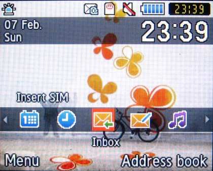
However, the home screen does have some customisation features, including a quick-access 'shortcuts toolbar', and a sidebar option which is enabled out of the box on the Orange version of the handset.
Both of these options can be switched on or off from within the menus, and if they're on, they restrict the navigation pad shortcuts.
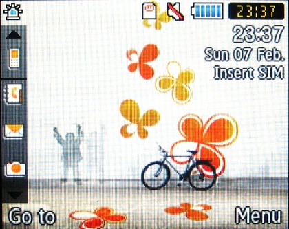
These shortcut toolbar features are easy to operate and intuitive. Rows of feature icons are displayed, which can be browsed through and selected from the navigation pad.
They're not particularly whizzy or sophisticated like Samsung's TouchWiz touchscreen widgets.
The shortcuts toolbar, which runs in a strip across the bottom of the display, can be edited to your tastes; five shortcuts are pre-set (messaging inbox, new message, music player, organiser and alarms), though up to 15 can be used, and all can be assigned to one of a dozen features or applications.
It's a useful option to have to hand, though not a particularly special feature.
Oddly, it's switched on or off via the phone's wallpaper menu rather than the separate Shortcuts Toolbar menu (which is used for editing options only).
With the Orange sidebar activated, though, the Shortcuts toolbar option can't be selected, as they won't work together, like some sort of Sharks and Jets dance face-off.
The out-of-the-box Orange sidebar can be switched off or activated via the Home screen menu options, again quirkily located in the Phone Settings menu rather than in the Display and Light menus.
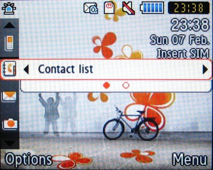
Navigation of the sidebar differs slightly from the simple highlight-and-select shortcuts toolbar.
As you scroll down the sidebar, you can also scroll across to get additional options for that particular icon – for example, different messaging options under the Messages icon, or links to different parts of the Orange World portal from that icon.
Again, it's not particularly innovative, but it makes accessing certain applications quicker and easier directly from the home screen.
Not that the Genio QWERTY's menu system isn't accessible enough in itself. Samsung's convention of using numbers next to sub menu options for quick selection is used again here, cutting down on having to continuously scroll as you drill down through the sub menus.
Apart from the quirkily placed shortcuts settings mentioned above, most of the Genio QWERTY's menus appear straightforward to work through and uncluttered, so shouldn't present too many issues for Samsung newcomers.
Current page: Samsung Genio QWERTY: User interface
Prev Page Samsung Genio QWERTY: Overview, design and handling Next Page Samsung Genio QWERTY: Calls