Why you can trust TechRadar
Ah, we were looking forward to this. The internet experience on the Samsung Jet. Overhauled, re-vamped and ready for anything, the launch promised us a new internet experience from Samsung.
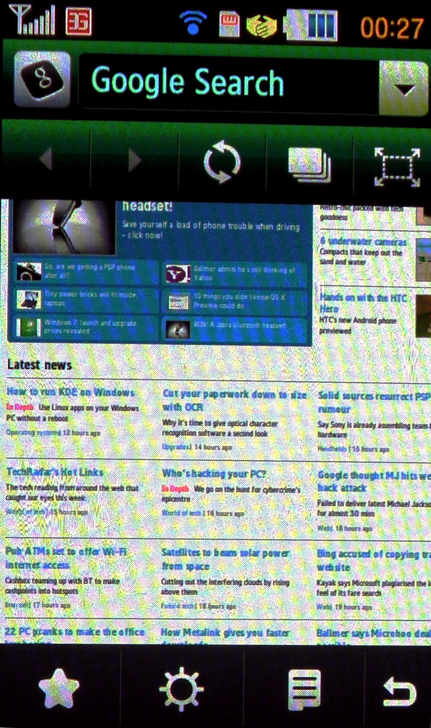
And it certainly was an improvement on the Tocco Ultra Edition, with extras like being able to toggle the address bar to not only accept web pages, but also Google search and on-page text search.
Added to that was the ability to have multiple pages open at once, and you can see that Samsung has gone to town on the new web browser.

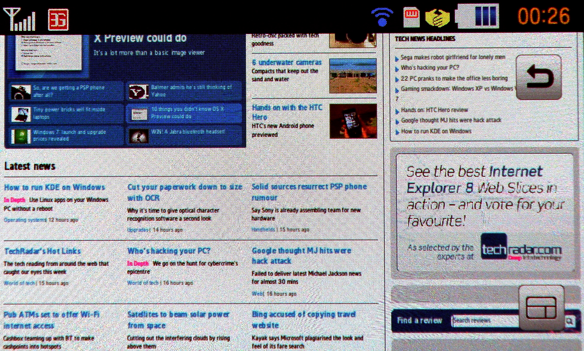
Except, well, it hasn't really. It's essentially the same web browser as found on the other TouchWiz handsets with a few new party tricks. When browsing, the phone would flip between offering you a mobile version of a page or the full HTML, although much of the problem can be laid at the feet of Google.
For instance, the BBC home page is brilliant when accessed via the mobile portal, and a nightmare to load when not.
When using the in-built Google search bar to search for said site, it takes you straight to the full HTML page, and you have to scroll for the mobile version. However, type it into the address bar and it auto-finds the right version.

Perhaps the fact that this is the only way forward isn't anything to do with the software, more to do with the fact the whole experience is cramped on the 3.1-inch screen. After the beauty of Safari Mobile, or even Opera Mini, the TouchWiz internet browser just feels under powered and too cluttered.
We tried to open up a few sites at once, and it worked, but you're never going to use this in the same way you would on other phones (ie the Android line up or the iPhone 3GS). It simply takes to long to load them in full HTML, and WAP versions of sites are 90 per cent boring.
One nice touch is the 'Hide Ad' function, which masks the advertisements on sites to help speed up the loading process - but this still didn't bring the overall speed of the browser in line with other internet-enabled smartphones.
The final piece of irritation is the lack of smart fit on board, or at least one that we could find to easily toggle on and off. Double tapping does bring things closer, but only after the Samsung Jet S8000 has had a chance to think about what you're after and then zoom in on the page.

Hitting links isn't easy either, with sometimes a double tap and sometimes a single tap needed to register a push, and even then there's a slight delay before the haptics confirm you've hit the right spot. As we mentioned at the start of this section, the new upgrade was a chance to get things right (Samsung's managed it on its Symbian devices, and even its Windows Mobile efforts to a degree) but it hasn't managed that with the Jet.

Gareth has been part of the consumer technology world in a career spanning three decades. He started life as a staff writer on the fledgling TechRadar, and has grew with the site (primarily as phones, tablets and wearables editor) until becoming Global Editor in Chief in 2018. Gareth has written over 4,000 articles for TechRadar, has contributed expert insight to a number of other publications, chaired panels on zeitgeist technologies, presented at the Gadget Show Live as well as representing the brand on TV and radio for multiple channels including Sky, BBC, ITV and Al-Jazeera. Passionate about fitness, he can bore anyone rigid about stress management, sleep tracking, heart rate variance as well as bemoaning something about the latest iPhone, Galaxy or OLED TV.
