Why you can trust TechRadar
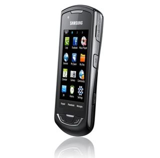
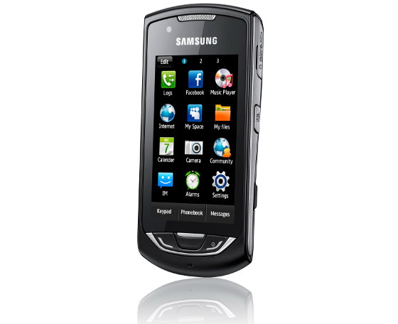
The Samsung Monte really caught our eye straight out of the box. Lightweight, with sleek lines and comfortable in the hand – we were looking forward to turning it on.
Sadly, the excitement didn't last long past hitting the power button. A budget capacitive touchscreen phone is a great idea by our reckoning, but what good is a control scheme you can't trust to actually choose the right option?
We're still not entirely certain if it's just the software at fault, or if it's the screen itself, too. We'd have rather had a good resistive screen than a poor, under-utilised capacitive one, if that was the choice.
The virtual numberpad instead of a QWERTY is a bold move. We would have preferred to have the latter (or maybe an option), but we appreciate that for some it may actually be a point in the Monte's favour, so we won't criticise Samsung for that.
We liked
The Monte really does have a nice design, with gentle curves and a comfortable grip. Yes, it feels a little plasticky, but it's solid and well-built.
The contacts list is well thought out, if blocky and unexciting. It's very easy to search or scroll, and the different call/message options are well presented.
It's nice to see a focus on online functionality on a phone at this price, and this is helped in no small part by the good 3G signal the Monte picks up. While the social networking apps may not blow you away in terms of usability, this is still a worthy way to update your various statuses when out and about.
The camera is surprisingly good for a modest 3.2-megapixel affair. The key to this is a fast shutter speed. There's no lag, and therefore no motion blur, which many camera phones suffer from. The impressively sharp images from the Sports mode really demonstrate the good job Samsung has done here.
We disliked
To say we disliked "using the phone" would be overly harsh, but there are far too many times when navigating the phone passes well beyond 'trying' and into 'tooth-grinding frustration'.
Flicking through the home screens is often unresponsive, and occasionally involves accidentally grabbing a widget. Scrolling through most lists means inadvertently choosing an option you didn't want once or twice, and links in the browser sometimes just don't respond at all.
Some of the options, like the Wi-Fi and Bluetooth, have pointlessly flashy interfaces that not only make it harder to see what's going on, but just mask more sensible list options anyway. You can't help but feel Samsung would have been better off just focussing on getting the touchscreen working.
The browser has a good interface, but is slow to render and regularly cripples the phone, ruining any good grace it may have earned.
The email wizard is needlessly difficult to use. If it takes technology reviewers several attempts to get right, what chance does a hipster teenage socialite have?
Verdict
When it comes down to it, we just can't recommend the Monte. It gets the basic functions right, so we commend it for that, but it's so frustrating to use.
We know it's aimed as being somewhat budget compared to smartphones, but it's still £120 – and this doesn't feel like £120 of quality overall.
We'd advise those interested in the Monte to glance over at its stablemate, the Genio Slide. It's got a touchscreen and a physical QWERTY keyboard, which alleviates at least some of the control issues we have.
Indeed, this is the final nail for the Monte. It's not the worst phone in the world, but there are much better phones available, even from the same manufacturer.
Want to get rid of your old mobile? Compare and get the best price
Current page: Samsung Monte: Verdict
Prev Page Samsung Monte: Official gallery