Why you can trust TechRadar
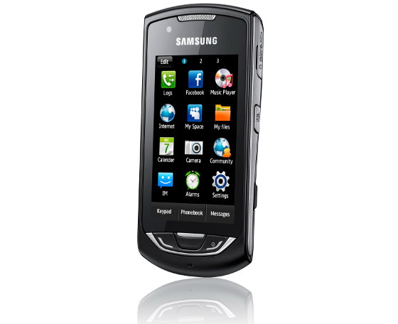
Like the Samsung Genio Touch, the Monte features a capacitive touchscreen for prodding the familiar TouchWiz interface.
The Genio Touch didn't really make full use of the extra options offered by a capactitive screen, and it will probably surprise nobody to learn its the same situation with the Monte.
Multi-touch is notable only for its continued absence. To its credit, the operating system isn't actively confused by extra touches, but just ignores them.
Scrolling is smooth, but the rate changes smartly depending on what you're doing. It's basically one-to-one when browsing the web, but goes faster than your finger when going through your long contacts list.
The problem with scrolling is that the TouchWiz interface struggles to discern whether you're scrolling or selecting something, and if it can get it wrong, it will. You need to carefully choose where you place your finger to start scrolling, which isn't good enough.
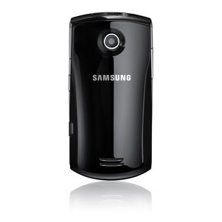
Not only that, but the Samsung Monte frequently takes a couple of taps before it registers your choice, or sometimes misses swipes completely.
At first, we thought the touchscreen was a bit suspect and the TouchWiz interface a little slow. After spending more time with the phone, we now think the touchscreen is mostly fine, but the software is drastically inadequate.
A good touchscreen interface is reliant on your ability to accurately select a button you can see on the screen. The Monte's interface occasionally lags so much that you'll think your touch hasn't registered, so you tap a different option.
Suddenly, the screen changes, and that second tap has been queued up and applied to whatever new button appears there. Now you're calling someone/searching for something/loading a web page you didn't mean to.
It's confusing the first time, frustrating the second time, and may cause no small amount of rage whenever it happens after that.
Ignoring performance, the TouchWiz interface is handsome enough, and it's not too difficult to find your way around (though we probably wouldn't go so far as to use the word 'intuitive').
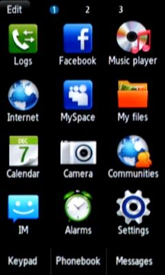
You might wonder why Google Maps is under 'Games' in the menu (and why there aren't any games in there), but it's all easy enough to get to grips with.
The home screen widgets have value in terms of being shortcuts to websites and phone options, but are no match for dedicated apps.
Flicking between your three home screens is a laggy affair and we didn't really see that it was worth the bother most of the time.
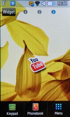
The 3-inch screen is a little small for the whole information-at-a-glance ethos, and using the juddery touch controls to fit more than one or two decent widgets onto one screen is like taking a spatial awareness IQ test using only your feet.
Current page: Samsung Monte: Interface
Prev Page Samsung Monte: Design and handling Next Page Samsung Monte: Calls and contacts
I tested the stylish Apple Milanese Loop watch band – here's my verdict on whether it's worth that hefty price tag

Millions of Americans are missing out on cheap unlimited cloud storage - how to check if you are one of them

Netflix launches trailer for Black Mirror season 7, giving us a look at its first-ever sequel episode and an unexpected returning character
