Why you can trust TechRadar
Samsung Solid Immerse review: Interface
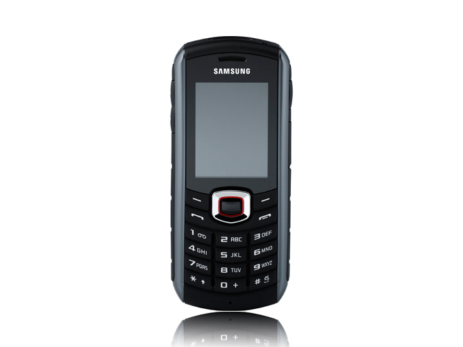
Samsung has tried to make the most of the interface options on the Solid Immerse, offering you a few different ways of configuring the look and feel, but this is no touchscreen handset with widgets galore to call on.
As a non-smartphone, it harks back to the glorious days of press-and-happen. That means you press a button, and the Solid Immerse does it straight away.
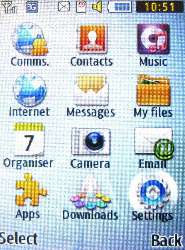
You can choose between different themes for the look and feel, and fiddle with font styles too.
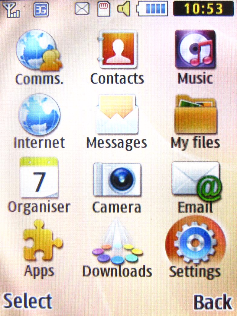
None of the combinations presents a radical change, but at least there is some personalisation.
The Themes screen offers the option to download some new themes too, though there were none available when we looked online for some.
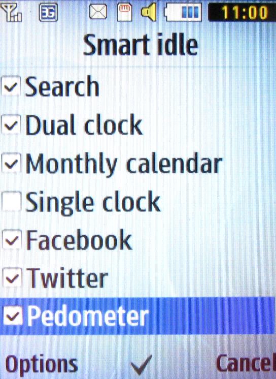
You can also decide how many shortcuts to have on the Home screen to apps and data. You can go really mad here, checking as many options as you like from a fairly long list that includes Facebook and Twitter updates, a monthly calendar and even pedometer data.
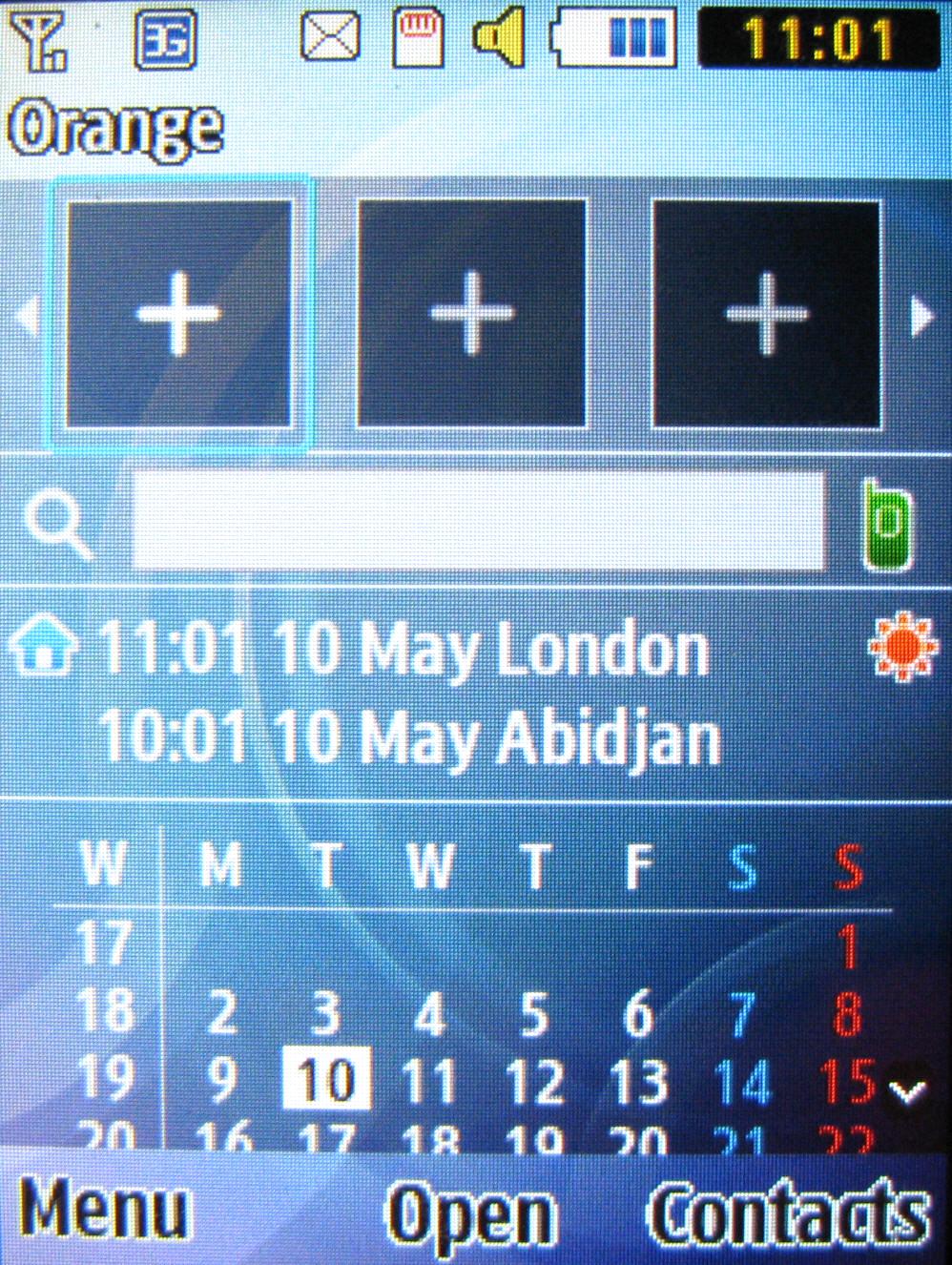
If you choose more elements than can be shown on the screen at once, you'll simply have to scroll horizontally to see them all.
Sign up for breaking news, reviews, opinion, top tech deals, and more.
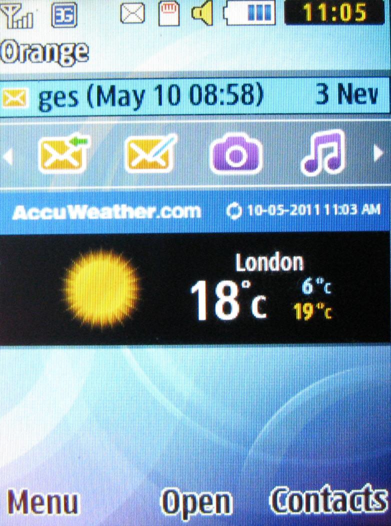
Minimalists might want to stick to having just an apps shortcut bar and maybe a weather app – one of a couple that update automatically.
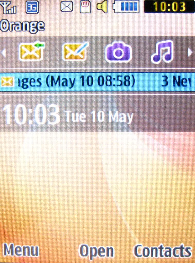
Once you've fiddled with the options on offer and set up the Home screen the way you like it, there is capacity for a fair bit of personalisation, though it's nothing like what you'll get on a smartphone.
Current page: Samsung Solid Immerse: Interface
Prev Page Samsung Solid Immerse: Overview, design and feel Next Page Samsung Solid Immerse: Contacts and calling