Why you can trust TechRadar
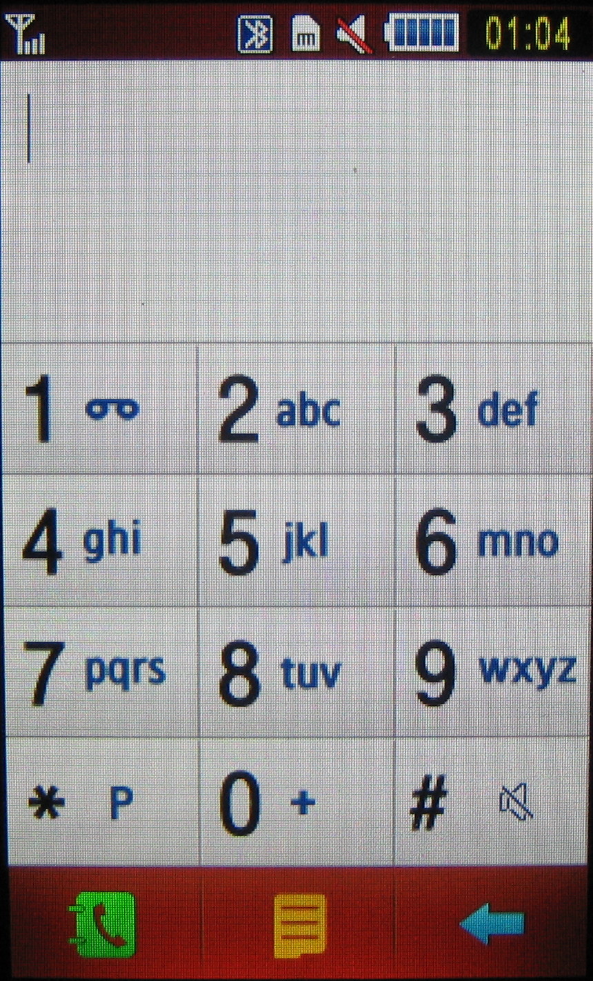
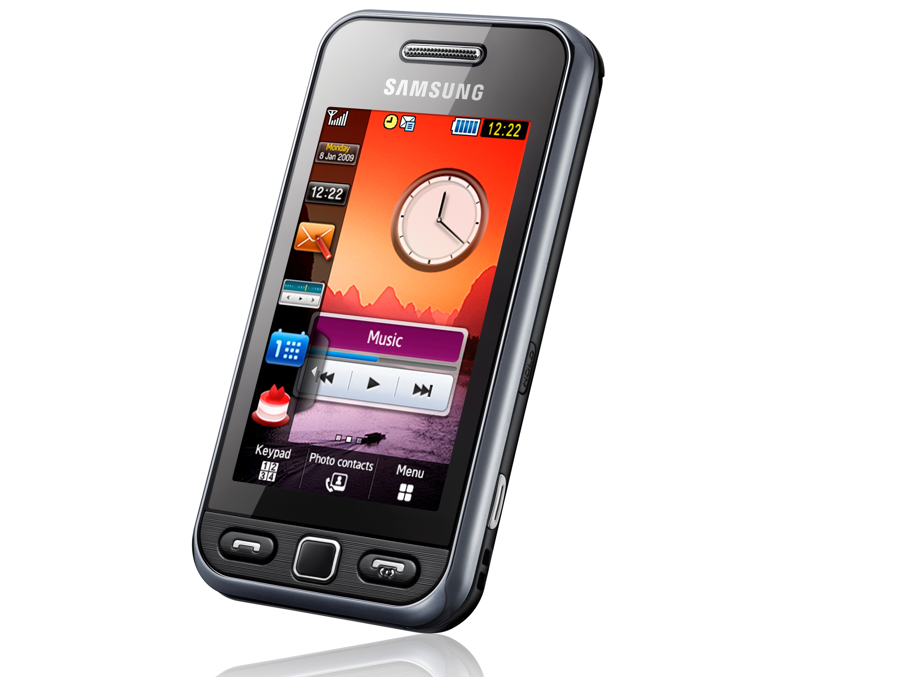
The standby screen has three buttons at the bottom – one for bringing up the keypad – a virtual numberpad you can use for dialling or texting - another for the phonebook, plus one for taking you into the main menu.
The numberpad is roomy enough to avoid mis-pressing keys, and the screen is quick and responsive enough so you don't double up with extra presses.

A touch of haptic feedback also confirms that you've pressed an on-screen key properly.
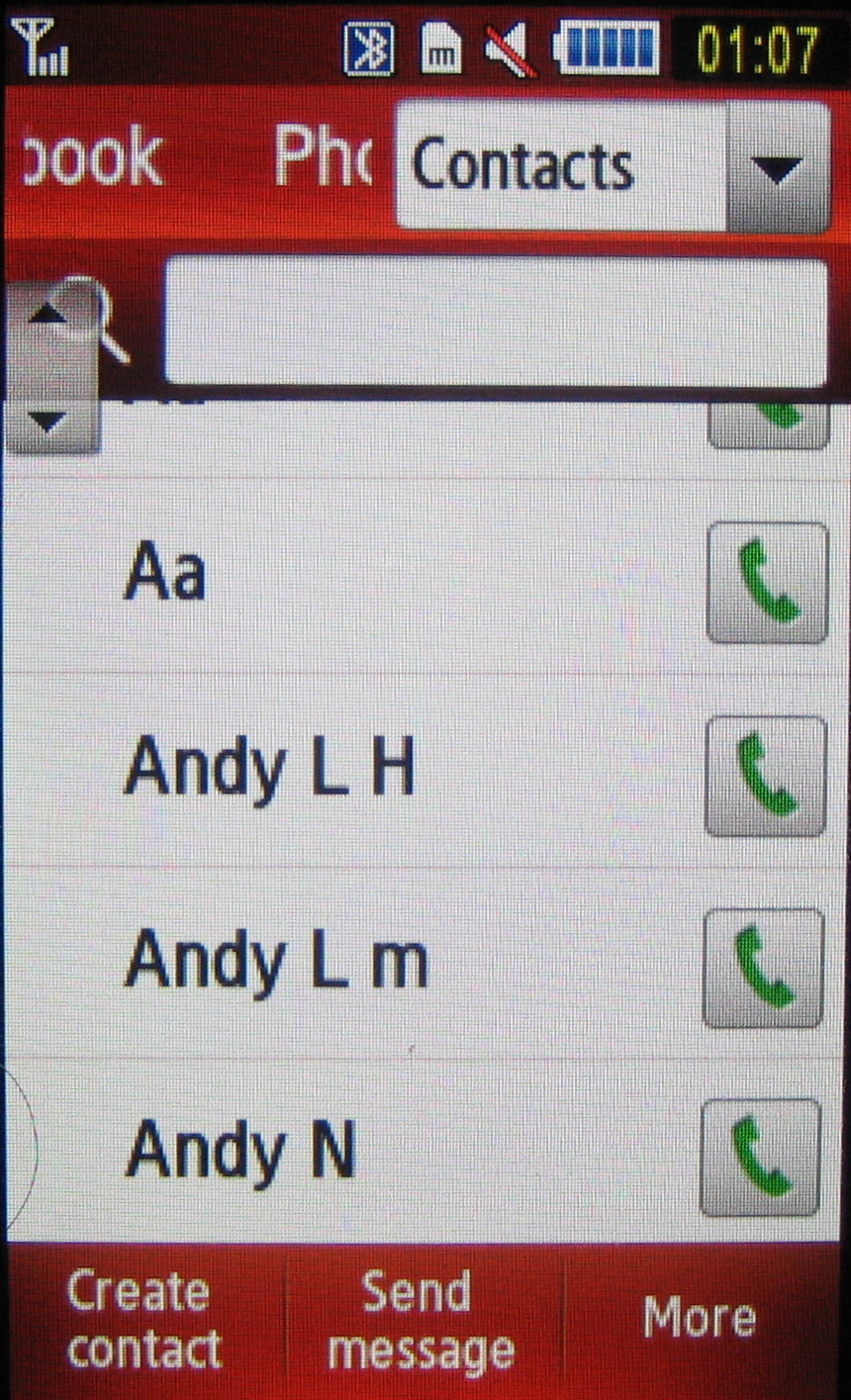
In the phonebook, there are three methods of hunting down a number. Firstly you can scroll down with finger swipes downscreen (which isn't nearly as smooth as iPhone scroll spinning). Alternatively you can search by pressing a search bar and then typing in appropriate letters from the numberpad.

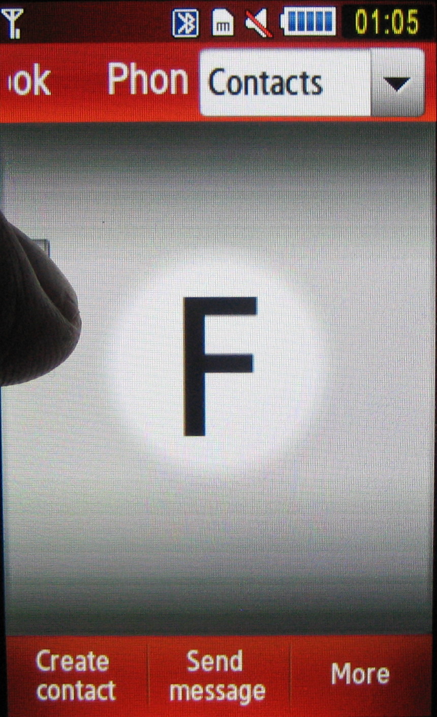
Lastly you can use a small arrowed button on the top left of the screen to whizz through sections by letter, pressing the screen and dragging your finger down till you find the right letter.

It doesn't take much practice for this to becomes quick, effective and almost second nature to operate.

The Samsung Tocco Lite's main menu though will be familiar to any phone user. A grid of 12 icons presents a regular way of accessing further sub-menu sections, which are usually listed in standard mobile fashion.
These can be scrolled by finger stroke, with a tap selecting them. It's easy stuff.
When scrolling we occasionally found ourselves selecting listed options by mistake, as our fingers dawdled and pressed when we should have been scrolling, but it doesn't detract that much from a system that's generally straightforward to use.
Photo contacts
Another control button among three at the bottom of the main menu screen enables users to pull up a list of Photo Contacts – grouping together your recently used numbers in one carousel-like panel, so you can flick to view and select when you want to make calls or send messages. If contacts have photos assigned, these appear on the carousel.
Current page: Samsung Tocco Lite: Menus
Prev Page Samsung Tocco Lite: Interface Next Page Samsung Tocco Lite: Messaging