Why you can trust TechRadar
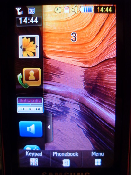
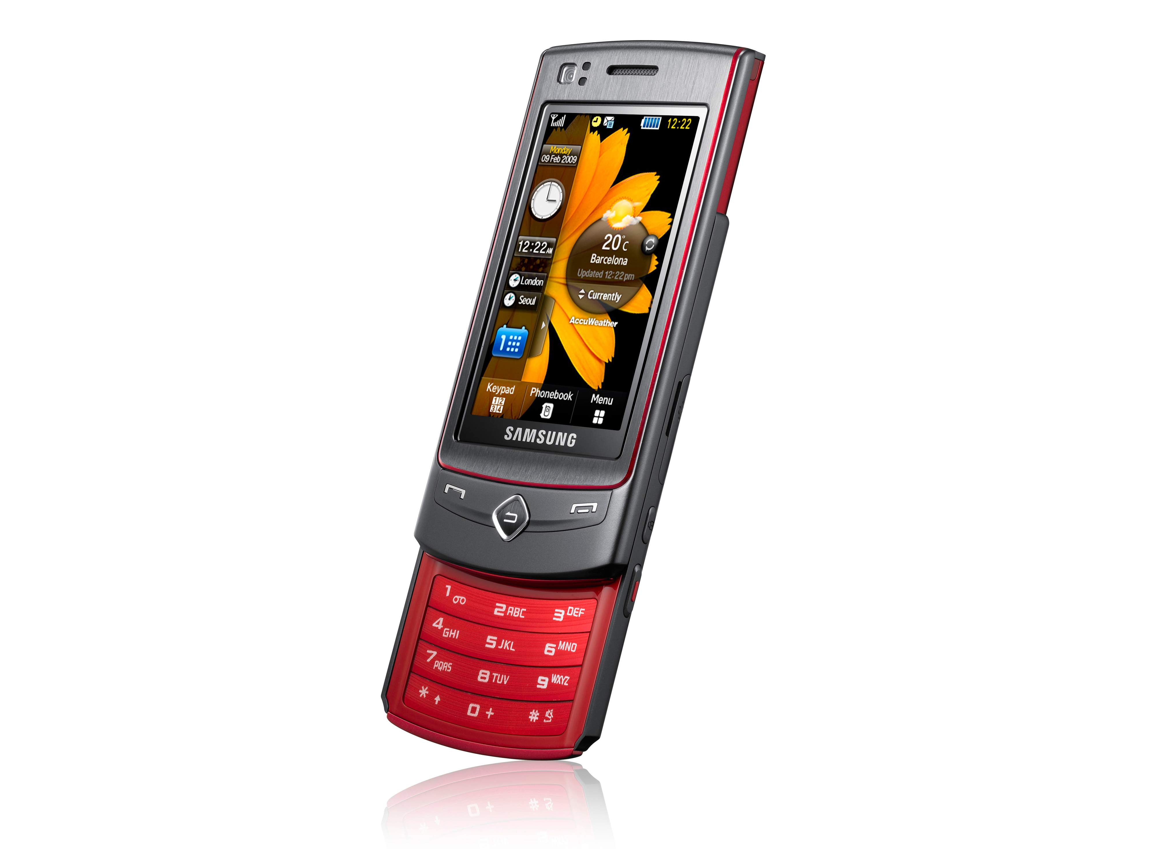
Samsung's TouchWiz interface has been used on a fairly high number of handsets from the Koreans in the past, and while the company hasn't really evolved it very much, Samsung still has tweaked it to feel a little more slick when used.
Compared to the likes of Nokia's S60 or Sony Ericsson's proprietary OS, it works a lot more intuitively and the widgets on the side bar of the home screen are a decent method of getting to the applications you want. However, the icons are pre-defined by Samsung (although you can go into settings and turn on only the ones you want to see) and some of them can't be pressed in the side bar, meaning you have to drag them onto the home screen to activate them.

Widgets
It's more annoying that some have to be dragged to use and some not, rather than a homogenous system for all. But if widgets are your thing, Samsung has included a nice touch in allowing you a 'scrollable' home screen - think the Android effort where you can swipe left and right to access more icons, but doing it vertically for a large amount of screen real estate for your widgets.
Some of the pre-installed widgets are very useful however, such as being able to access the music player and Bluetooth, although others, such as the dieting application which seemed to just be a day counter for something (the amount of days starved?) seemed less... necessary.
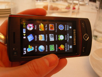
The menu screen is laid out pretty well, with all icons available simply by swiping left from the homescreen, though it's slight easier just to press the menu key, although it's always nice to have options.
Each sub menu is numbered as well, so you can use the number pad to quick link to something simply by entering the number code on the menu screen, the same way that people were used to on the older style Nokias, and presenting a retro alternative to the widgets on the front screen.

Pressing the up and down key on the home screen activated the phone sound and vibration volume, and for some reason the only way to turn off keytones and touch press tones was to turn off the sounds altogether. In nearly every other phone you're able to suppress keypad tones without the need to silence all other alerts sounds bar the ringtones.
Calling
Given the length of device, you would think that call quality on this handset was pretty good, and we found it to be pretty good every time we used it. Call history could be accessed by pressing the 'Call' button, and not only that, you were shown all messaging in and out as well, which was pretty handy when you wanted to swiftly reply to someone on the hop.
Audio quality from the speaker was good, with the speakerphone sounding loud albeit a bit crackly. Similarly call reception (on the 3 network) was fine, with no cases of being lost without a signal reported, although the phone would drop down to an EDGE or even GPRS signal on occasion... but the main thing was we were pretty much always able to call and text.
People on the other end of the phone also reported being able to hear us clearly, which we put down to the sheer length of the device putting it close to the mouth when fully extended.
Phonebook
The phonebook, found by pressing the middle virtual key on the home screen, is functional without being fantastic. The large font of each contact makes for ease of pressing to open up said person's details, but does mean the screen looks a bit cluttered.
You can either search for a person using the top bar, or swipe down by touch. It's actually easier to scroll through the list with the up / down keys located on the left of the device, which is a feature that Samsung has been using to negate the poor scrolling its touchscreen allows.
Other options include the ability to send your own name card and the ability to mark favourites for regular use, although this is a little hard to access and will probably result in users just interacting with the handset in the same way they always have done by scrolling to the name and selecting it.
Current page: Samsung Tocco Ultra: Interface
Prev Page Samsung Tocco Ultra: Overview; look and feel Next Page Samsung Tocco Ultra: Messaging
Gareth has been part of the consumer technology world in a career spanning three decades. He started life as a staff writer on the fledgling TechRadar, and has grew with the site (primarily as phones, tablets and wearables editor) until becoming Global Editor in Chief in 2018. Gareth has written over 4,000 articles for TechRadar, has contributed expert insight to a number of other publications, chaired panels on zeitgeist technologies, presented at the Gadget Show Live as well as representing the brand on TV and radio for multiple channels including Sky, BBC, ITV and Al-Jazeera. Passionate about fitness, he can bore anyone rigid about stress management, sleep tracking, heart rate variance as well as bemoaning something about the latest iPhone, Galaxy or OLED TV.
