Why you can trust TechRadar
As we mentioned, the Samsung Wave is rocking the TouchWiz UI on top of Samsung's new Bada OS, which is meant to make most of its range into smartphones with access to its own app store.
While those of you that have played with the Samsung Jet might groan at the thought of another TouchWiz phone, the good news is the Wave is the first handset to use TouchWiz 3.0, which comes with a lot more intuition baked right in.
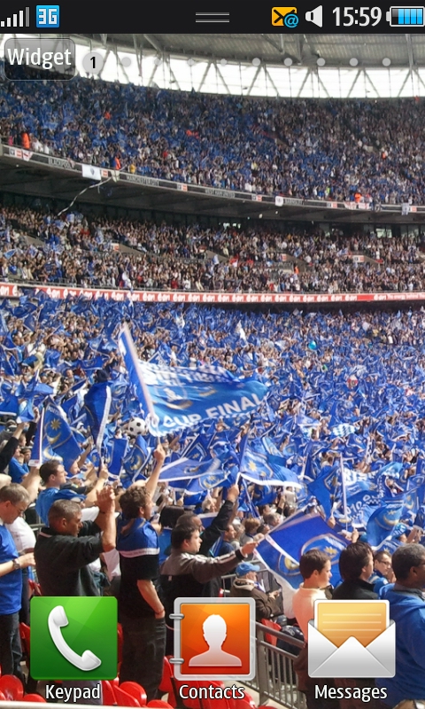
For instance, you get a number of homescreens to play with a la Android, rather than the odd three that took an age to scroll through.
You can add widgets to these, and when you start to run out of space, another is added to the pile, up to a maximum of 10.
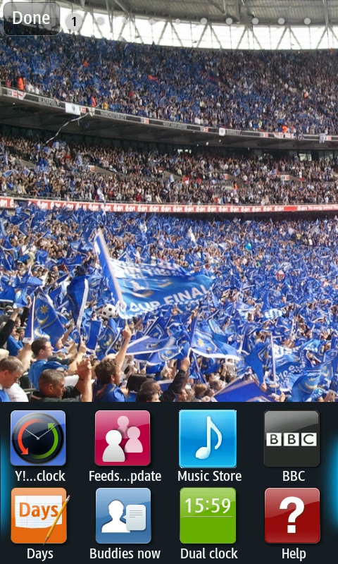
It's relatively easy to add home screens, and should you want to drop the amount of screens on offer you simply move the phone into landscape mode and use the 'x' in the corner of each screen to delete them.
The amount of widgets has been improved too from previous Samsung handsets, with a simple 'widget' key in the top right calling up the list available from the bottom of the screen and letting you drag them onto the home page.
These range from diary-keeping apps to favourite contacts to a Google Suite, with more available to download from the Samsung store.
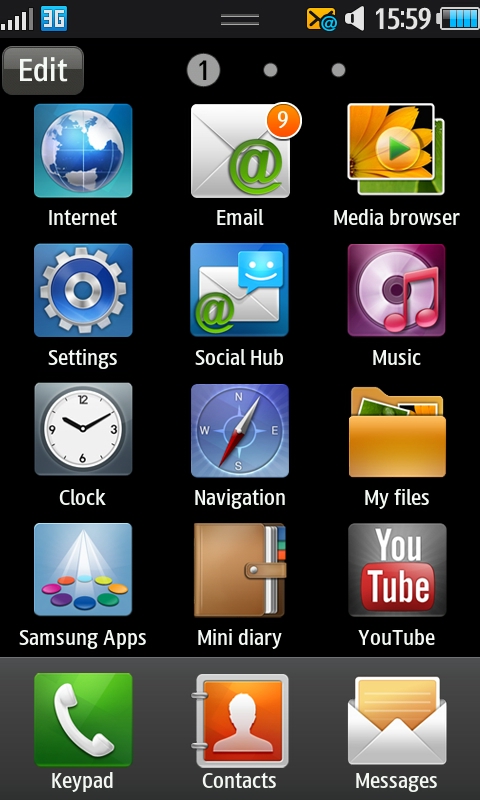
We mentioned the screen swooped nice and responsively under the finger, and the menu system is very familiar, just rows of icons with new apps joining the back of the queue when downloaded.
There is the option to arrange the icons by most used, which is pretty nifty – if you can't be bothered to arrange things by yourself, you lazy thing, then you can ask the phone to do it for you.
However this does get confusing as the order will constantly change, even if there's an app your use way more than anything else.
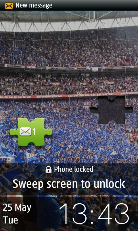
We did like the unlock mechanism though: not only can you swipe any way you want across the screen to unlock the Samsung Wave, but if there's a message or a missed call a small piece of jigsaw appears that you have to place in the right slot to open up said notification.
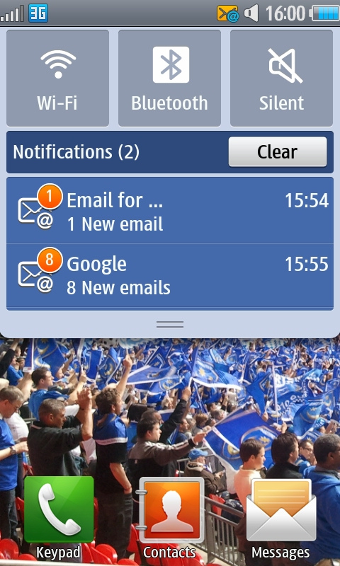
Aping Android once more, there's also a drop down menu from the top of the phone to let you see when you've got new messages and emails and the like – they sit below three massive buttons controlling Wi-Fi, Bluetooth and phone volume for easy access.
It's easy to slide the menu down from any application in a similarly slick way to other smartphones like the HTC Desire and Sony Ericsson Xperia X10.
One massively annoying feature is the inability to put menu icons on the home screen for quick access. Why this wouldn't be included is beyond us, but Samsung seems to have decided that only widgets are allowed on the home screen - icons would not only make sense but make the whole process more intuitive.
An odd feature Samsung has thrown in too is the option to double tap the phone and get a search menu, one that's pretty comprehensive.
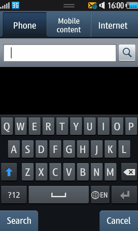
While you do look a bit foolish tapping the top of your phone to open up a menu, there are a lot of search options on offer: you can search messages and contacts within the phone, search the internet or just look at mobile content on offer.
Overall though, we're generally impressed by the interface on the Samsung Wave, as it's quick and slick under the finger - good work on a first effort, Samsung.
Current page: Samsung Wave: Interface
Prev Page Samsung Wave: Overview, design and feel Next Page Samsung Wave: Contacts and calling
Gareth has been part of the consumer technology world in a career spanning three decades. He started life as a staff writer on the fledgling TechRadar, and has grew with the site (primarily as phones, tablets and wearables editor) until becoming Global Editor in Chief in 2018. Gareth has written over 4,000 articles for TechRadar, has contributed expert insight to a number of other publications, chaired panels on zeitgeist technologies, presented at the Gadget Show Live as well as representing the brand on TV and radio for multiple channels including Sky, BBC, ITV and Al-Jazeera. Passionate about fitness, he can bore anyone rigid about stress management, sleep tracking, heart rate variance as well as bemoaning something about the latest iPhone, Galaxy or OLED TV.
