Why you can trust TechRadar
Although the user interface is mostly typical higher mid-level Sony Ericsson, the Elm adds to the D-pad and Activity menu shortcuts with a widgets feature on the homescreen.
A widget manager – accessible as one of the D-pad shortcuts with an 'up' click – enables you to select from a limited number of widget options to post mini apps on the homescreen that provide quick updates.

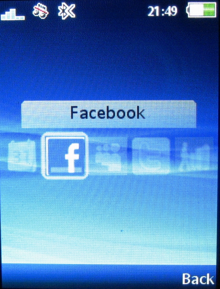
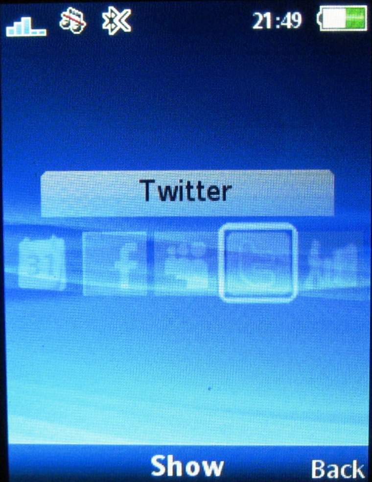
These include calendar, Facebook, MySpace, Twitter functions, plus one for Sony Ericsson Walk Mate Eco pedometer application.
Once selected, these sit on the homescreen, and you can switch between them, so you can see regular updates from whichever of the online services you use.
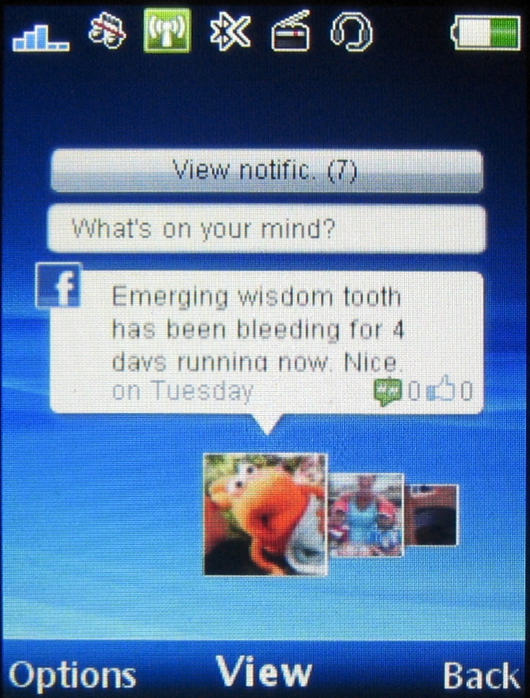
The widgets do work neatly for a phone like this. The Facebook status updates appear, for example, with thumbnail pics of friends with comments that carousel automatically when you click on the widget, and you can add your own status update, comments and so on.

You can toggle sideways between widgets you've activated, so you can follow tweets on Twitter and then slip into Facebook or MySpace with a side-click of the D-pad. All nice and easy, and you can enter straight into the full application by selecting a softkey menu option.

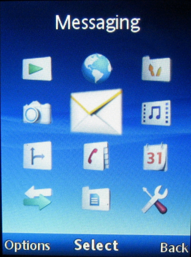
The overall phone navigation set up is straightforward to operate. The main menu structure is essentially based around a conventional grid of function or folder icons with subsequent sub-menus arranged in lists of options – occasionally tabbed if required for multiple categories.

This is mostly conventional and intuitive stuff and the D-pad is responsive enough for easy navigation and selection.
Current page: Sony Ericsson Elm: Interface
Prev Page Sony Ericsson Elm: Overview, design and handling Next Page Sony Ericsson Elm: Calls and messaging