Why you can trust TechRadar
Running on a Java platform, the Sony Ericsson Mix Walkman doesn't pack any punches whatsoever. It's a clunky, unintuitive system that takes a little wandering around before you get used to it. It may walk you through the initial set up of contacts and so on, but after that you're on your own in an unfamiliar landscape.
Tapping the Home button, for example, doesn't automatically bring up the menu. No, that's hiding under a small arrow icon at the bottom of the screen, indicating the need to swipe it up to reveal applications.

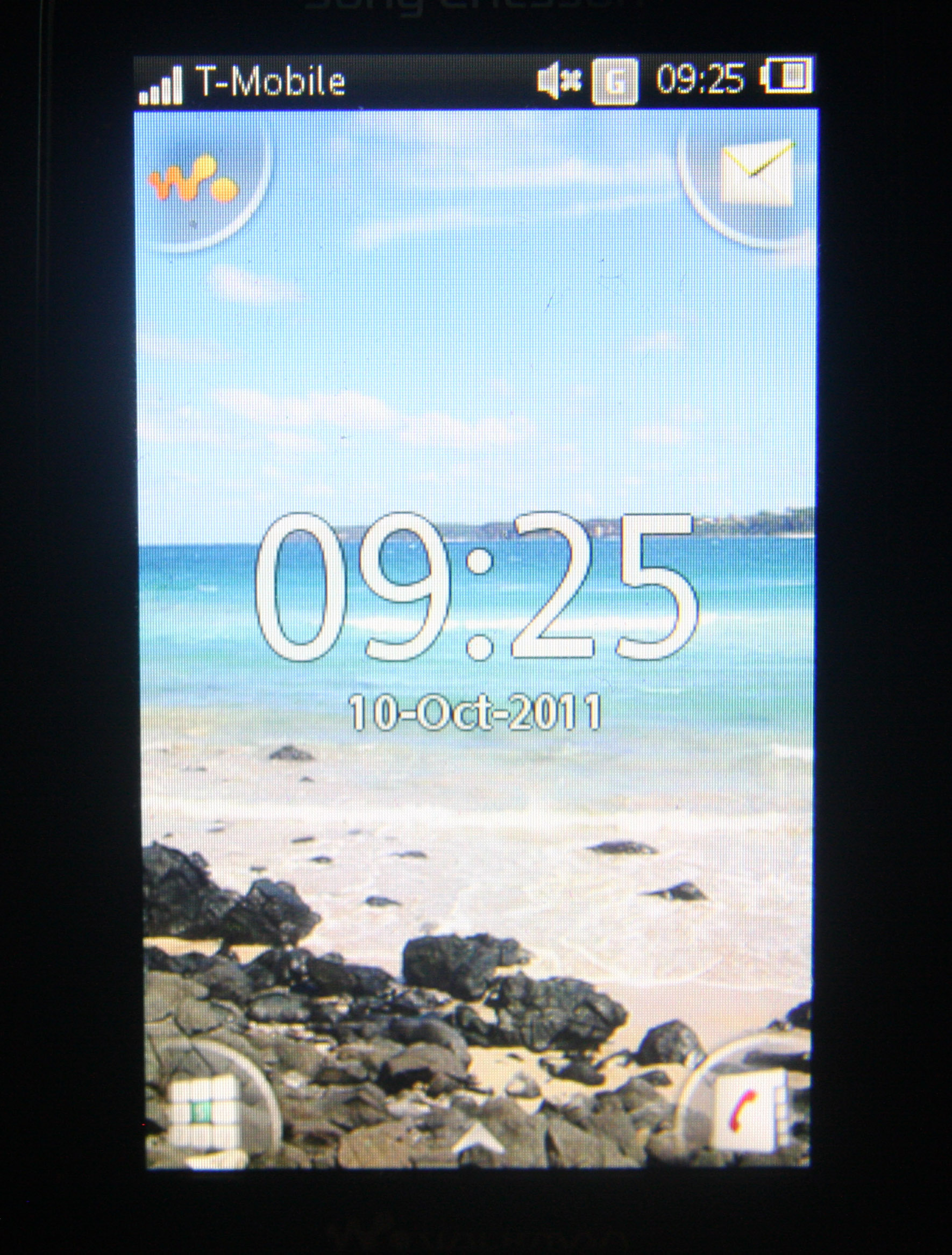
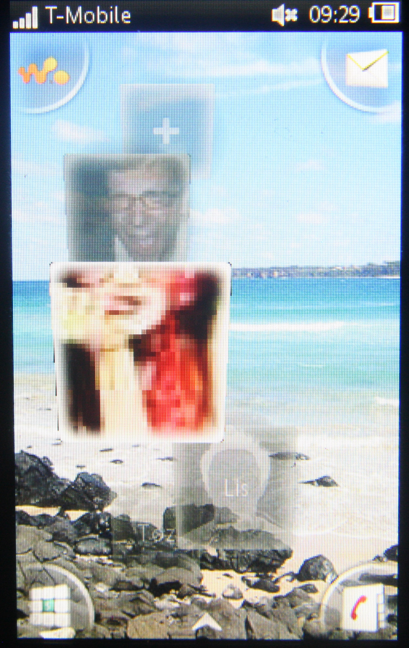
As for home screens, the Sony Ericsson Mix Walkman has two of them: one to hold favourite contacts, integrated with Twitter and Facebook, and one with four customisable shortcuts and the date/time.

The home screen to hold favourite contacts is nicely designed, with a waterfall of profile images grabbed from Facebook or Twitter, but the images themselves are often pixelated, which ruins the effect somewhat.
Setting it up is a bit of a fiddly process too, with you having to go out of the home screen and into the settings to authorise the apps. But, once you've done that, you can head back to the home screen and manually add your favourite friends and their Twitter/Facebook feeds to their text message history.
Twitter is frustrating though, because you have to scroll through friends in the order that you followed them, not alphabetically, causing us to connect a friend to the wrong Twitter account five times, thanks to the Mix's poor touchscreen responsiveness.
Ah, the responsiveness. Or lack of it, rather. It's a big deal for the Sony Ericsson Mix Walkman, ruining the fact that it even has a capacitive touchscreen at all. Navigating is clumsy, with several false starts when you accidentally pick programmes you never meant to open.
It's slow, and the small size of the screen means you have to be equally small of hand to comfortably use it. It does have haptic feedback, though, which can be quite comforting when, say, tapping out a text.
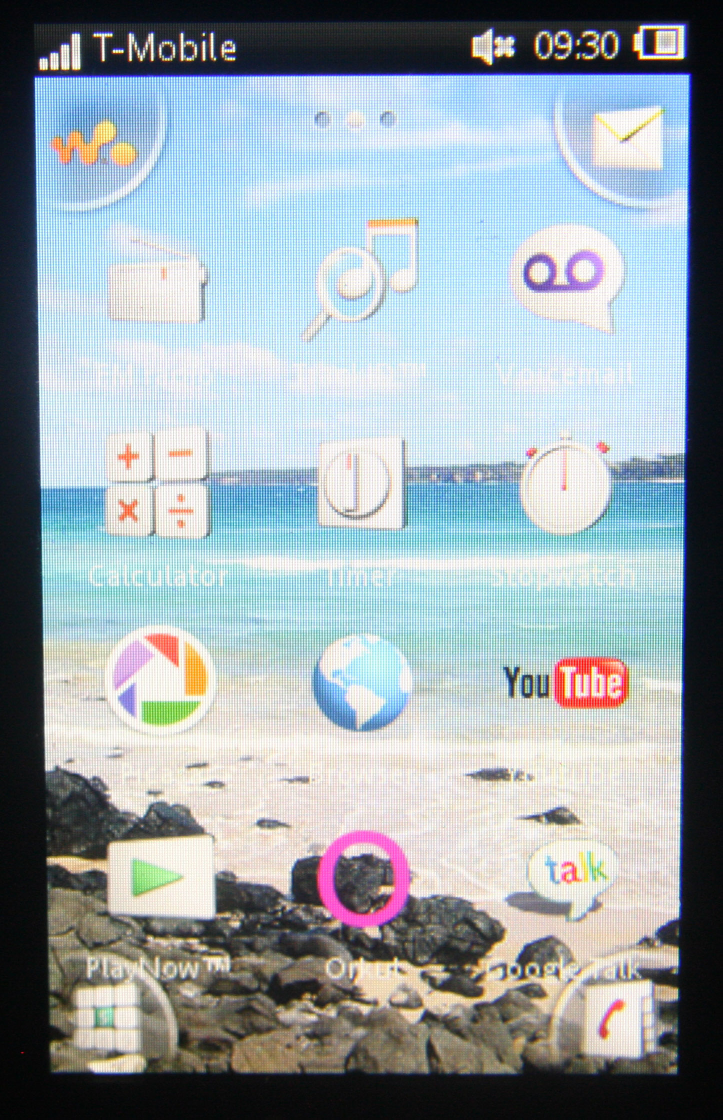
The menu itself is customisable in terms of being able to personalise the order of the widgets and to drag your four favourites into the corners to personalise the first home screen, but little else. Still, the widgets look good and there's a decent sprinkling of internet favourites included such as Twitter, Facebook, Gmail and You Tube.

It's not a difficult user interface to pick up, but it does require a little bit of fiddling to get used to. With a 400 x 240 pixel screen, it's a bright and friendly interface with just enough customisable touches for its target audience.
