Why you can trust TechRadar
The Sony Ericsson interface is built on Symbian S60 5th edition, which has been used in all Nokia's touchscreen devices so far (bar the N900) and also on Samsung's i8910 HD.
However, Sony Ericsson has taken it one step further with the Satio, making it a lot easier to navigate around the areas users need.

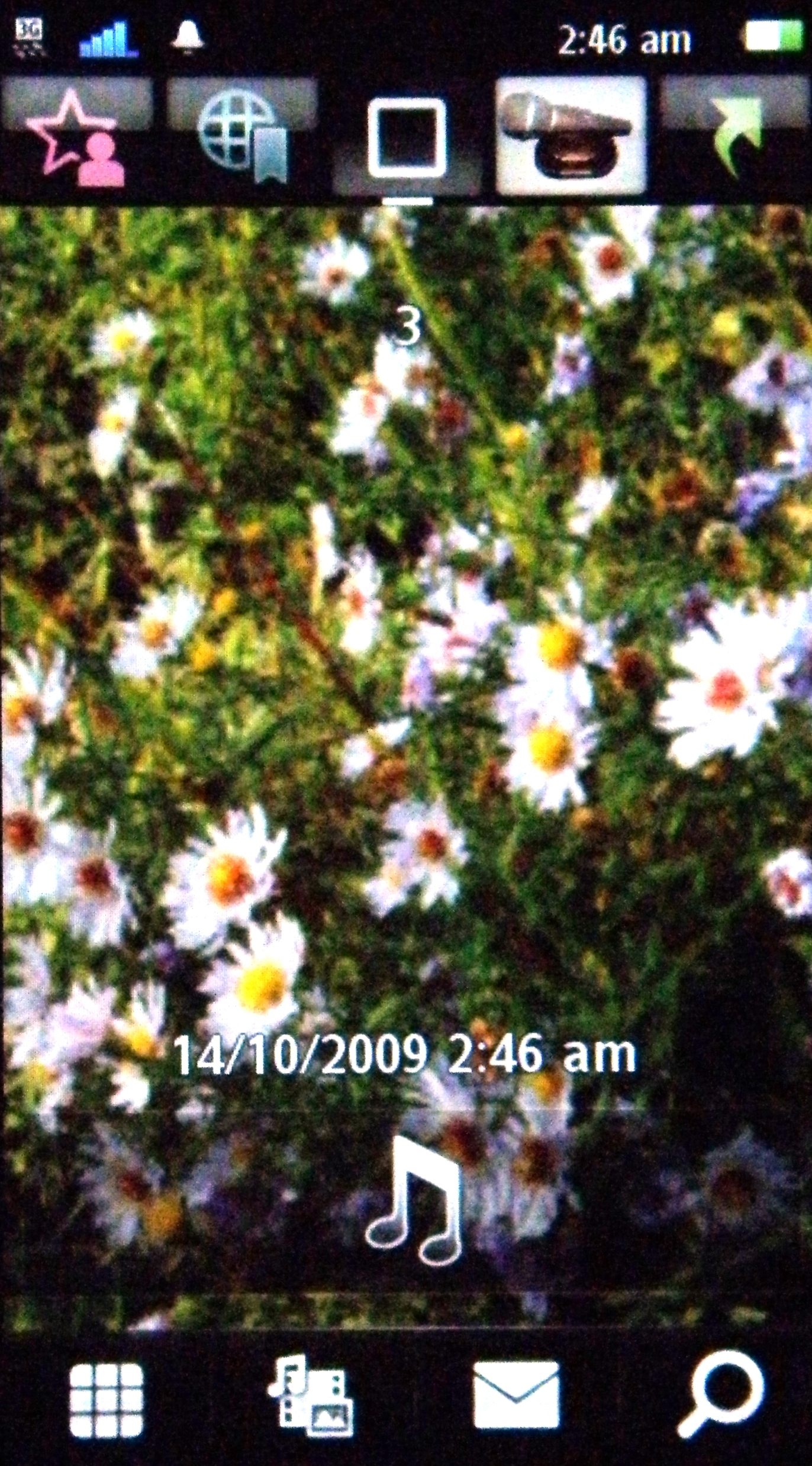
The homes screen is almost Android-like in that it has a number of different screens to scroll left and right to.
The photo section is the most impressive – it shows the photos in all their glory, yet is superbly quick to scroll through. Considering the Sony Ericsson Satio only has a 600MHz processor on board, this is an area where we expected the phone to struggle.

The central home screen also has some quick links to important areas of the phone, such as a search button that opens both Google search and the contents of your phone – such as messages, music tracks, pictures and video clips. It lacks the slickness of the iPhone or Android and is rather slow in checking for stuff, but it's still a nice feature to have nonetheless.
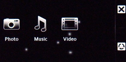
The bottom icon bar also holds access to stored media, which has been Sony Ericsson's forte in recent years. The interface jumps to a pseudo-Xross Media bar when entering this area, listing music, photos and videos in a similar fashion to the PS3 or Bravia TVs.

The bottom bar also gives access to the dial pad and a direct link to messaging too, although we have problems with the former of the two.
Yes, we know we can set up favourites, but to not have a direct way of accessing contacts from the home screen seems counter intuitive to us, as this is the real reason for phones still, despite what the likes of Apple are trying to make us believe.
Flicking left and right to move through the separate levels of the home screen can be a bit of a pain, especially past the gallery section, as inadvertently hitting a picture happened all too frequently, meaning we have to fiddle about with cancelling menus a lot.
There's also an option at the top of the screen to call up information on active connections and the alarm, although you seemingly have a 2mm thin gap to hit at the top of the phone to activate this, and we couldn't make it work first time no matter how hard we tried.

Using the Symbian S60 OS is a good and bad thing for Sony Ericsson to have done in our book. On the one hand, it's a well established, hard working OS with a lot of heritage and development gone into it. Compare it to the TouchWiz-based proprietary Samsung UI on the Pixon12, and you can see the potential for widening your experience on the Satio.
However, it suffers from the 'stereotypical Symbian lag', whereby you'll ask the phone to do something and it will pause slightly, flash some blocky screen transitions and then get round to what you asked. This is mostly apparent in the messaging section, where opening a message will lead to the phone showing you all the commands it has to execute before opening your message.
It's not the biggest problem in the world, but when we've become used to the likes of Apple, HTC and Palm all giving us slick UIs, we've perhaps started to expect a little bit more.
And another problem – the Satio uses a resistive screen. This means that although you can use handwriting recognition and work it with gloves on, it's just not as accurate as a capacitive screen, which recognises the presence of a finger much more accurately.
This means we were constantly left tapping a menu option a few times in order to open it up – we're sorry, but we're just not using a stylus any more, technology has moved on too far for this to be necessary.

The menu systems are both a bit long winded and confusing too – sometimes you need a single tap, sometimes a double. This can also change depending on how long ago you pressed the screen, which combined with the aforementioned lag can result in pressing the wrong option in the end.
And if you're looking to change something on the phone, for instance the alarm time, you have to hit the menu option, which opens up a dialogue box for editing. You then need to tap that again to edit it – very long winded.
The lock method is also far too convoluted for our tastes. Too often the phone screen would burst into life with a message or the like and we wouldn't be able to touch it because we've failed to notice the tiny key icon in the corner, meaning we have to use the slider to open it up.
This then lags for up to a second to open up the phone, especially when coming out of blank screen sleep mode, and we'd imagine this might get a little infuriating over time.
Overall we're fans of Symbian, as it's a simple, well laid-out OS with the bits mostly in obvious places. But it's possibly getting a bit long in the tooth, and combined with the touchscreen isn't really what we were expecting from the Sony Ericsson Satio.
Current page: Sony Ericsson Satio: Interface
Prev Page Sony Ericsson Satio: Overview, design and feel Next Page Sony Ericsson Satio: Calling and contacts
Gareth has been part of the consumer technology world in a career spanning three decades. He started life as a staff writer on the fledgling TechRadar, and has grew with the site (primarily as phones, tablets and wearables editor) until becoming Global Editor in Chief in 2018. Gareth has written over 4,000 articles for TechRadar, has contributed expert insight to a number of other publications, chaired panels on zeitgeist technologies, presented at the Gadget Show Live as well as representing the brand on TV and radio for multiple channels including Sky, BBC, ITV and Al-Jazeera. Passionate about fitness, he can bore anyone rigid about stress management, sleep tracking, heart rate variance as well as bemoaning something about the latest iPhone, Galaxy or OLED TV.
