Why you can trust TechRadar
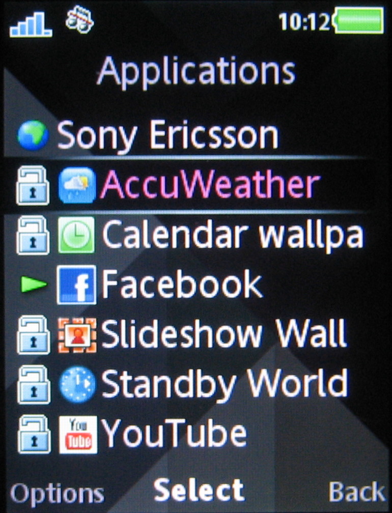
The T715's user interface will be familiar to anyone who's used a Sony Ericsson handset. It's a typical mid-tier set-up, with a grid-based main menu grid of 12 icons taking you into further sub menus.
These are generally list-based, so are simple to negotiate and find options. This makes for a straightforward, conventional mobile user interface that's functional and easy to get to grips with.

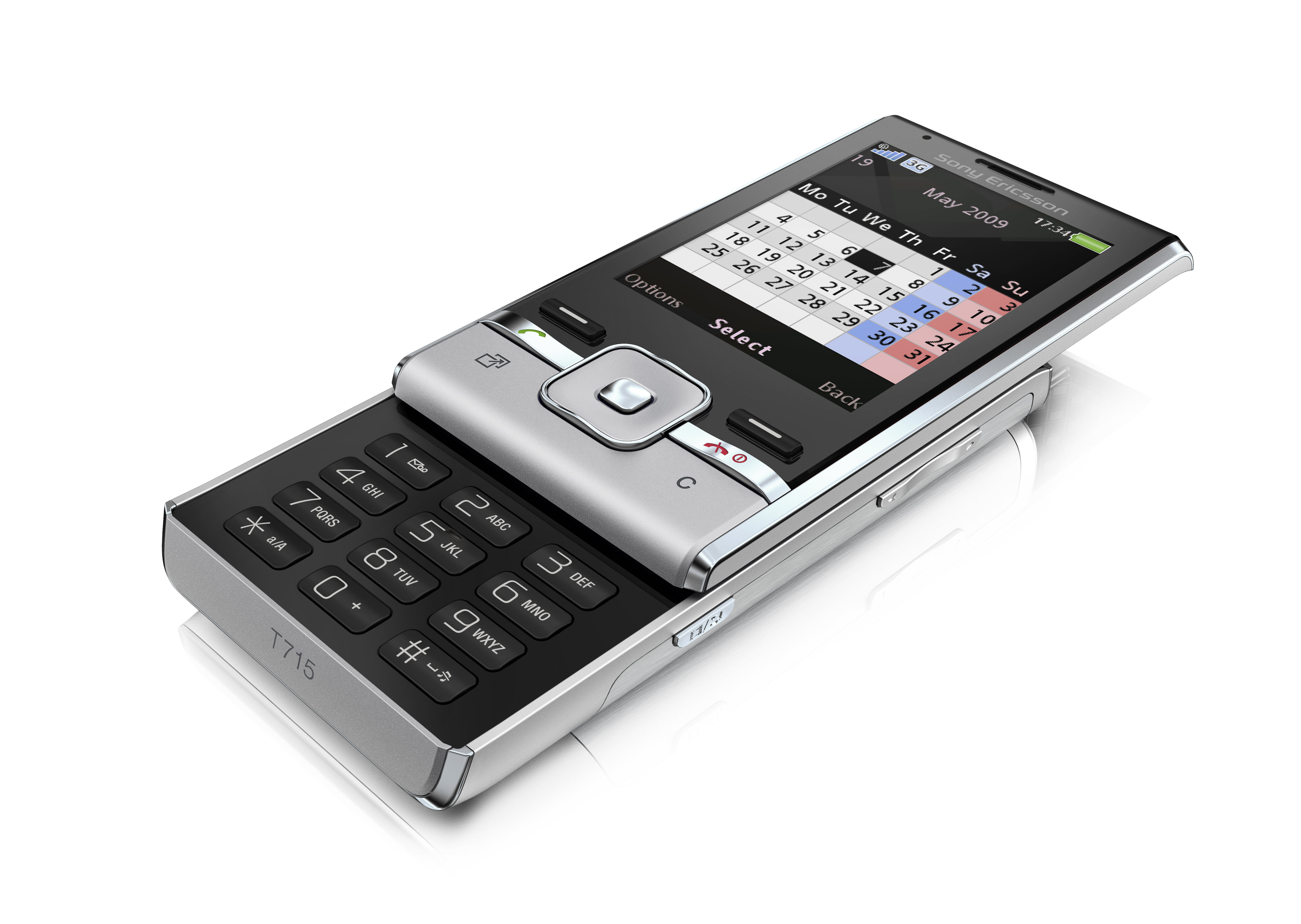
Conventional mobile shortcuts are available from the navigation pad; it's set up for contacts, messages and calendar by default, although users can define their own preferred shortcuts too through the setting menu.
Softkey options on standby include a search facility, which offers options for Google searches online and stored web links for fast internet access.

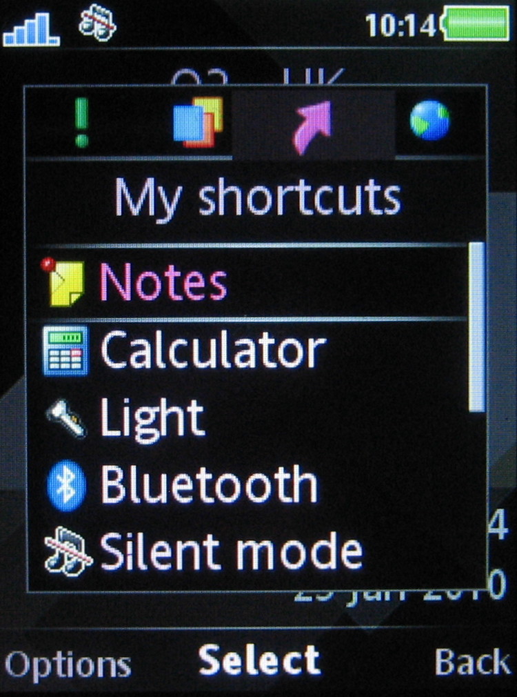
The useful Activity Menu button also provides shortcuts to features and applications. The tabbed lists pull up a My Shortcuts list that can be customised how you want: internet browsing options, new event notifications and a running apps list are all on offer.
Current page: Sony Ericsson T715: Interface
Prev Page Sony Ericsson T715: Design Next Page Sony Ericsson T715: Calls