Why you can trust TechRadar
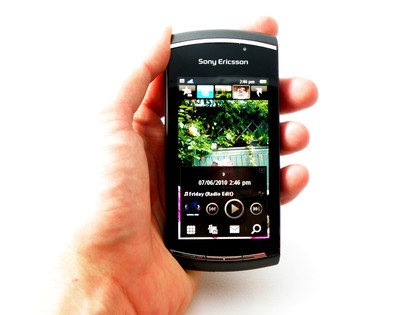
The Sony Ericsson Vivaz Pro, like its little brother, uses the Symbian S60 OS, which you may remember from other phones such as the Nokia N97, the Nokia 5800 and the Samsung i8190 HD.
The thing all these phones have in common is that they didn't perform too well in our tests - well, save for the i8910. The reason being that the latter phone has a large and easy-to-use capacitive screen, while the others have smaller and harder to use resistive options.

The Vivaz Pro sadly sides with the Nokias, with a screen that's too small to really let the user get to grips with the fiddly Symbian OS.
The presence of the resistive screen doesn't help matters, as the accuracy is reduced even further when trying to mash the screen with a sausage-like digit.
You do get used to using the edge of a fingernail to navigate fairly swiftly, but on the whole it's a little convoluted, especially in the face of Android and the iPhone's iOS.
Sony Ericsson or Nokia fans will quickly get used to using the Vivaz Pro, as it uses the simple home screen and menu system that's served so well for many years.

But as with the Sony Ericsson Satio, the Vivaz Pro offers a more in-depth home screen: five screens you can swipe through, offering the likes of Twitter, favourite contacts, a 'normal' screen with no widgets, media section to see photos and some shortcuts you can customise.
Sign up for breaking news, reviews, opinion, top tech deals, and more.
The latter option is the only area for customisation at all - the rest you're stuck with. Twitter will frequently log you out of the service, and even when it does work you're still stuck with only a few tweets to read before you need to log into the web version instead.
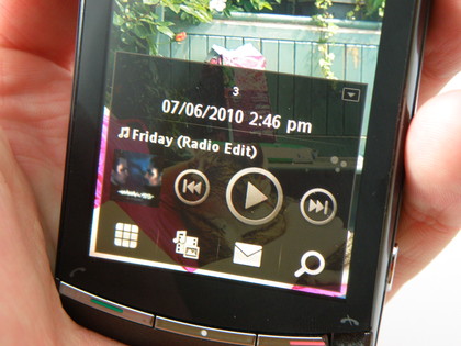
The middle screen is a mystery - apart from putting your own picture on there, there's not much you can do in the way of customisation. Pressing the terminate key will open up the music and 'quick' menu system that gives you access to key functions like the music player, but that's about it.

Other than that it's the normal menu system: one option press leads to another set of menus until you get to the one you want. However, a constantly annoying feature of the Symbian OS is that you have to sometimes double tap an option to open it, where other times it's a simple single tap instead.

Another irritating feature is that while some elements, like contacts and media, allow you to swipe up and down the list to activate kinetic scrolling, others (like the menu on the internet) require you to grab and hold a scroll bar instead, which is ludicrous.
However, it's often slow to open up compared to the might of the 1GHz brigade we're used to using nowadays, with the likes of the HTC Desire and even the Sony Ericsson Xperia X10 blowing the Vivaz Pro away in terms of speed of use.
Essentially Symbian is an ageing, creaking, archaic operating system that was never meant to be touch friendly - how anyone can still be building phones based on it is a mystery to us.
We can only hope that a) Symbian^3 is much, much better and b) the Vivaz Pro gets an upgrade to it, but we very much doubt that last point due to technical specifications.
Current page: Sony Ericsson Vivaz Pro: Interface
Prev Page Sony Ericsson Vivaz Pro: Overview, design and feel Next Page Sony Ericsson Vivaz Pro: Calling and messaging
Gareth has been part of the consumer technology world in a career spanning three decades. He started life as a staff writer on the fledgling TechRadar, and has grew with the site (primarily as phones, tablets and wearables editor) until becoming Global Editor in Chief in 2018. Gareth has written over 4,000 articles for TechRadar, has contributed expert insight to a number of other publications, chaired panels on zeitgeist technologies, presented at the Gadget Show Live as well as representing the brand on TV and radio for multiple channels including Sky, BBC, ITV and Al-Jazeera. Passionate about fitness, he can bore anyone rigid about stress management, sleep tracking, heart rate variance as well as bemoaning something about the latest iPhone, Galaxy or OLED TV.


