Why you can trust TechRadar
Sony Ericsson Xperia Arc review: Interface
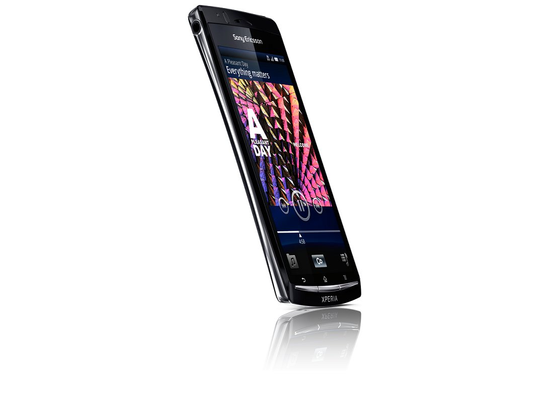
Android 2.3 has been lightly skinned on Sony Ericsson Xperia Arc, with animated icons, large media widgets and a clever folder-creation system added to the mobile OS. It's pretty, and it's easy to use.

The 4.2-inch touchscreen supports multi-touch input, and Sony Ericsson illustrates this by letting you spin the Home screen out into an overview mode with a two-fingered zoom motion. There are only five Home screens included here, for some odd reason, so you're unlikely to ever get so lost you need this satellite view.

The screen is very sensitive to the touch, while the 1GHz single-core processor does a fine job of pushing menu pages about, scrolling Home screens and populating lists of apps without trouble.

Sony Ericsson has again included its Timescape social aggregator on the Xperia Arc, with the animating widget letting users pull in their text messages, Twitter feeds and Facebook nonsense into one combined space.

It is a clever but rather pointless feature, to be honest, providing a disjointed experience. Clicking on a tweet or Facebook status update takes you to the mobile websites of the services rather than opening any app you may use.
So when you see a web link in a tweet and click on it, it opens up the Twitter mobile site rather than the actual link. Which feels like rather a waste of time and a step back from using one of the many excellent Twitter apps available for Android.

Still, it's a fancy way of organising your text messages, with the app also giving your missed calls a whole page to themselves. But the way it blows up Twitter and Facebook icons to fill the background creates a rather ugly widget. Which means Timescape is best removed, sadly, and replaced by individual apps for each service.
Sign up for breaking news, reviews, opinion, top tech deals, and more.

Also, Sony Ericsson has stuffed another one of its five Home screens with a gallery widget, music widget and media shortcut bar. These widgets are useful, but having three on the screen pulling in data and photos can result in the occasional glitch when paging through your Home screens as the phone struggles to fill all these content-rich windows.

What is very nice is the customisable floating dock. Along the bottom of the screen sits four icons, and, as with the icons on the Home screen, you're able to long-press on these and put your own favourite apps or links in this dock.

The one dock icon you can't change is the central icon, which opens up the app drawer. This can be edited, too, with Sony Ericsson letting users sort their app collections manually, by alphabetical order or most used.

The drag-down notifications bar is a little under-stocked compared to its Android brethren – even the HTC Desire S has joined the Samsung Galaxy S2 and INQ Cloud Touch in offering easy access to turning on and off Wi-Fi or GPS from anywhere in the phone.
One clever new little touch (for Android – iPhone 4 users will find this familiar) is the ability to create folders to group your apps together on the fly. Simply dragging one Home screen icon onto another brings up a prompt to name a folder – and the system then dumps the two icons into your new storage space. Nice.

Folder use in general is good, with a very pretty little annotated window popping up when you open one. Getting things into folders is a bit tough on Android, though. How do you get a photo from the Gallery to a folder on the Home screen, for example?
It doesn't seem possible, which limits the use of folders to grouping icons and freeing up space on your Home screen – but then again, that hasn't stopped it being a popular feature on the iPhone.
Current page: Sony Ericsson Xperia Arc: Interface
Prev Page Sony Ericsson Xperia Arc: Overview and design Next Page Sony Ericsson Xperia Arc: Contacts and calling