Why you can trust TechRadar
Sony Ericsson Xperia Neo: Maps and apps
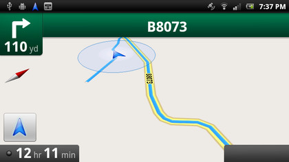
Google Maps software is obviously included, and there's nothing new here beyond what you usually get: directions, satellite view, Street View, and new 3D building hotness. The Xperia Neo GPS is quick to lock onto a location and the compass calibrates quickly. It definitely got us out of a lost spot or two.

The layers can be pretty useful, detailing transit lines and 'Buzz'. Though, Google Buzz never seems to cache anything useful, so you're probably better off sticking with your own social networks to tell you what's happening round and about.
Google's Maps app is easily the most impressive mapping and navigation tool out there. As well as access to classic Maps, full voice navigation across most of Europe (although you can't pre-cache routes, so be prepared with a decent data plans.
Simply accessing the Directions tab lets you specify a start and end point, with Google computing a route for you. Clicking on the Maps Navigation arrow then opens the sat-nav part of the app, prompting you to download and install a voice pack for spoken directions – if you want to hear some amusing American mis-translations of UK place names.
The route is calculated in advance, so it's simple to punch it in while at home on Wi-Fi, then head off and let the GPS do the rest of the job - in our opinion it easily beats a standalone sat-nav, and obviously is nice and free to boot.

Apps
The Xperia Neo doesn't come pre-loaded with any stand-out apps, but that's okay given the extent of the Android Market app store.
For social networkers, the Timescape app is fun and pretty but unless all you want to do is scan status updates, it's really rather pointless.
Clicking on Facebook or Twitter updates will simply open the mobile site, and profile pictures are pixelated in the extreme, meaning it can be difficult to tell who's who. Stick with the original Android versions of networking apps. You can't flick through them like a Vegas dealer flipping cards, but you sure get better usability.
Viewing and organising apps in the menu is intuitively easy, as previously mentioned, with the options to order them in your favourite pages view, or by alphabetical list, most used or recently installed.
You can also arrange the apps into organised folders, if you so wish, on the Home screen, giving you tidy and easy access to your favourite apps.
Current page: Sony Ericsson Xperia Neo: Maps and apps
Prev Page Sony Ericsson Xperia Neo: Battery life Next Page Sony Ericsson Xperia Neo: Hands-on gallery