Why you can trust TechRadar
Sony Ericsson Xperia Neo: Interface
The Sony Ericsson Xperia Neo runs on Android Gingerbread 2.3, neatly aligning it with the Samsung Galaxy S2 and earmarking it as one of the few handsets to be launched with the updated OS.
It offers a smooth navigation experience, with little-to-no juddering – in fact, the only stuttering we found was with internet browsing, but we'll get to that in a little while.
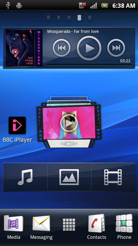
For customisation fans, the little Xperia Neo offers a plethora of possibilities, with five Home screens, moveable widgets and shortcuts, and – hello to Apple's iOS – the ability to organise all of them into folders.
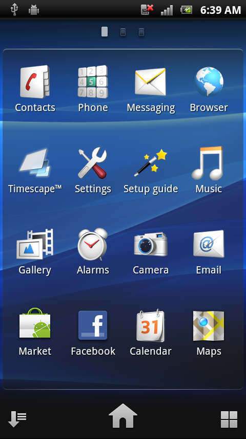
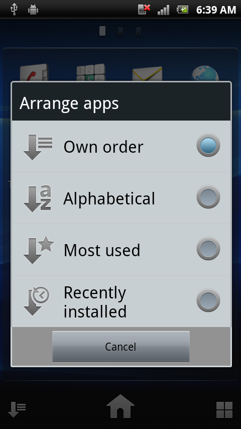
Diving into the menu delivers the apps, the ordering of which is easy. Click on the right-hand squares icon and it floats the apps, making it easy to sort into content panels. Or, click on the left-hand arrow icon and sort them alphabetically, by most used or by most recently installed.
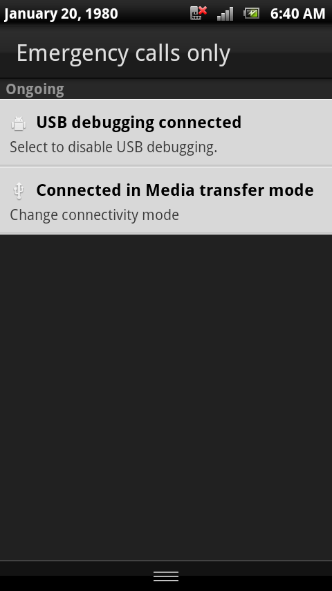
The Android pull-down notifications tab is still around, something we like as a handy way of viewing your most recent messages/notifications.
And for your four key, most-used apps, there's a dock across the bottom of each screen to pin them on. By default these sit as media, messaging, contacts and phone dialer, but they too can be customised and changed around.

Plus, holding the Home button momentarily will bring up a multitasking screen, which allows you to pick from the most recent apps you've had open.
Sign up for breaking news, reviews, opinion, top tech deals, and more.
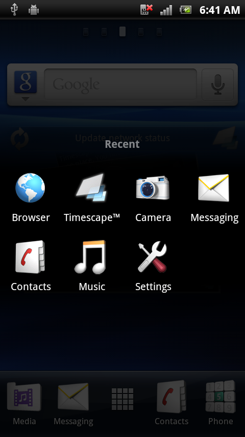
Altogether, a good operating system overlaid with a Sony Ericsson skin, making for an easy to navigate UI that you can make your own in many ways.
Current page: Sony Ericsson Xperia Neo: Interface
Prev Page Sony Ericsson Xperia Neo: Overview and design Next Page Sony Ericsson Xperia Neo: Contacts and calling