TechRadar Verdict
The Android 2.1 update hasn't made this into a contender, and Sony Ericsson has missed a chance to make the X10 into a real powerhouse.
Pros
- +
Great camera
- +
Nice media player
- +
Bundled 8GB card
- +
Slick OS
- +
Easy to backup vital data
Cons
- -
Poor text input
- -
Lagging system
- -
Poor audio quality
- -
Suspect battery
- -
No multi-touch, no proper camera flash
Why you can trust TechRadar
UPDATE: We've now got our hands on a Sony Ericsson Xperia X10 complete with the Android 2.1 update - lets see if it's any better or whether it's pushed SE further behind the Android pack.
After a disappointing 2009 for Sony Ericsson, with the likes of the Satio failing to live up to its flagship billing, the Swedish-Japanese alliance is back with its first Android proposition - the Sony Ericsson Xperia X10.
It's got all the makings of a true classic - a whopping 4-inch screen, a 1GHz Snapdragon processor and it's rocking Android with a cool overlay.
In short, since we first heard about it at the tail end of 2009, we've been excited to see if it can be the handset to return Sony Ericsson to the sharp end of the mobile phone game.
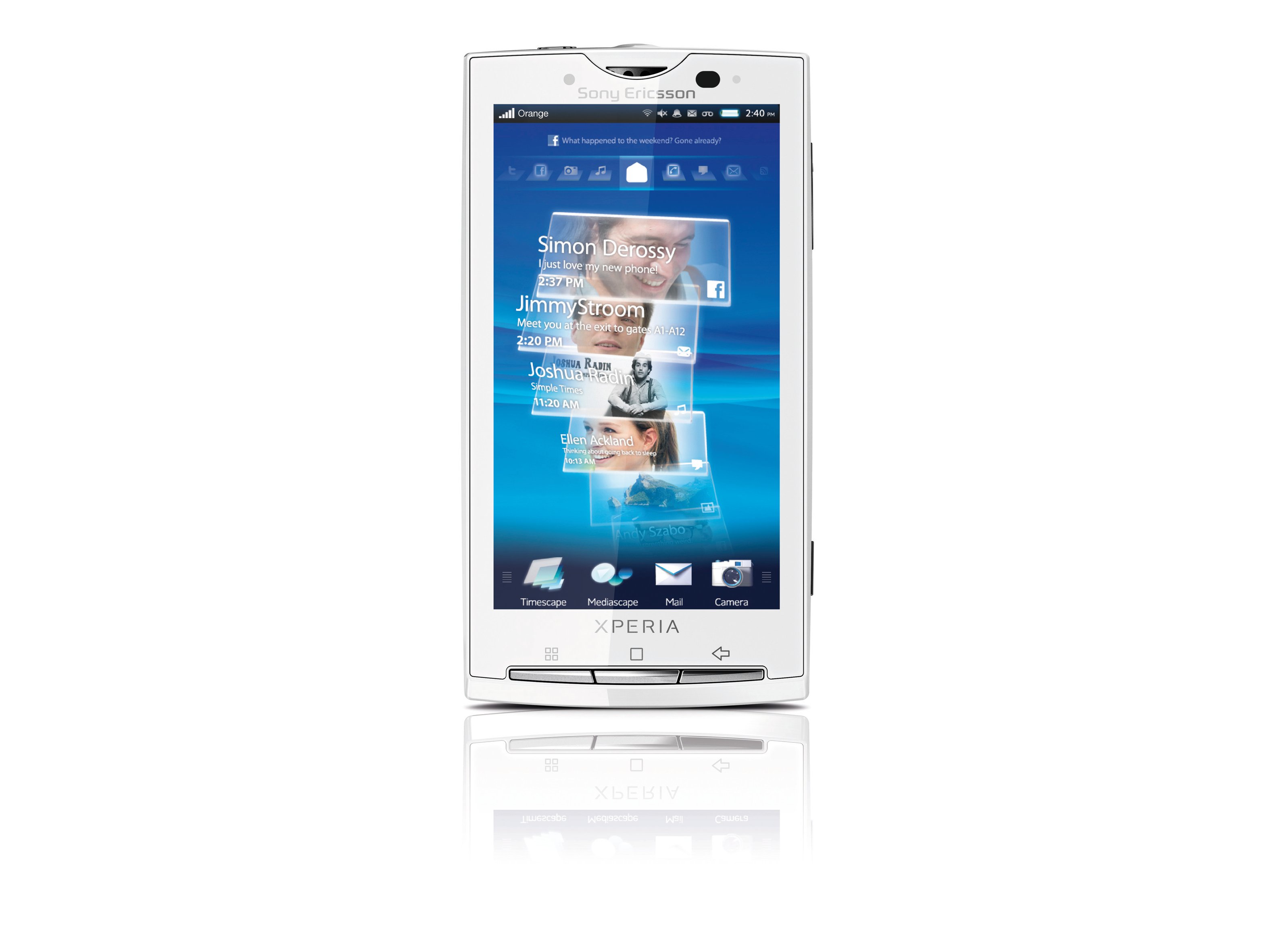
It's odd, but given the massive screen on the phone, the first thing you notice when looking at the Xperia X10 is not the screen - on our black review model the main thing is simply how shiny it is.
It's an understated phone, with a sharp, angular design and minimal buttons - in short, it looks like the kind of high-end handset we'd expect from one of the leading mobile manufacturers.
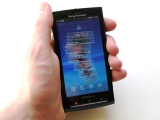
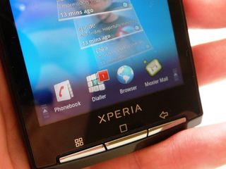
The screen dominates most of the front of the Xperia X10, and there are three buttons at the bottom, denoted as menu, home and back. (Albeit with some indecipherable symbols - what's wrong with actually writing 'Menu' and 'Home' on there?)
Between each of the front buttons there's a little LED, which glows brightly whenever the phone is used - a nice touch that adds a premium feel, although they can get a little annoying, especially in the dark - and it seems there's no way to turn them off.
The rest of the phone is pretty sparse - compared to the likes of the Sony Ericsson Satio and Vivaz, it's a little odd to only see a single camera shutter button on the right-hand side of the phone, with the volume up/down key above it at the other end.
On the top of the phone, there's the 3.5mm headphone jack, flush to the chassis, and the on/off button, which doubles as the lock key too.
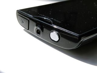
It's a little far away from where you usually rest your hand, so you'll generally find yourself using your other hand to activate it - which is a little irritating.
The microUSB slot is located at the top as well under a dust cap - this is a little awkward to get off at times, and has a frustratingly short leash to keep it in place - meaning you have to really wedge it out of the way to connect up the charger.
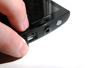
There's nothing at all on the left-hand side of the Xperia X10, nor on the bottom, save a little grille to attach a lanyard if you're one of those that sees a big mobile as an ideal replacement for a necklace.
The back of the phone is slightly curved - we assume this is another corollary of the ergonomics study conducted by Sony Ericsson which led to the 'human curvature' of the Sony Ericsson Vivaz.
It does make it slightly nicer to hold in the hand admittedly - but it adds a lot of thickness to the device, which is 13mm.
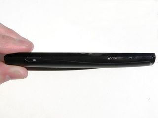
When you consider the HTC HD2, which has a much larger 4.3-inch screen, is a couple of millimetres thinner at 11mm, it does make something of a difference with a device this size.
Overall though, it's not the worst looking phone in the world by a long way - it certainly doesn't overpower your hand when you're holding it, and the screen looks lovely and bright in use, without being dominated by the chassis.
In the box
Sony Ericsson usually chucks in everything it can find into the boxes of its phones, but with the Xperia X10 things are a little more minimalist.

Like HTC and Apple, the box for the X10 is coffin-like, with only basic cables inside.
The environmentally friendly idea of offering a microUSB cable with plug adaptor saves on needing an extra charger, but does get irritating when you keep having to go off and find the lead when transferring content.
Of course, it's probably easier to just perform the latter task by just connecting a memory card and transferring content that way - especially when you get an 8GB card in the box and Android is set up to connect up to your PC and easily copy content across.
Current page: Sony Ericsson Xperia X10: Overview and design
Next Page Sony Ericsson Xperia X10: Interface part I
Gareth has been part of the consumer technology world in a career spanning three decades. He started life as a staff writer on the fledgling TechRadar, and has grew with the site (primarily as phones, tablets and wearables editor) until becoming Global Editor in Chief in 2018. Gareth has written over 4,000 articles for TechRadar, has contributed expert insight to a number of other publications, chaired panels on zeitgeist technologies, presented at the Gadget Show Live as well as representing the brand on TV and radio for multiple channels including Sky, BBC, ITV and Al-Jazeera. Passionate about fitness, he can bore anyone rigid about stress management, sleep tracking, heart rate variance as well as bemoaning something about the latest iPhone, Galaxy or OLED TV.
The stylish De'Longhi Magnifica Evo is down to its lowest-ever price at Amazon
Following recent problems, Chromecasts are getting a free update to Android 14 – here's what that means

Today’s Steam Spring Sale features my absolute favorite game of all time - here's when the sale starts and all the key info
