Why you can trust TechRadar
If you've ever heard anything about the Sony Ericsson Xperia X10 before, you'll know that it is not only rocking Android but its headline-grabbing feature is the new Timescape overlay.
The home screen uses the generic Android display (albeit with a slightly tweaked UI, with everything given a kind of futuristic 'sheen' by Sony Ericsson) and Sony Ericsson appears to have removed the option of having Splines as your home screen alternative, which we can't say we're sad about.
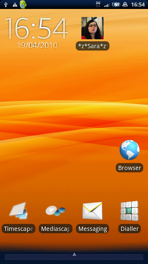
If all that sounds like complete gobbledygook, then don't fret – it's just the ridiculous language used by Sony Ericsson to describe a very simple system.
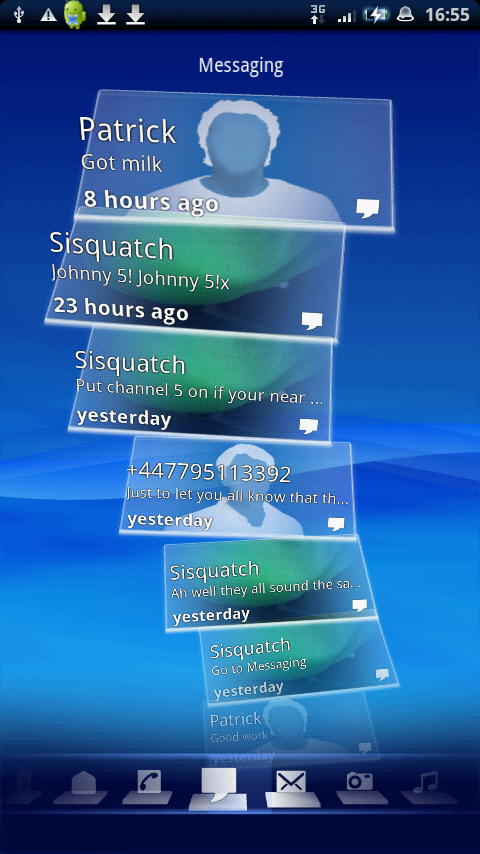
Timescape is basically a stack of tiles, with each one representing a different method of communication or action. Twitter and Facebook updates, text messages, songs listened to, photos taken – all of these get their own tile in the stack (which Sony Ericsson calls 'Splines'... we know).
Now the only way to get to this is by the main tile widget on the home screen, which also displays the most recent messaging update you've received from Twitter, Facebook or text, as well as photos you've recently taken too (although you can alter the filters in the settings menu).
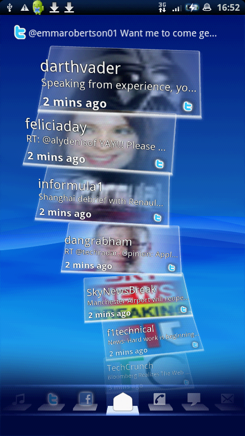
The main view is all of these things together in one long scrollable line – you can set the likes of Twitter and Facebook to update as often as every 15 minutes, but this will obviously drain the battery life faster.
Swipe left and right and you get each activity in its own separate Spline, making it easier to get to things like music or emails.
It's easy enough to just swipe left and right, but if you want to go to a specific Spline, then it's much harder to scroll along the bottom, where all the icons are held.
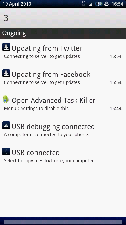
If you have the default Android UI as your main home screen, then things should be pretty straightforward – swipe up from the bottom of the screen for the menu, swipe down from the top and you'll get access to all your notifications.
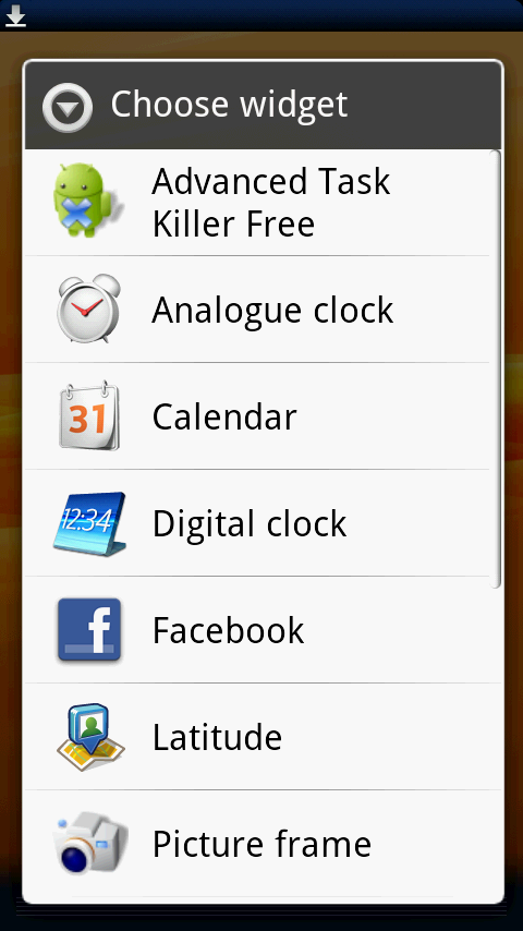
You now get five home screens to swipe left and right onto – here you can drag and drop icons from the menu, or long-press the screen and get access to the widget list, such as power management or clocks.
There's not the greatest range of options in there to be honest – we'd have hoped for more from Sony Ericsson on its first Android phone.
The menu screen at the bottom has been overhauled to bring it up to date with the Android 2.1 upgrade - it's no longer a pull up menu, but a button to press directly. Much easier to interact with, although there can be a terrible slow down on the menu animation actually kicking in - worse, in our eyes, than the original X10 version.
Current page: Sony Ericsson Xperia X10: Interface part I
Prev Page Sony Ericsson Xperia X10: Overview and design Next Page Sony Ericsson Xperia X10: Interface part II
Gareth has been part of the consumer technology world in a career spanning three decades. He started life as a staff writer on the fledgling TechRadar, and has grew with the site (primarily as phones, tablets and wearables editor) until becoming Global Editor in Chief in 2018. Gareth has written over 4,000 articles for TechRadar, has contributed expert insight to a number of other publications, chaired panels on zeitgeist technologies, presented at the Gadget Show Live as well as representing the brand on TV and radio for multiple channels including Sky, BBC, ITV and Al-Jazeera. Passionate about fitness, he can bore anyone rigid about stress management, sleep tracking, heart rate variance as well as bemoaning something about the latest iPhone, Galaxy or OLED TV.
