Why you can trust TechRadar
The updated Sony Ericsson Xperia X10 Mini now comes with the standard Android 2.1 lock screen, albeit one that's blue-tinged as with the rest of the phone's customised Android interface.
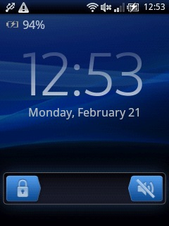
Is it a better system than Android 1.6's press-a-button-to-unlock system? It's a bit more stylish and enables you to silence the phone without fiddling around. Nothing groundbreaking, but a welcome tweak.
The Xperia X10 Mini's Android 1.6 operating system has been thoroughly, comprehensively skinned, just like its fatter older brother the Xperia X10. Gone is the usual Android Home screen, replaced by a flickable, scrolling list of widgets.
This is a most jarring change if you're an experienced Android user, with each of the X10 Mini's imitation Home pages only allowing one widget to sit right in the middle of it.
But you are allowed to have 20 active widgets on the go at once, all lined up from left to right with a screen all to themselves.
The clever part is what happens when you press the screen's down arrow or the Home button when on a widget screen – it pops up a segmented Android app drawer, with your collection of installed apps neatly tucked away beneath the headline widget in neat, three-by-three grids, so there's no extra scrolling or fiddling about to launch apps.
Basically, every app on the phone is part of this lower extension of the widgetised Home screen, which is a very clever way of maximising the X10's precious screen size and helping users navigate the phone.
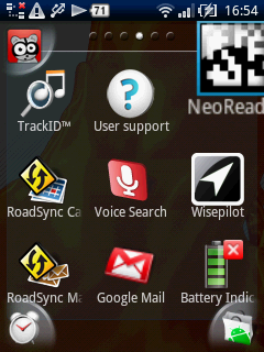
Plus, each top screen has a separate shortcut icon space in each of its four corners, letting users add quick launch buttons to favourite apps.
Yes, you only get four of these links across the whole top space – but when pressing Home brings up your entire collection of installed apps anyway, it really doesn't matter. It's simply a nice little extra.
However, being Android underneath means third-party Android Market apps are all fully installable, including the alternate launcher tools and Home replacements.
Now the Xperia X10 Mini has been updated to Android 2.1, more apps are available, filling a few of the embarrassing gaps caused by the phone's use of Android 1.6 at launch.
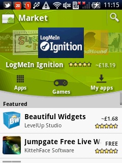
Using the redesigned Android Market on the X10 Mini's tiny screen is quite difficult. It's hard enough navigating on a 2.5-inch touchscreen and when you're only allowed to use less than half of it it becomes harder still.
But it's quick enough to use and allows the phone to sync and access online installs from the new web-based Android Market, so is a significant improvement over the old 1.6 version of the phone. Although that's thanks to Google's recent updates, rather than Sony Ericsson's.
We tried putting the popular ADW.Launcher on the X10 Mini and it worked perfectly, giving the X10 Mini a standard Android-style desktop layout if that's what you're after – or if you just want to see how silly it looks on a 2.55-inch screen.
Again, we doubt the sort of buyer Sony Ericsson has in mind will be bothered about alternate Home launchers, but if you're worrying that the OS has been dumbed down in any way – stop. It's Android through and through. You can tweak away. Nothing's been compromised.
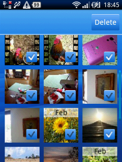
A particularly nice minor UI touch is the addition of a 'Delete Several' option, which pops up a tickbox on large lists of icons, making it super-easy to trim down your memory card's music or photo library content.
You'll find this a lot when using the X10 Mini – whenever you press a button expecting something to happen, the thing you hoped would happen, happens. It's definitely rivalling HTC's Sense UI, as featured on the five-star HTC Desire, in the usability stakes.
Current page: Sony Ericsson Xperia X10 Mini: Interface
Prev Page Sony Ericsson Xperia X10 Mini: Overview Next Page Sony Ericsson Xperia X10 Mini: Contacts