Why you can trust TechRadar
Again, this is déja vu time if you've already read our review of the Xperia X10 Mini, since the Sony Ericsson Xperia X10 Mini Pro uses an identical version of the heavily skinned Android OS that worked so smoothly within the X10 Mini.
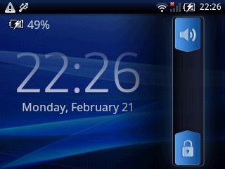
The change to Android 2.1 brings one immediate and obvious alteration, thanks to the new lock screen. Press any button to wake up the screen, then slide the lock icon to access the phone's Home screens – or slide the volume icon to silence all tones and alerts.
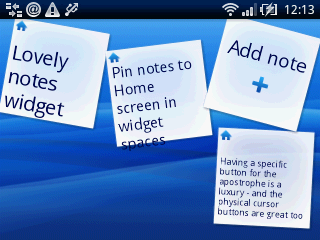
The Home screen look and operation is exactly the same as in Sony Ericsson's Android 1.6 user interface skin. You start off greeted by the reworked widgets system, which only enables users to display one large Android widget in the middle of each screen.
You're allowed to have 20 of these screens lined up from left to right for you to scroll through, with Sony's corner-based UI adding four additional customisable app shortcuts to the corner of the main screen.
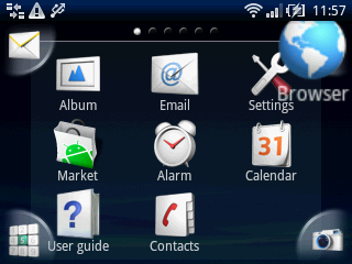
It's a brilliantly simple system. Pressing the Menu button from the Home screen reveals the option to rearrange your icons, and from here you're able to choose which four you want to be permanently displayed on the four corners of your phone's desktop.
Anything goes, so you can have a shortcut to your SMS messages, music player, browser or whatever, all perma-displayed in the corner for easy access.
If you do use your phone for more than four things, do not panic – swiping your finger up the screen slides the standard Android app drawer into view, which features shortcuts to everything that's installed on your phone.
It's a very smart way of maximising the phone's tiny 2.55-inch touchscreen.
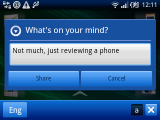
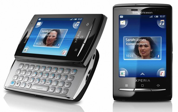
The QWERTY keyboard is also a bit of a godsend when working with the X10 Mini Pro's limited screen space. The simple fact that you tend to use the Mini Pro in landscape mode with the keyboard popped out means you find yourself with a more readable, spacious screen than found when navigating on the regular X10 Mini.
Slide out the QWERTY – which clunks open in a very solid and satisfying manner – and the screen orientation immediately rotates, making everything seem slightly more natural and uncluttered when displayed in this miniature widescreen format.
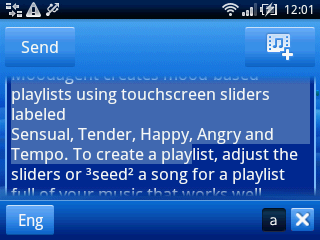
The only problem we have with the Sony Ericsson Xperia X10 Mini Pro's QWERTY keyboard is its lack of an Android-spec Back button. The left and right cursor buttons let you navigate through text easily, but if you want to quit an app or go back the previous menu, you have to reach up and press the silver button beneath the touchscreen.
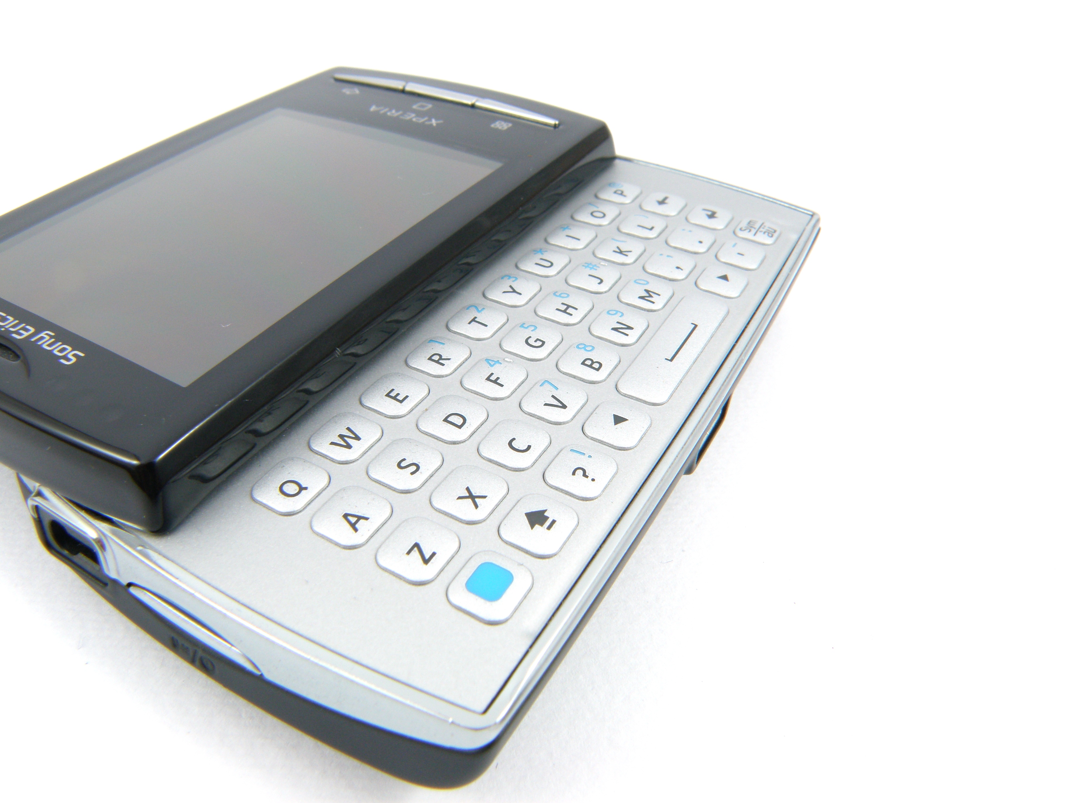
It's not much of a reach given how compact the phone is, but an extra Back button in the QWERTY area would've been a nice touch.
Current page: Sony Ericsson Xperia X10 Mini Pro: Interface
Prev Page Sony Ericsson Xperia X10 Mini Pro: Overview Next Page Sony Ericsson Xperia X10 Mini Pro: Calling