Why you can trust TechRadar
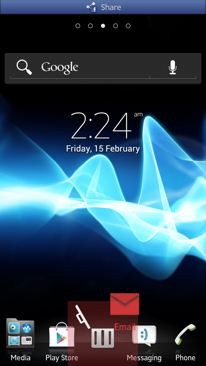
As custom Android interfaces go, Sony's NXT UI stands out among our favourites. The interface elements are clean and polished-looking, and many feature animations which really bring the phone to life, in some small measure.

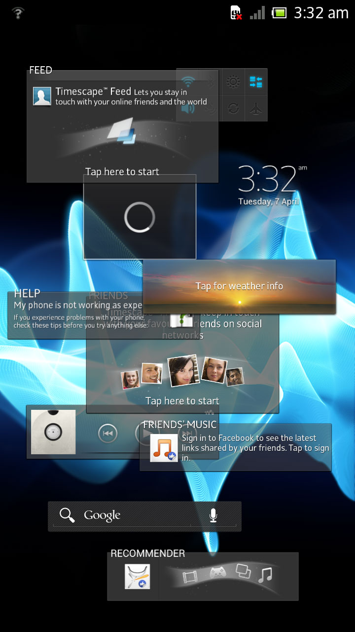
When you power up the Arco S for the first time you'll find Sony-designed widgets on every home screen pane. This may sound commonplace, but few phone makers spend the time and money on creating as many of these handy tools as Sony does. The weather widget is attractive, the video playlist widget is in a funky animated rolodex style, and Sony include a full-featured connectivity widget for quickly switching tools, like Wi-Fi, on and off.
Most importantly, the system responds well to our input, with only minor lag noticeable during standard home screen navigation. Virtual buttons respond promptly when pressed and gestures like pinching are effective. Some previous Sony phones have felt a bit sluggish, but this isn't the case with the Acro S.
Our review unit was delivered running Android ICS (4.0.4), which dates the handset slightly, and means you miss out on some of the cool Google-made features found in the newer Jelly Bean build of the Android platform, specifically the excellent Google Now search tool. Sony has been pretty good about updating its older phones to new versions of Android of late, but it is hard to say when the Acro S will see the update.
This shouldn't be seen as a deterrent for many users, though. The ICS platform definitely provides a solid base for the phone, and delivers zippy performance.

This system isn't as easy to pick up and use as others as, though, especially next to the iPhone. Lots of important functions are hidden within menus or behind icons that don't adequate illustrate what their purpose is.
For example, in the applications draw there is an image of a box made up of four smaller boxes inside it. Without knowing, we'd have guessed this indicated that the app drawer was displaying a Grid View, and that pressing it would change the apps draw into a List View, perhaps.
Instead, you use this button to rearrange icons in the app draw, and you need to press it if you want to uninstall an app from the system. There is absolutely no way of knowing that just by looking at the icon.
