Why you can trust TechRadar
The Sony Xperia E1's hardware is not perfect, but I do find the Sony custom interface to be one of the better ones you can get at this low price point.
At this cheaper end of the scale, UIs can often be produced by price-slashing phone makers that don't always 'get' what makes software work.
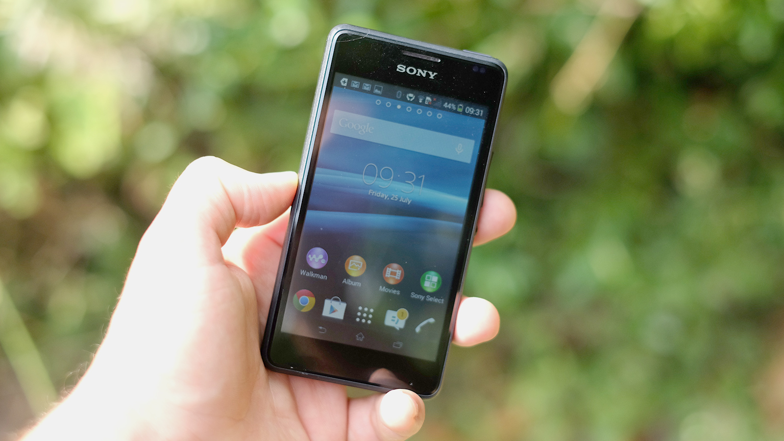
Sony knows how to make its software look good, and its custom Android UI largely subscribes to the 'keep it simple, stupid' mantra. It's a good one.
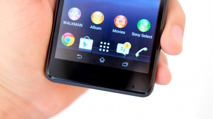
The Sony Xperia E1 doesn't mess around with the basic layout of normal Android, and while the soft navigation keys are built into the screen rather than having their own hardware, Sony has made sure they're not too big. They also look good, something that's not always the case in cheaper phones.

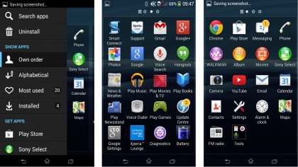
You get five homescreens, although you can add an extra two if you want. Sony's app menu is pretty good too.
Flick to the far left of the menu and you can bring up another menu that lets you quickly uninstall apps and rearrange your app treasure trove. The Xperia E1 also supports folders, making it easy to hide away anything you don't like (although there's no actual 'hide app' option).
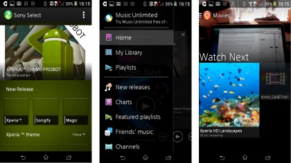
Like other Sony phones, the Xperia E1 has a few pre-installed apps, and not all of them are too useful. Having a Sony movie player and Sony Walkman app is handy, as they look quite good and these areas are generally neglected in cheaper mobiles – you often only get Google's default apps.

I could live without things like Xperia Lounge, Xperia Care support, Smart Connect and Sony Select, though. While they're there to help out, they are also bloatware, and who need a third-party app store like Sony Select when Google Play is pre-installed? They're part of the reason why the Xperia E1 has so little spare storage.
This bloat is minimal though, and some other elements of the interface are refreshingly pared-back. The notifications menu is the best example.
Where some UIs fill this all-important notifications screen with brightness sliders and features toggles, leaving little room for actual notifications, the Sony Xperia E1 makes sure phone updates are given priority. And it still manages to fit in buttons for features and brightness, plus a clock. It's careful design in action.

For all the thought that has gone into the interface, though, it's not tremendously quick. While not consistently slow, you do have to put up with a lot of pauses and stuttering as the Xperia E1 struggles to keep up. It's all down to that lacking 512MB of RAM – its the grease that makes the cogs of any computer system run smoothly, and 512MB isn't quite enough these days.
Until quite recently, that sort of spec was something you had to put up with in an entry-level phone. But now several offer 1GB of RAM, you can get smoother performance elsewhere. Having experienced these smoother phones, most notably the Motorola Moto E, the Xperia E1 can be quite frustrating to use
In benchmarks and games, the Xperia E1 fares a bit better as deficiencies in RAM are clearest when multitasking, or at least hopping between apps. The phone scores a pretty lowly 606 points in Geekbench 3, but it's around the figure I'd expect from a phone with a Snapdragon 200 CPU – it's dead on the score of the Motorola Moto E.

The phone can handle some 3D games fairly well thanks to its low screen resolution too. But storage is a huge issue.
You only get a few hundred megabytes of free data to play with from the initial 4GB, and as most games can't simply be installed to an SD card right off the bat, the Xperia E1 makes a pretty terrible gaming comparison. It's the same deal with many 4GB storage phones.
If you're a gaming fan, think about upgrading to the excellent Motorola Moto G, now available for around £100 if you shop around.
Current page: Interface and Performance
Prev Page Key features Next Page Battery life and the essentialsAndrew is a freelance journalist and has been writing and editing for some of the UK's top tech and lifestyle publications including TrustedReviews, Stuff, T3, TechRadar, Lifehacker and others.

