Why you can trust TechRadar
Contacts
If like us, you still use your phone to make phone calls, you will be glad to find that the Xperia L comes with that ability. If you have lots of contacts, unlike us, you'll also be pleased to find that with Google's Android Jelly Bean behind it, the Xperia L will draw in your contacts.

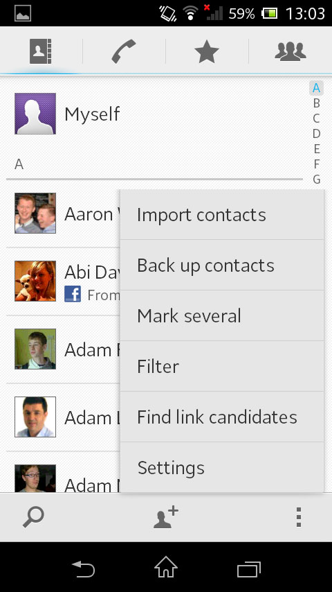
The contacts app itself is a nice design, with Sony adding a few tweaks to customise the Android underneath. The white background is pleasing and makes the text easier to read in the sunlight. Each contact also comes with a little profile picture, which defaults to the Google+ image.
Images will also be drawn in Facebook, or other social accounts, should you not have a Google image for that person.
Overall as an app, it is a pretty standard affair by smartphone, or Android standards. The list is quick to navigate, and as you scroll through, a little letter pops up at the top of the screen to allow you to stop when you get to right one. You can also navigate by tapping the letters down the side.
Android also allows you to filter contacts, only showing data from certain accounts. The Xperia for Facebook app also pulls in your data, and allows you to view contact's status' . After installing the Twitter app from Google Play, you can also use the Xperia for Twitter function.
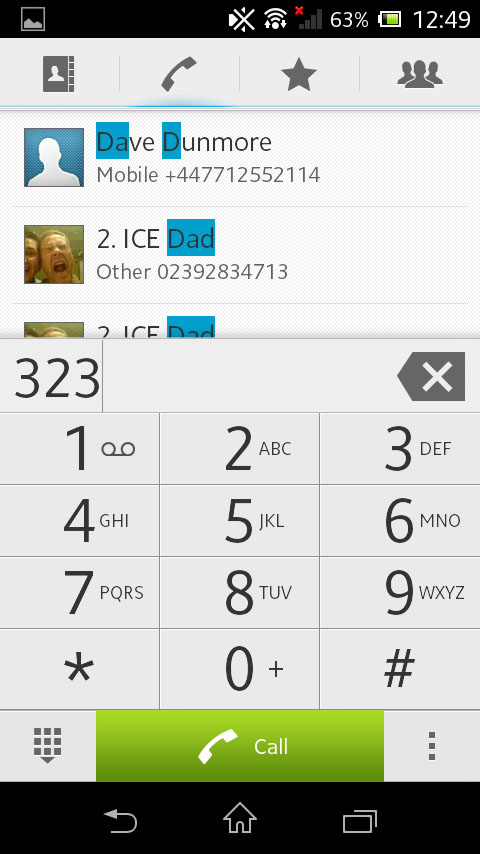
Within the Xperia's contact and phone app, the top houses four main tabs, allowing you to flick between Contacts, the Dialler, Favourites and Groups. Each app is fairly self explanatory, and you'll be pleased to know that the Dialler does support smart dialling.

Besides the settings button (denoted throughout Android as a series of three dots), sits a magnifying glass, for contact searching, and the contacts add button.
Sign up for breaking news, reviews, opinion, top tech deals, and more.
Within the settings are the account settings, as well as allowing you to filter out on/offline contacts, and show only contacts with phone numbers.
Contact cards on the Xperia L are, again, a fairly standard affair. Mini cards can be accessed by tapping the profile pic, or the main one is loaded by tapping the contact. The theme continues through, and you are able to make calls and send messages directly by tapping the contact information.
Disappointingly, within the contact card, the larger pictures that fill the top of the screen can feel a little low res, as they have often been stretched to accommodate the large horizontal bar. Within the editing screen, it is possible to set customised ringtones, or even send calls from that contact straight to voicemail.
Calling
The call quality on the Xperia L is actually rather decent. The microphone and speaker are both placed well enough and are both loud enough for you to hear. We also found that the volume rocker was well placed so that we could adjust it while in a call with little no hassle.
When receiving a call, a large contact image comes up, or a large silhouette. This is a massive improvement over the Samsung cartoon face, that always seemed a bit creepy to us. Large red and green buttons also appear allowing you to swipe to accept or reject calls.
Thankfully, we didn't experience any dropped calls. Signal holding is about what you can expect, nothing spectacular, but it managed to match what we expected from other handsets.
