TechRadar Verdict
The compact Sony Xperia M may be both competent and affordable, but with the low-end competition stronger than ever, it doesn't represent great value for money.
Pros
- +
Affordable & lightweight
- +
Dedicated camera button
- +
Expandable storage
- +
Loud speaker
Cons
- -
Cramped screen & keyboard
- -
Old Jelly Bean OS
- -
Mediocre camera
- -
Very low internal storage
Why you can trust TechRadar
Sony was so intent on returning to the top of the smartphone tree in 2013 that it launched two high-end flagship devices. The Sony Xperia Z1 trailed the Sony Xperia Z by just six months.
But this rather misses the fact that the low-end is where all the excitement is with Android right now. The recently launched Sony Xperia L might be seen as Sony's affordable effort, but the likes of the Nokia Lumia 520 and the Motorola Moto G offer a decent smartphone experience for well under the £200 (under $200, AU$230) price point.
Indeed, the Moto G pretty much redefined what a 'cheap' smartphone could be, both in terms of price and performance.
The question the Sony Xperia M has to answer, then, is one that we suspect every affordable smartphone will have to answer in the first half of 2014. Why should you buy one when you can buy a Motorola Moto G for less money?
The answer, we're afraid to say, is that you probably shouldn't. Unless, that is, you want an iPhone-sized screen in a cheap Android shell, or if you demand a physical camera shutter button on your phone.
Family traits
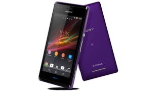
Sony attracted a fair amount of praise for its 2013 smartphone facelift. By focusing on a severe, almost industrial, sharp-cornered black slab design it managed to stand out from the crowd of me-too iPhone copies and sculpted plastic efforts.
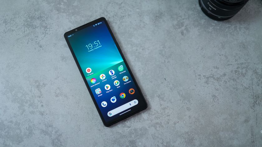
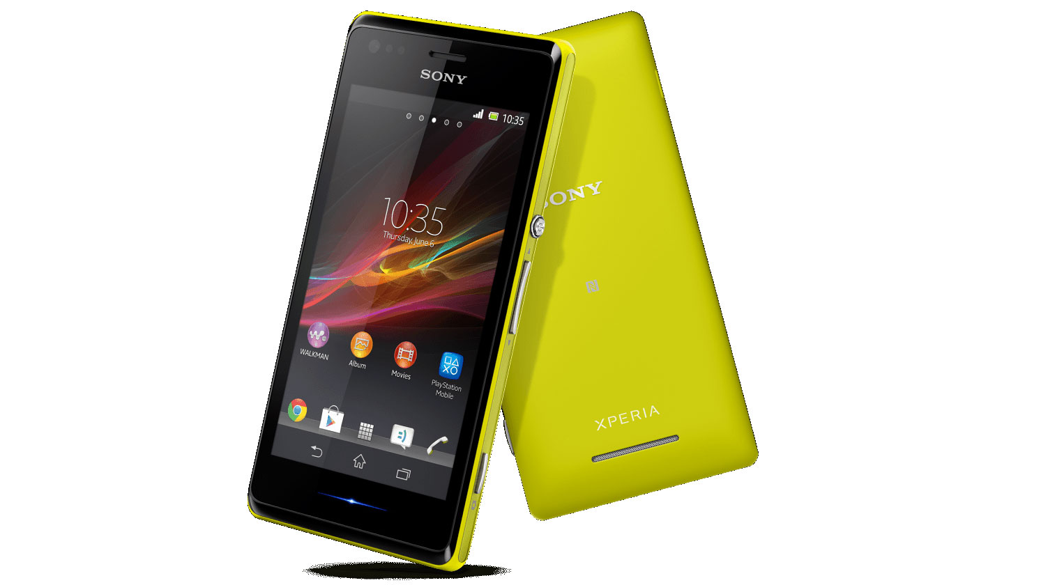
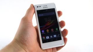
The Sony Xperia M makes a cursory nod to that immediate heritage, but it's hardly a looker. Sony has once again gone with a somewhat anonymous blank-faced design with an all-glass (or mostly glass) front, with a slightly gaudy (but useful) notification strip-light hidden immediately below the screen.
The sides and rear of the device are all one plastic component. This can be peeled off via a neat access point built into the ridge of the microUSB port on the upper left hand side. Exposing the Xperia M's innards provides access to its battery, as well as the SIM and microSD slots.
Though this approach is commendably tidy, I almost wish the microSD slot had been made accessible from the outside, as the Xperia M suffers from a cripplingly small amount of internal storage - a frankly pathetic 4GB, which works out to just 2GB of usable space once the OS has had its portion.
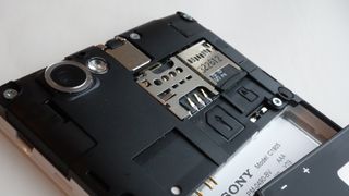
If you have anything less than a 16GB card, I fear you'll be reaching capacity quickly.
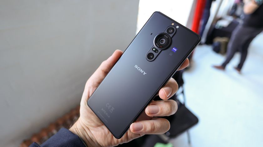
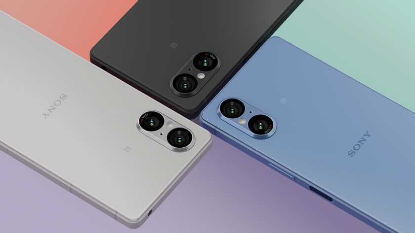
Back to external matters, and by making its rear cover encompass so much of the phone, the Xperia M feels pleasantly solid. Turn it over, and the matte finish and blunted corners of the rear panel put us in mind of the recent Nokia Lumia range.
Those silver plastic edge strips just look plain tacky, though, and the tapered shiny plastic front panel surround reminds us of HTC's designs from four years ago.
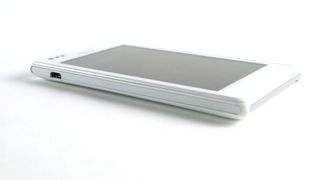
Sony's ideas about control layout continue in the entry-level Xperia M - that is, keep the front section completely free of physical buttons and plonk some contrastingly chunky examples together on the side.
I quite like this approach. It means that you never have to take your attention away from the screen to press a button, even when you have to interact with one of the virtual controls that takes up a thin band of the display.
Yes, Sony is one of startlingly few manufacturers to adopt Google's own virtual control set-up, but we'll discuss that more a little later.
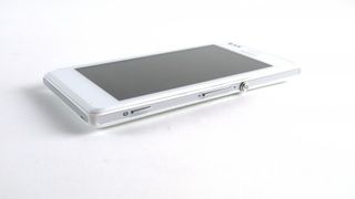
The side-mounted physical controls do the job far better than most rival offerings. The almost obscenely pronounced power button is as easy to find in a rushed pocket scramble as it is satisfying to press, and its location two-thirds of the way up the device make it fall naturally under your right thumb or left forefinger.
Just below that is the similarly well positioned volume rocker, which has a usefully pronounced concave curve from end to end.
Speaking of concave, the entire rear panel of the Xperia M dips slightly in the middle, with the top section (housing the camera) and the bottom section (housing the speaker) bulging out slightly.
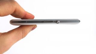
The effect isn't quite as pronounced as that of the Sony Xperia L, but there's clearly some of that phone's DNA in the Xperia M.
At just 115g it's a fair bit lighter than most modern smartphones, and almost matches fellow 4-inch lightweight the iPhone 5S.
Suffice to say that overall, the Sony Xperia M is a solidly built phone that betrays its entry-level position with some less-than-premium components.
