Why you can trust TechRadar
Snappy features
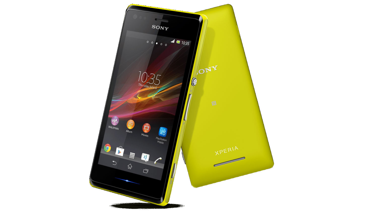
Sony is marketing the Sony Xperia M as an affordable smartphone that provides high-end features. But is that necessarily the case?
It's certainly true that features such as NFC for quick connectivity to speaker docks and easy 'one touch' local data transfers is a relatively advanced feature. Neither the Motorola Moto G nor the Nokia Lumia 520 have the feature, for example.
It's also true that most low-end smartphones fail to include an HDR camera mode (the quality of which we'll discuss in the appropriate section).
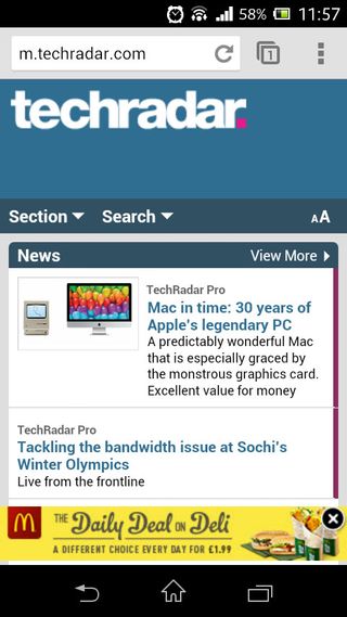
However, in general terms the Xperia M is far from high-end. Most noticeably, its 4-inch display is well below what most non-Apple smartphone users have come to expect in terms of size.
Indeed, with Android phones specifically the bare minimum screen size seems to have been accepted as 4.3 inches.
There's no doubt that the Sony Xperia M feels small in a way that even the iPhone doesn't.
While iOS has been built with Apple's gorgeous 4-inch display firmly in mind, resulting in a thoroughly pleasant experience throughout, the Xperia M's Android OS feels somewhat cramped.
Part of that could be to do with the implementation of those virtual controls we mentioned earlier, which take up a small-but-noticeable portion of the screen.
With a 5-inch display like that found on the Nexus 5, it's not a problem. Here, it makes things like games and websites feel all the more squished.

There's also the unavoidable issue of sharpness. The Sony Xperia M only has an 854 x 480 resolution, which produces 244ppi.
That's not bad, exactly, but trails behind new entry level devices like the Moto G (326ppi) or even older mid-range phones like the Nexus 4 (318ppi) by a little under 100ppi.
This means that text and images on the Xperia M look, if not exactly fuzzy, then certainly not quite as sharp or detailed as on other recent Android phones.
It's also noticeable that the Xperia M's display is positioned a fair bit below the external touchscreen surface, which leaves a slightly disconcerting gap and leads to a picture that doesn't pop as much as it should. That's probably not helped by the fact that there's no Bravia technology to be found here.
One key feature of the Sony Xperia M that we're fully behind, though, is its dedicated camera shutter button.
Not only does its offer a two-stage capturing system, negating the need for an unnatural and unsteady grip as with most touchscreen-activated phones, but it also offers a quick shortcut to the camera app.
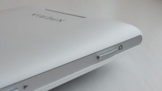
Hold the shutter button all the way down and the Xperia M will jump you straight to the camera. Response times aren't lightning quick, but they're certainly swifter and more reliable than any touchscreen-only camera phone - particularly when you're fumbling to capture that fleeting moment.
We've been big fans of this approach for some time, so it's a shame that only Sony and Nokia seem interested in perpetuating it.
But the primary key feature of the Sony Xperia M has already been mentioned - its price. At £175 (around $195, AU$220) it's currently the cheapest phone in the Xperia range, but it still feels overpriced to us when you can get sharper, faster, more desirable phones for the same or less.
