TechRadar Verdict
The Xperia M2 faces some serious opposition in the mid-range market. Its battery life is impressive, as is the design of the UI and handset. The camera disappoints, as do a few other features, but overall it manages to hold its own.
Pros
- +
Flagship design
- +
Impressive battery
- +
Attractive Sony UI
Cons
- -
Poor camera
- -
Lower res screen
- -
Body scratches easily
Why you can trust TechRadar
Given the critical acclaim that the newly launched Sony Xperia Z2 has received, it is vital that Sony follows up with equally impressive mid range handsets if it is to compete with Apple and Samsung. Enter the Sony Xperia M2.
Not too long ago it seemed that Sony might have been out of the mobile running. Shoot forward to 2014 and Sony has established itself at the top, although the Japanese firm has yet to firmly prove itself with a truly decent midrange handset. Could things be about to change with the Xperia M2?
At first glance the Xperia M2 seems like a respectable proposition; a quad-core processor, 8MP camera and 4G LTE support, wrapped in a chassis that looks oddly familiar all for £230 (about $385, AU$415) or free on two year contracts starting at around £13 per month.
This means that the Sony handset has a tough fight on its hands, facing off against the newly relaunched 4G Moto G, as well as the Samsung Galaxy Ace 3, EE Kestrel and the OnePlus One, all of which come in with a similarly low price tag.
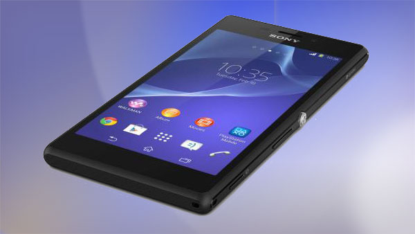
The competition is fierce then, but with the same Sony Omnibalance design aesthetics that has graced its recent flagships the Xperia M2 certainly stands out. This could really help the M2 succeed where the Xperia SP failed.
Sony could be criticised for its almost minimalist approach, but I have grown fond of the more industrial design nature that accompanies Sony handsets.
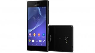
The large 4.8-inch screen dominates proceedings, packed with 540 x 960 pixels. This seems a little disappointing as the 229ppi pixel desnity is by no means razor sharp, although I never found the lack of pixels to be too much of a sticking point.
It should be noted though that the 4.5-inch Moto G comes in with a HD 720 x 1280 screen, so would be a better choice for those intent on watching a lot of movies or for heavy mobile gamers.
Back to the design I feel that the language of the Xperia M2 is far more reminiscent of the original Xperia Z flagship, albeit one fashioned out of plastic rather than glass and metal.
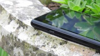
The plastic construction helps to keep the weight of the 139.7 x 71.1 x 8.6mm frame down to only 148g, although the M2 still has a reassuring heft behind it.
Over the course of my time with the Sony Xperia M2 though, I found that the shiny plastic back was extremely prone to fingerprints and it wasn't long before minor scratches became noticeable.
Along the base of the M2 you'll find the external speaker in the same place as on the Xperia Z. Those with a good memory will remember that this was a bit of a problem for the Z, especially when watching movies.
Although Sony has taken note of this and corrected it on the Xperia Z2, the problem persists here. Being seated at the bottom means that holding the M2 in landscape for movie watching causes the sound to feel distorted coming in just one ear.
While in portrait for gaming I found that my thumb was covering the speaker giving a heavily muffled sound.
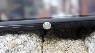
Elsewhere the Sony design is evident with the large power/lock key sat in the middle of the right side of the Xperia M2, with the microSIM and microSD slots hidden at the top end behind a small plastic cover. The volume rocker and dedicated camera button sit towards the bottom.
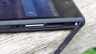
Hiding the SIM and SD slot might appear to be a hint that the Xperia M2 has taken notes from its bigger brother in terms of water and dust resistance, although this isn't the case. I found this very disappointing, as it would certainly have given the M2 an edge over its nearest rivals.
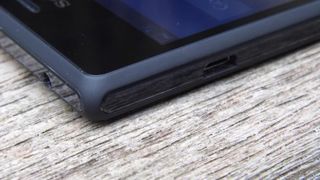
On the other side of the handset is an uncovered microUSB port leaving the headphone port to sit along the top.
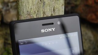
Interestingly there is a notification light that shows up just to the left of the speaker. This illuminates while the M2 is on charge, as well as when you have a text message. However I found that it only lit up once rather than repetitively and is so small it's almost unnoticeable.
At the base of the screen is another light, very discretely hidden. This light seems even more pointless as the only time I saw it light up was when a call was coming in, and given that the M2 spent most of its time in my pocket it wasn't seen.
Packed behind the screen is a 1.2GHz quad-core Snapdragon 400 processor backed up with 1GB RAM and 8GB of internal storage.
Despite the microSD support I was disappointed to find that only 5GB of the internal space was accessible. A 2300mAh battery is also included to power the M2.
An 8MP camera has been fitted to the back, carrying the same app features that can be found on the Xperia Z range. Round the front is a far more modest VGA camera for those desperate to take a self-portrait.
On paper the Sony Xperia M2 paints an interesting picture for itself, but the specs can only ever paint half the picture. Can the M2 live up to these high expectations?
