Why you can trust TechRadar
When it comes to choosing an Android phone, the interface can prove to be as important as the specs. First and foremost is the version of Android, currently Android 4.3 Jelly Bean on the Sony Xperia M2, although an update to KitKat is thankfully on the cards.

Sony's UI doesn't come with any particular name, where Samsung has TouchWiz, HTC has Sense and Huawei has Emotion UI, it's something that Sony might want to look at.
It's hardly important, but makes it easier to talk about to friends. I'm voting for Sony Superawesome UI.
That's because the Sony UI is a highly polished interface, one that doesn't feel overbearing at any point, being far subtle in its implementation than Sense and TouchWiz. This allows the Android OS to shine through.
Moving around the Sony Xperia M2 was easy, unsurprisingly not as fast as the higher end flagships but at no point did I feel that I was left waiting.
The GeekBench 3 scores averaged at around 1060. This means that it comes in slightly slower than the Moto G, and oddly lower than the EE Kestrel that ships with the same internal power.
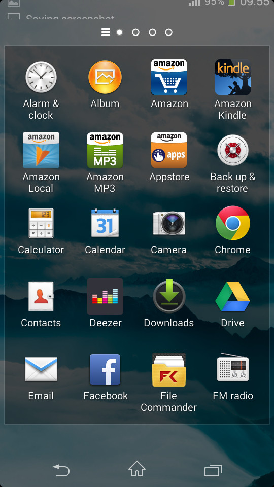
From the notifications bar, with its minimalist approach to the quick power toggles, to the app drawer and its menu located to the far left, it's clear that Sony has given the UI a lot of thought.

Themes can be applied to give the Xperia M2 a new feel, changing the background as well as the accent colours throughout the device.
Should you feel that none of the ones on the M2 are to your liking, you can always download more. I found the Spider-man one particularly tempting.
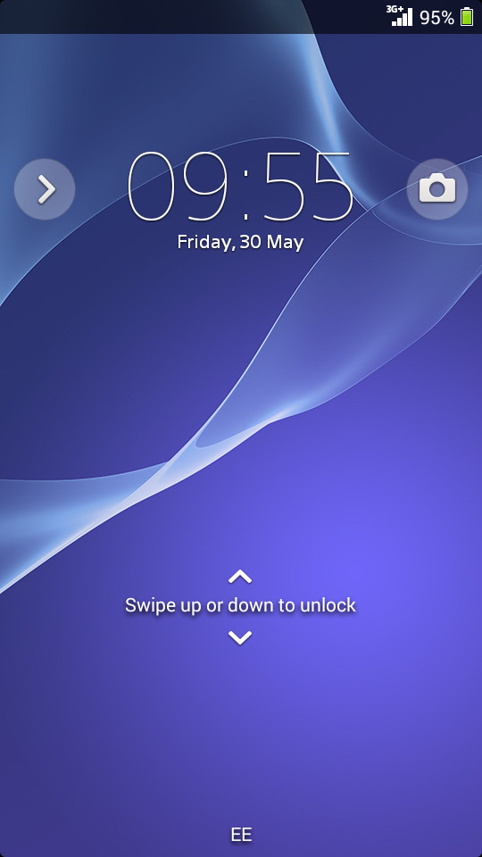
The lock screen has an interesting shutter effect as you swipe up and down, and also houses the ability to turn widgets on/off. This is something that is becoming popular among manufacturers, and while I can see the appeal it isn't something that I found myself using an awful lot.
Side swiping the top of the lock screen accesses these widgets, with a swipe right bringing up widgets and a swipe left loading up the camera.
I found this particularly confusing as the Sony Xperia M2 comes with a dedicated camera button that instantly loads the camera. This space on the lock screen could definitely have been used more efficiently.
One area that I think Samsung has gotten it right with TouchWiz is the ability to launch into a multi window view, allowing the easy copying of text between, for example, an internet browser and the SMS app. Sony has implemented a similar idea, but it feels a little less useful.
By pressing the multi-tasking Android key you're greeted at the bottom with the ability to load up floating windows. These include a browser, screen shot key and a calculator. More apps are available to download from the Google Play Store should you desire them.
