Why you can trust TechRadar
The Sony Xperia Miro continues to disappoint when you turn it on, with a screen that while bigger than the Xperia Tipo's is no higher resolution.
This leads to a low pixel density (165ppi).
It's not terrible, but it is noticeable, because neither text nor images are as crisp and sharp as they could be.
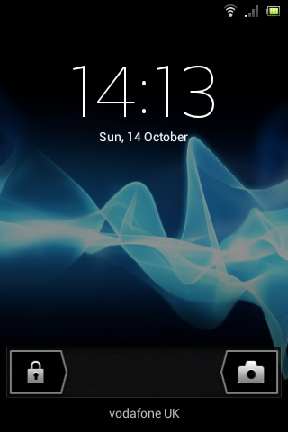
The lock screen has the standard Xperia layout of a big clock at the top with the date below it and a two way slider at the bottom.
Swipe it right to unlock the phone or left to launch the camera. You can also drag the notification bar down to view any reminders, access the settings screen or act on missed calls and texts.
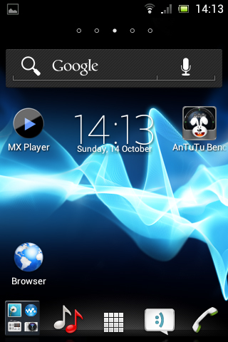
Once on the home screen you'll find a selection of widgets already up and running, and these are of varying usefulness.
On the one had you get the likes of a weather widget and a music controller, both of which are certainly appreciated, though you may find you want to replace them with alternatives once you've had a look around Google Play.
On the other hand, it also comes with a widget that just advertises various apps and games from Sony's own stores.
We can't see that one surviving more than a few minutes on most people's home screens.
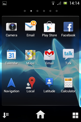
In the dock at the bottom of each home screen you'll find an icon that takes you to the app drawer.
All of your apps live here and can be sorted alphabetically, by most used, recently installed or in a custom order.
Of course you can also place apps on home screens and in folders.
You'll also be able to access your text messages, dialler and Sony's music store from icons in the dock, though you can move things around if you prefer.
The final icon that's in the dock by default is a media folder, with the camera, music player, radio and photo album inside it.
Pinching any home screen brings up a screen with all your active widgets, and tapping any of them will bring you to the screen it's on.
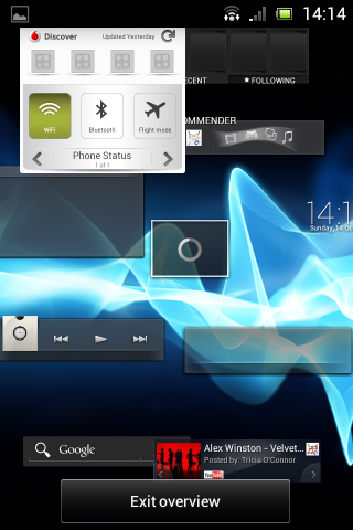
We'd have thought it would make more sense to launch the related application.
Alternatively, if it's intended as a way of jumping between home screens then showing a thumbnail of each home screen would make more sense than just showing the widgets.
As it is, its usefulness seems pretty limited, but if there are any widgets that you regularly want quick access to then you may find it beneficial.
Long-pressing empty space on a home screen will bring up a menu that enables you to place widgets, applications, folders and shortcuts, as well as changing the wallpaper or theme.
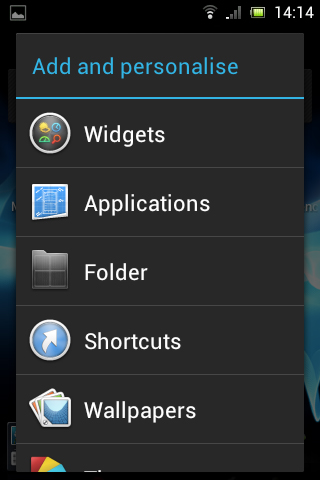
The themes on offer seem to just be wallpapers, providing an abstract background in one of a number of colours.
They don't change application icons or fonts as you might expect them to, but in a nice touch they do change the colour of the main notification light to match them.
Tapping the menu key from a home screen gives you access to the same set of options, along with the settings screen.
Long pressing an icon enables you to drag it around, or if you drag it to the bottom of the screen you can delete it, while dragging to the top enables you to share it when applicable.
Being Android 4.0.4, the Sony Xperia Miro's operating system is about as intuitive as Android has ever been.
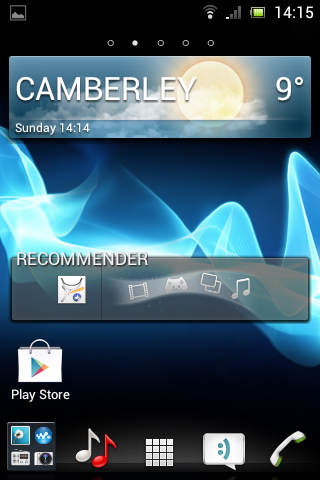
And Sony's overlay doesn't stray too far from the stock experience, doing little to help or hinder its intuitiveness.
That's a good thing, in our opinion.
There was a time when Android was still finding its feet and manufacturers' UI's were desirable because they often fixed any shortcomings of the system.
But stock Android has hit its stride now, and too much meddling is likely to hurt the experience.
Swiping between home screens is often a bit jerky, and you're limited to just five (unless you replace Sony's launcher with one from Google Play).
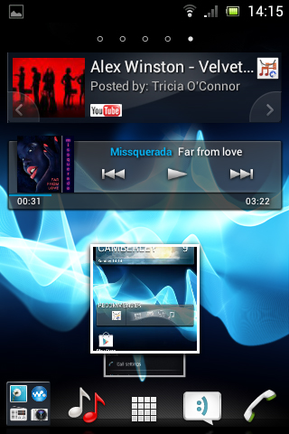
Five home screens isn't likely to go far for most users, since just two widgets can potentially take up a whole screen, and that's before you've filled them with apps and folders.
The jerkiness is disappointing too. We might expect it if we were running a processor-intensive game, but moving between home screens is one of the most basic operations that a smartphone needs to be able to do.
The touchscreen itself feels surprisingly resistive.
Not to the extent of say the Samsung Tocco Lite 2, where it actually impacted our ability to use it, but enough to leave it feeling slightly unpleasant and stiff.
It's all the more surprising because we didn't have this problem with the Sony Xperia Tipo despite it being a lower-end handset in the same range.
James is a freelance phones, tablets and wearables writer and sub-editor at TechRadar. He has a love for everything ‘smart’, from watches to lights, and can often be found arguing with AI assistants or drowning in the latest apps. James also contributes to 3G.co.uk, 4G.co.uk and 5G.co.uk and has written for T3, Digital Camera World, Clarity Media and others, with work on the web, in print and on TV.
