Why you can trust TechRadar
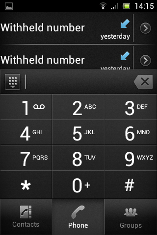
Tapping on either the contacts or phone icons on the Sony Xperia Miro will take you to the same set of screens.
The only difference is which one you start on.
The phone takes you to the dial pad, while contacts takes you to the address book, but there are icons at the bottom of either screen to switch between them.
You can also access groups from here, and there doesn't appear to be a separate icon for that.
The Sony Xperia Miro supports smart dialling, so once you start tapping out a number on the dial pad, suggestions will appear at the top of the screen.
Call logs also appear on this screen, and you can minimise the dial pad to get a better overview of them.
Pressing the menu button here enables you to hide the call log if you'd prefer, and you can also set up speed dial - assigning contacts to any number from 2 to 9, with 1 being used for voicemail.
Contacts
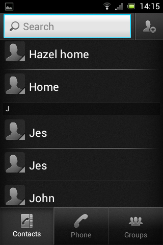
The contacts screen displays entries in alphabetical order, though you can sort the list by first or last name and filter contacts, for example to only show those with phone numbers or only show those who are currently online.
Tapping the menu button enables you to backup, import or delete contacts, as well as sharing them over Bluetooth, SMS, email or Evernote.
Tapping a contact brings up their details and enables you to call, text, email or IM them.
It's a shame you have to go into their information to call them rather than being able to do it straight from the main contacts screen, but smart dialling, speed dial and favourites provide plenty of other speedy calling options.
There's a search bar at the top of the contacts screen, making it quick to find a specific contact if your address book is heaving.
Next to that there's a button that enables you to add a new contact.
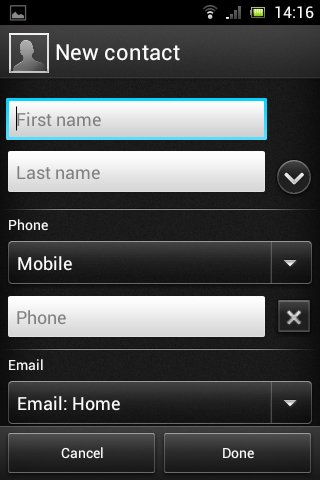
Doing so is straightforward and provides a lot of options, such as their address, multiple emails, instant messengers, notes, custom ringtones and the ability to send their calls straight to voicemail.
If you want to keep things simple and just add a name and phone number, that's no problem either.
You can also sync contacts with your Google account, keeping them backed up and easily accessible from other devices.
The only real omission is social network integration.
Instant messaging services such as Windows Live, Skype and Yahoo are integrated from the contacts screen, but Facebook is totally absent.
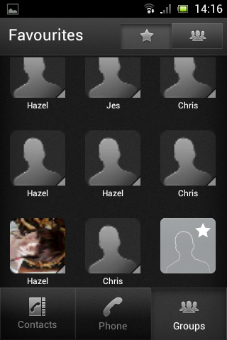
From the groups screen you can access favourites and groups, as well as creating new ones.
It's a fairly standard implementation, with thumbnail images for each favourite person and various contact options appearing once you tap on them.
The groups option enables you to essentially sort your address book into categories and send group emails and texts.
Calling
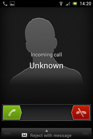
When a call comes through, a large image of the caller will pop up on the screen (assuming they're in your address book and have an image assigned) and you'll have the option to either accept the call with a swipe to the right, reject it with a swipe to the left or reject it with a message by swiping upwards.
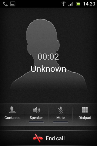
Once on a call, the image of the caller remains, overlaid with their name and the call duration.
Below it there are options to mute the call, turn on speaker phone, access the dial pad, access your address book or end the call.
As with most other screens, you can also pull down the notifications bar from here.
Of course there's no need to even stay on the call screen.
Pressing the home button will return you to the home screen, enabling you to navigate the phone without interrupting the call.
Returning to the call screen - which you might want to do to hang up, for example - is done by either pressing the phone icon or pulling down the notifications bar and tapping on the active call.
Call clarity was decent throughout our use, with neither us nor those on the other end of the line having any issues being heard. We had no dropped calls either.
James is a freelance phones, tablets and wearables writer and sub-editor at TechRadar. He has a love for everything ‘smart’, from watches to lights, and can often be found arguing with AI assistants or drowning in the latest apps. James also contributes to 3G.co.uk, 4G.co.uk and 5G.co.uk and has written for T3, Digital Camera World, Clarity Media and others, with work on the web, in print and on TV.
