Why you can trust TechRadar
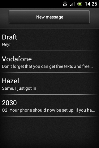
Text messages on the Sony Xperia Miro can be accessed and sent from the messaging app, which is found in the dock (unless you move it).
Opening the app will bring you to the last screen you were on, but the top level screen is a list of all your current conversations.
This is listed by most recent, and each conversation has the name of the person you were messaging, along with the first few words of the most recent message you sent or received.
Above the list there's a 'New Message' button, for messaging people that you haven't messaged previously.
It also enables you to message multiple people or simply save you the effort of scrolling through the list of conversations to find the person you want to message.
You can send emails and IMs to contacts from here too, and these will also appear in the conversations list, though they'll all be given a separate entry.
So, for example, emails to a contact will be listed as a separate conversation from texts to the same contact.
Sadly there's no social network integration here, which is a real missed opportunity.
Long pressing a conversation enables you to delete it, while hitting the menu key from the conversations list enables you to delete multiple conversations at once or search for a specific message.
It also gives access to a settings screen with a number of options, such as turning delivery reports on or off and changing the notification tone.
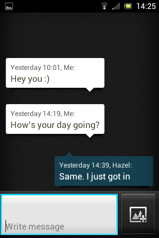
Tapping on a conversation opens it, enabling you to scroll through previous messages and send new ones.
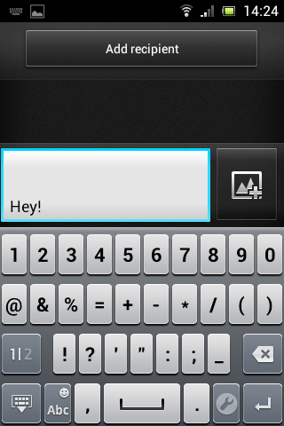
The keyboard is fairly accurate, and unlike its little brother the Xperia Tipo, the screen on the Sony Xperia Miro is just big enough that text entry isn't cramped or awkward.
The keyboard works well in both landscape and portrait mode, though landscape mode conceals all previous messages in exchange for giving you a bigger keyboard.
There's also a voice input option, but this was slow and not always very accurate.
Tapping on a contact's name at the top of this screen enables you to call them, while long pressing a message gives options for copying, deleting or forwarding it.
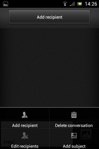
An icon to the right of the text entry box enables you to add photos, videos or sounds to the message, and pressing the menu key from this screen enables you to add or edit recipients, delete the conversation or add a subject to the current message.
Messages and missed calls will cause the notification light to come on, making it very hard to miss things for long. We've said before that this really is a great feature that rounds out the whole messaging experience.
Even better, the actual light on the Sony Xperia Miro manages to look pretty stylish, sending a beam out across the width of the phone.
Plus changing the theme will change its colour, so if the default blue isn't doing it for you then you can switch it to purple, gold, green and more.
While emails can be sent from the text message application, in general you'll want to use the dedicated email apps for that.
First up there's the standard Gmail app that comes with most Android handsets. That's fine, because not only will it be instantly familiar coming from other Android phones, but it's also very good.
Composing emails is a breeze, as is reading them. Its only failing is in not resizing emails to fit the screen, meaning you'll often have to zoom out or scroll around to read a message in its entirety.
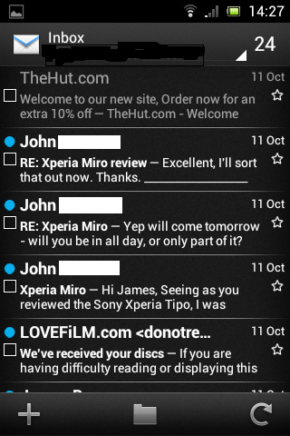
The other email app seems to be one of Sony's own devising, and it will take a bit longer to set up because you'll need to manually add accounts to it, but once it's up and running it seems almost as good as Google's offering.
Both composing and reading email is generally stress-free. The only downside to it is that the layout is slightly different to the Gmail app, which makes switching between them a bit jarring.
So if you use both Gmail and other emails then you might be best off sticking with this app for all of them, because Gmail is supported on it.
James is a freelance phones, tablets and wearables writer and sub-editor at TechRadar. He has a love for everything ‘smart’, from watches to lights, and can often be found arguing with AI assistants or drowning in the latest apps. James also contributes to 3G.co.uk, 4G.co.uk and 5G.co.uk and has written for T3, Digital Camera World, Clarity Media and others, with work on the web, in print and on TV.
